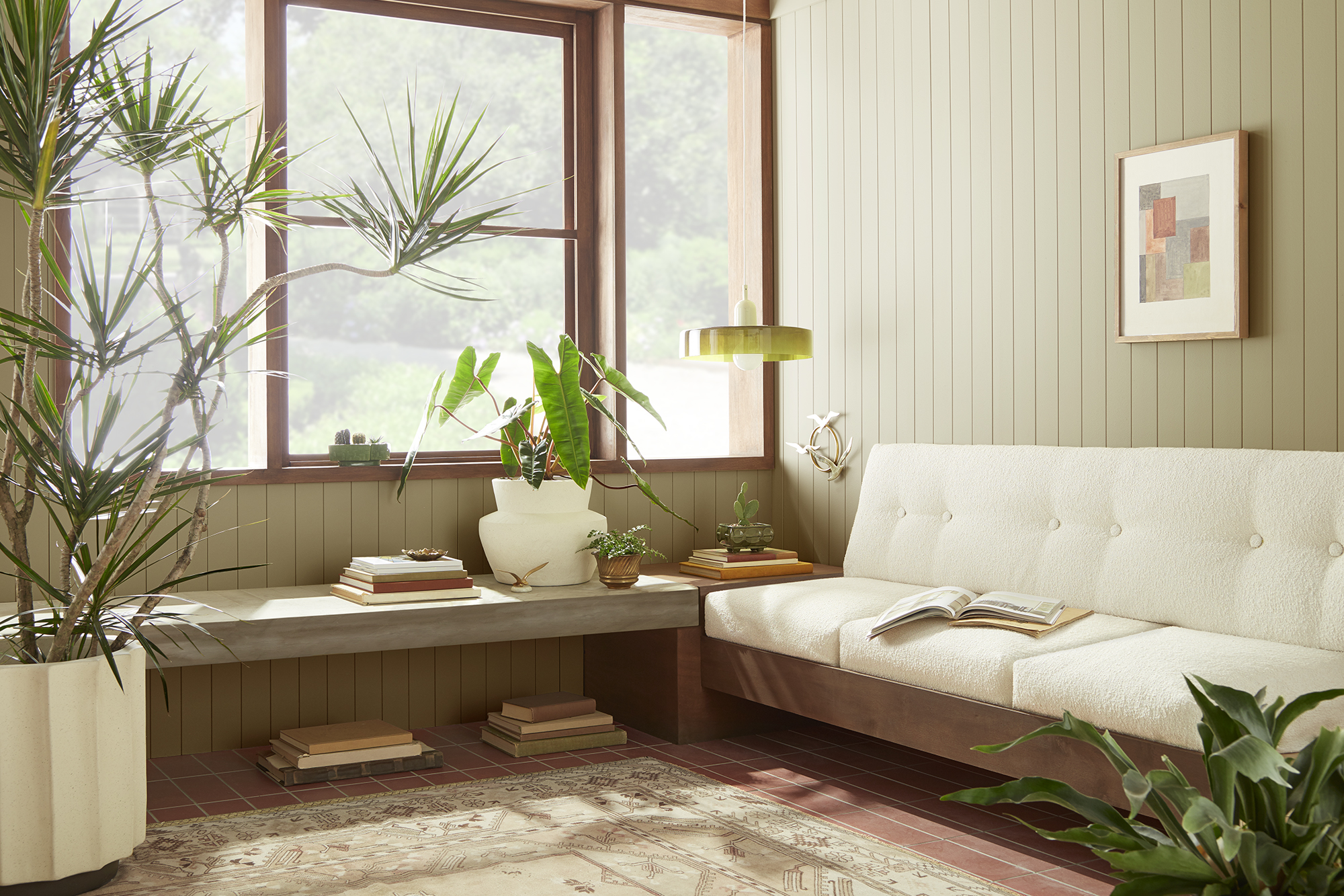
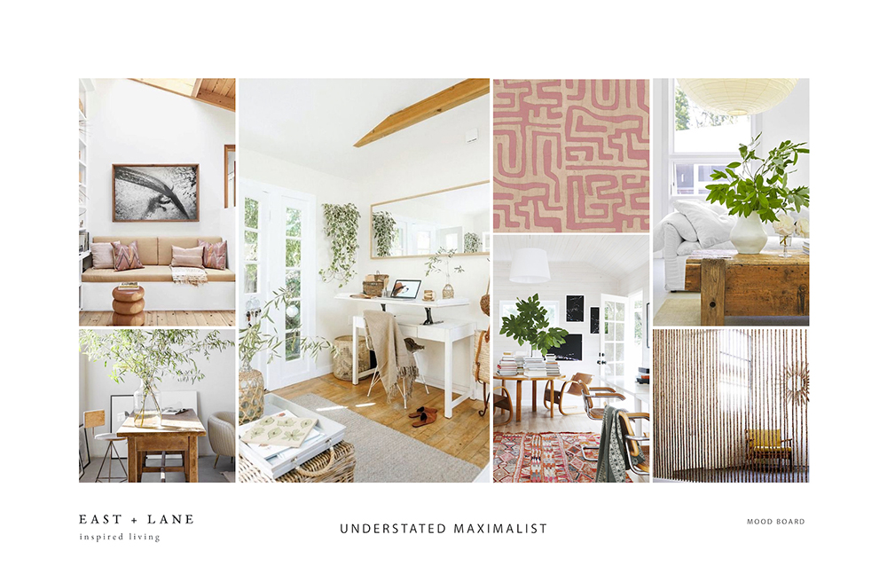
Tag: Living Room
Destination Restoration Rewind: A Look Back at our Best Projects of the Year
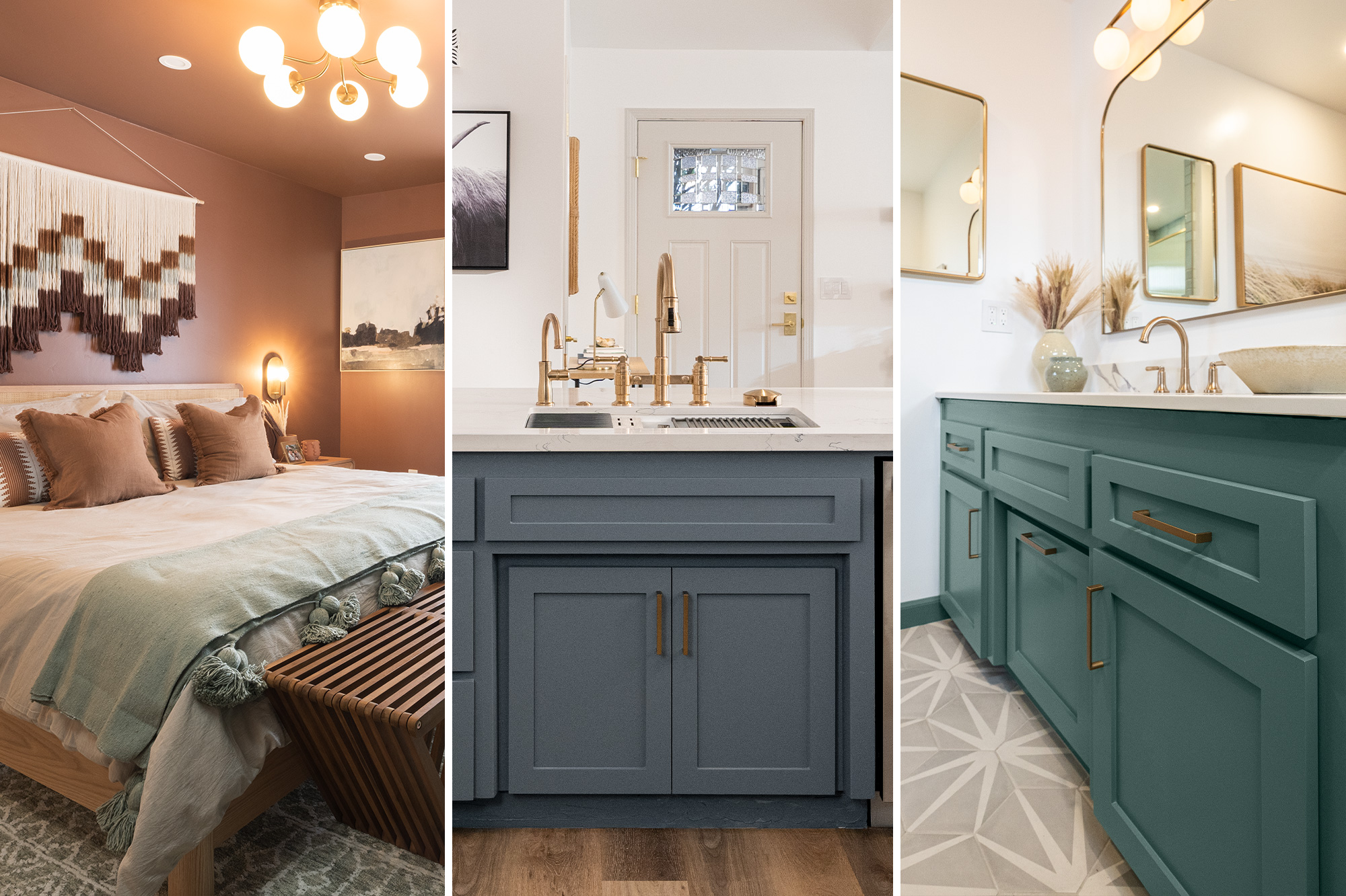
November 7, 2023At the end of the year, we like to reflect on some of our biggest accomplishments, and this year, we’re looking to our Destination Restoration series for inspiration. For this exciting video series, we enlisted the help of two paint, construction, and design experts to make over individual rooms in a single-family home. With their help, we refreshed and modernized four outdated rooms, saving time and money in the process, and extending the life of this charming residence.
Let’s recap our favorite moments from Destination Restoration and get excited to tackle another year of home improvement.
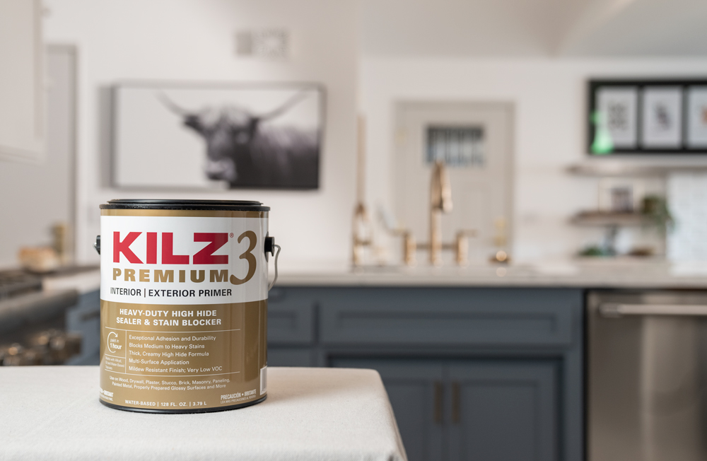
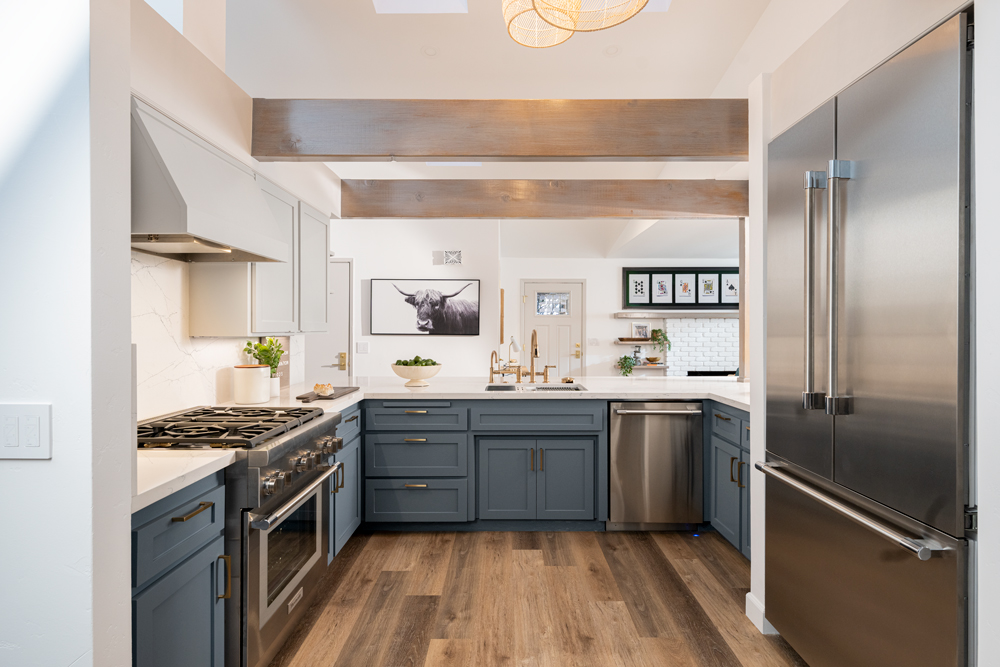
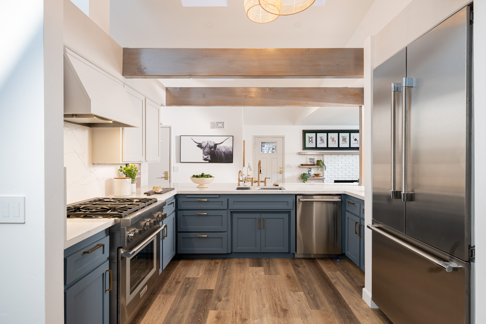
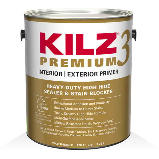
If you’re looking for kitchen remodeling ideas to inspire your DIY dreams, this is a great example of how you can make a big design change while keeping the integrity of the room intact. Our team of pros took a dark and dated kitchen, and, with a vision and some ingenuity, achieved a bright and modern space, renewed for the next generation. The striking cabinet transformation came to life with some light refinishing, KILZ 3® Premium Primer and a fresh coat of paint.
See the full project here.
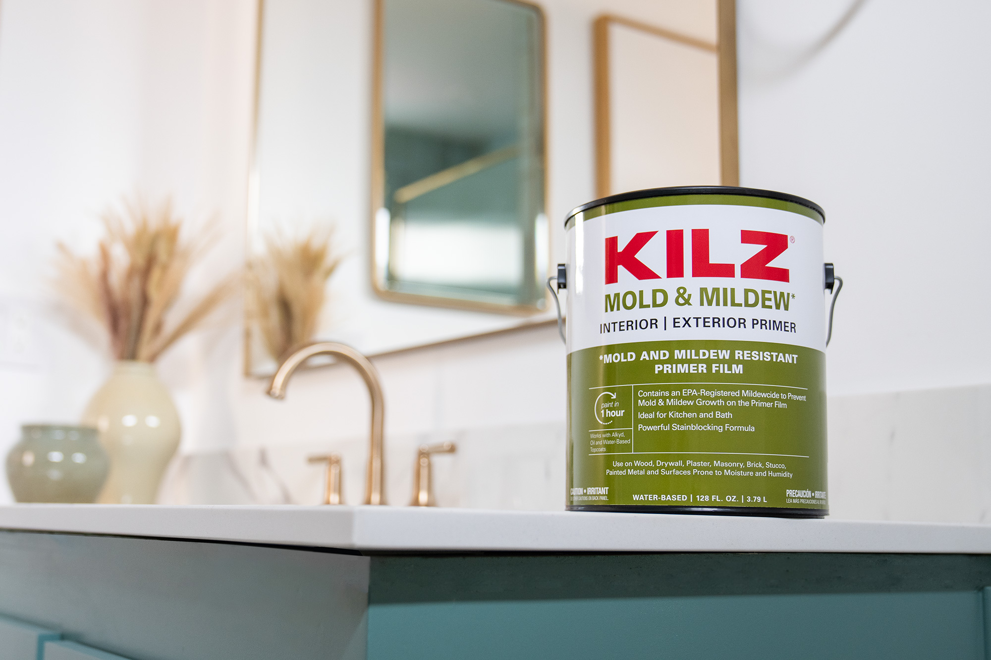
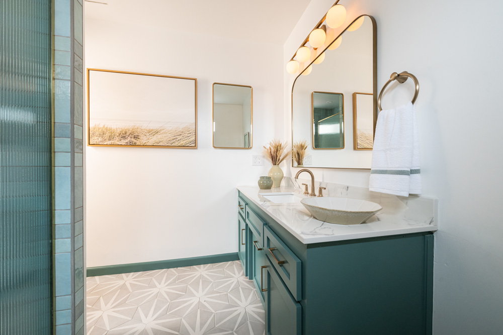
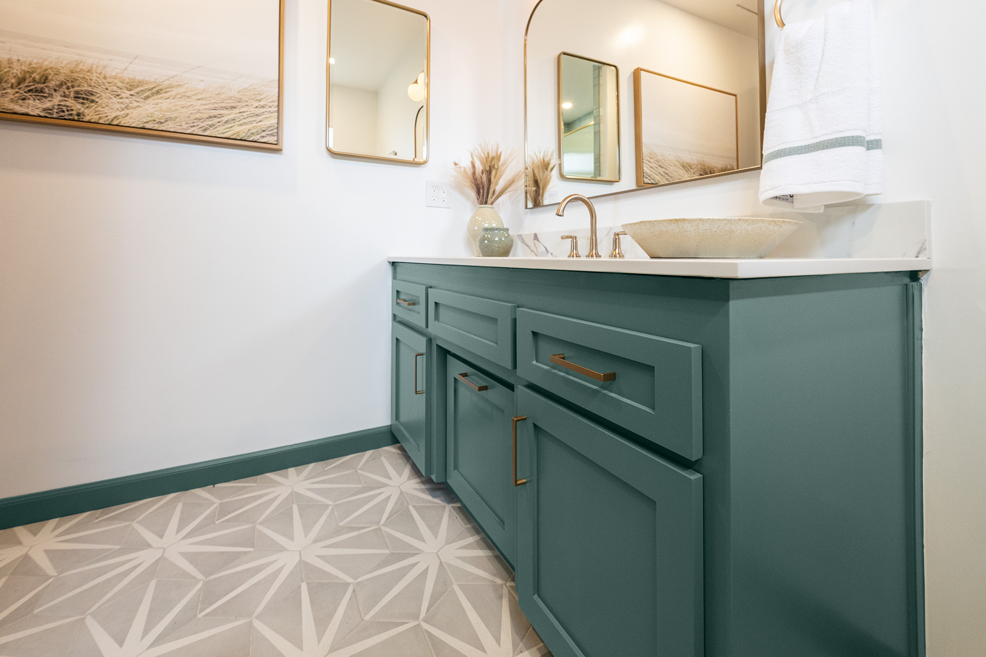
If you have a DIY bathroom project in mind for the new year, be sure to check out this stunning refresh for tips. Our Destination Restoration team made this makeover look easy to give you the bathroom inspiration you need to tackle your own transformation in 2024. With just a few cosmetic fixes, and the help of KILZ Mold & Mildew Primer, our pros converted this outdated room into a beautifully modern space that will last for the next generation to enjoy.
See the full project here.
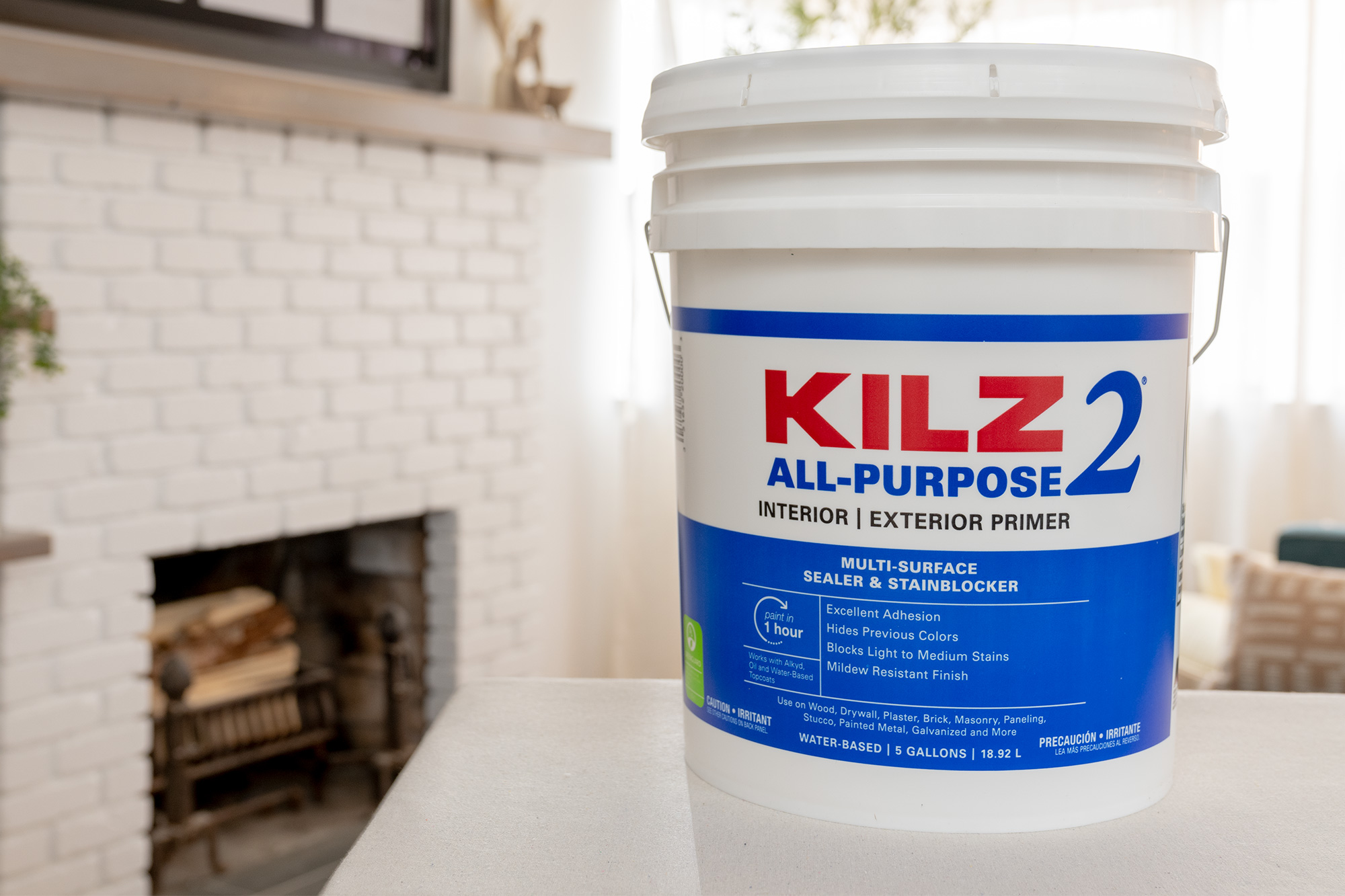

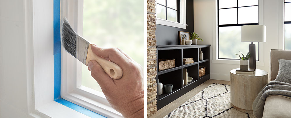
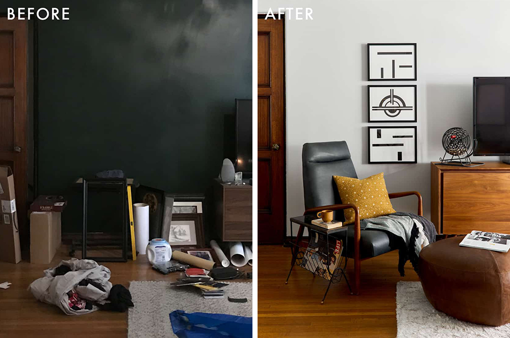
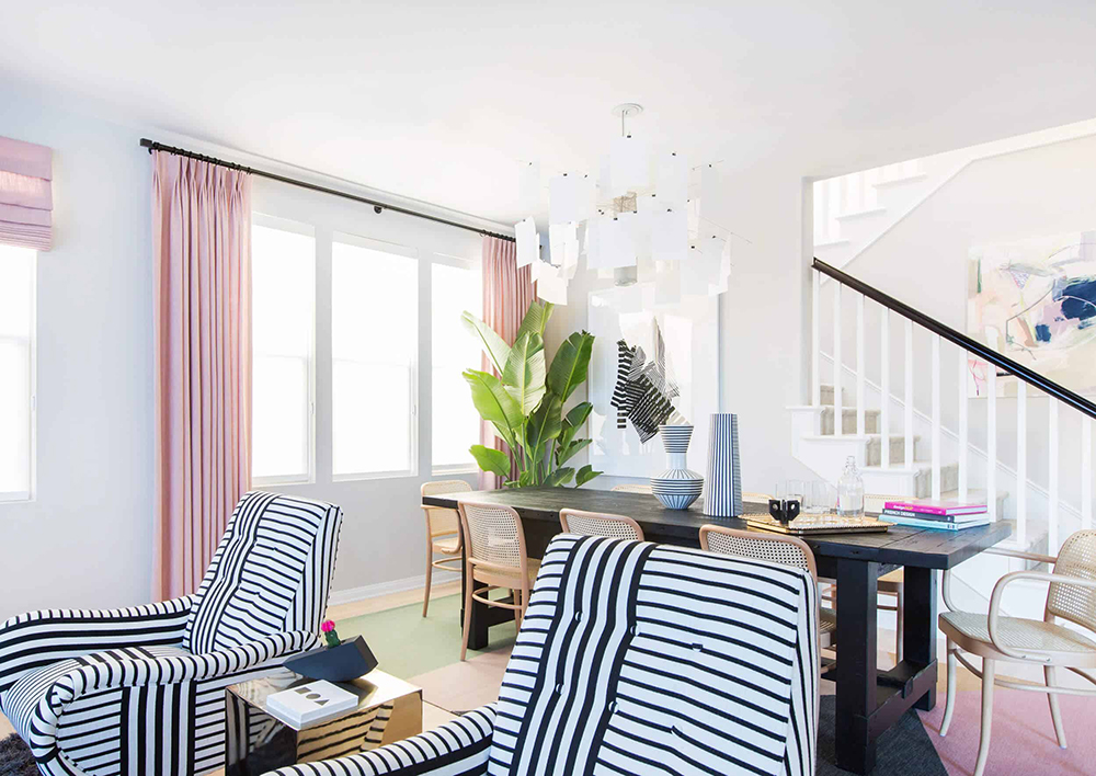
The power of KILZ 2® All-Purpose Primer did wonders for this open-concept living/dining room, where it helped to completely restore an old fireplace and brighten up the room. Rather than put the home through an expensive and time-consuming remodel, our pros reimagined the space and rejuvenated it for years to come with a few simple changes. DIY living room inspiration at its peak, this is a great example of how you can breathe new life into an older home while sticking to a budget.
See the full project here.
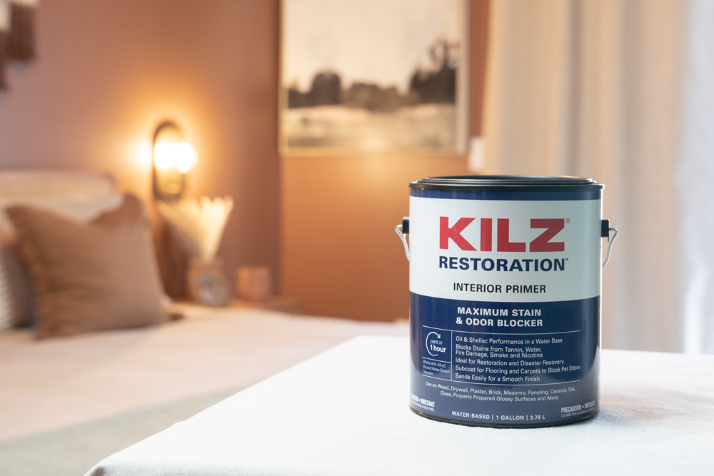

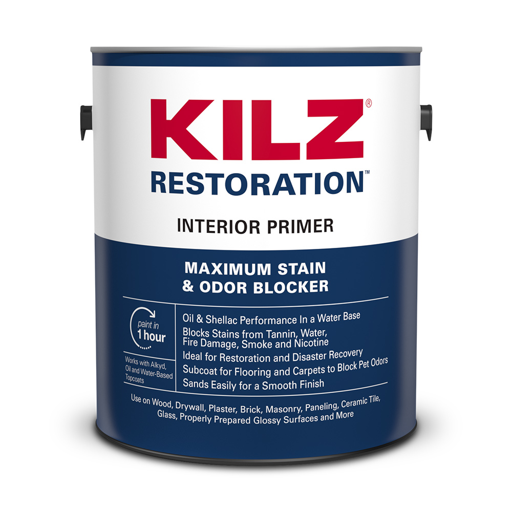
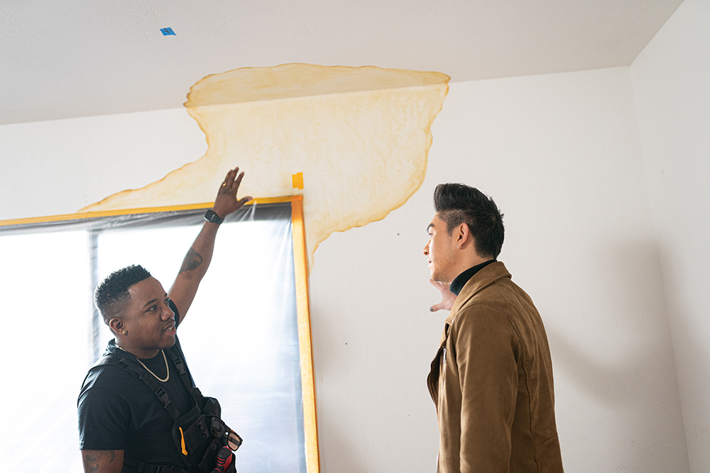
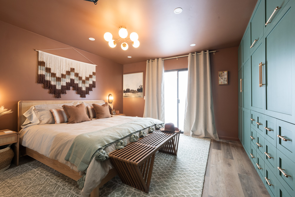
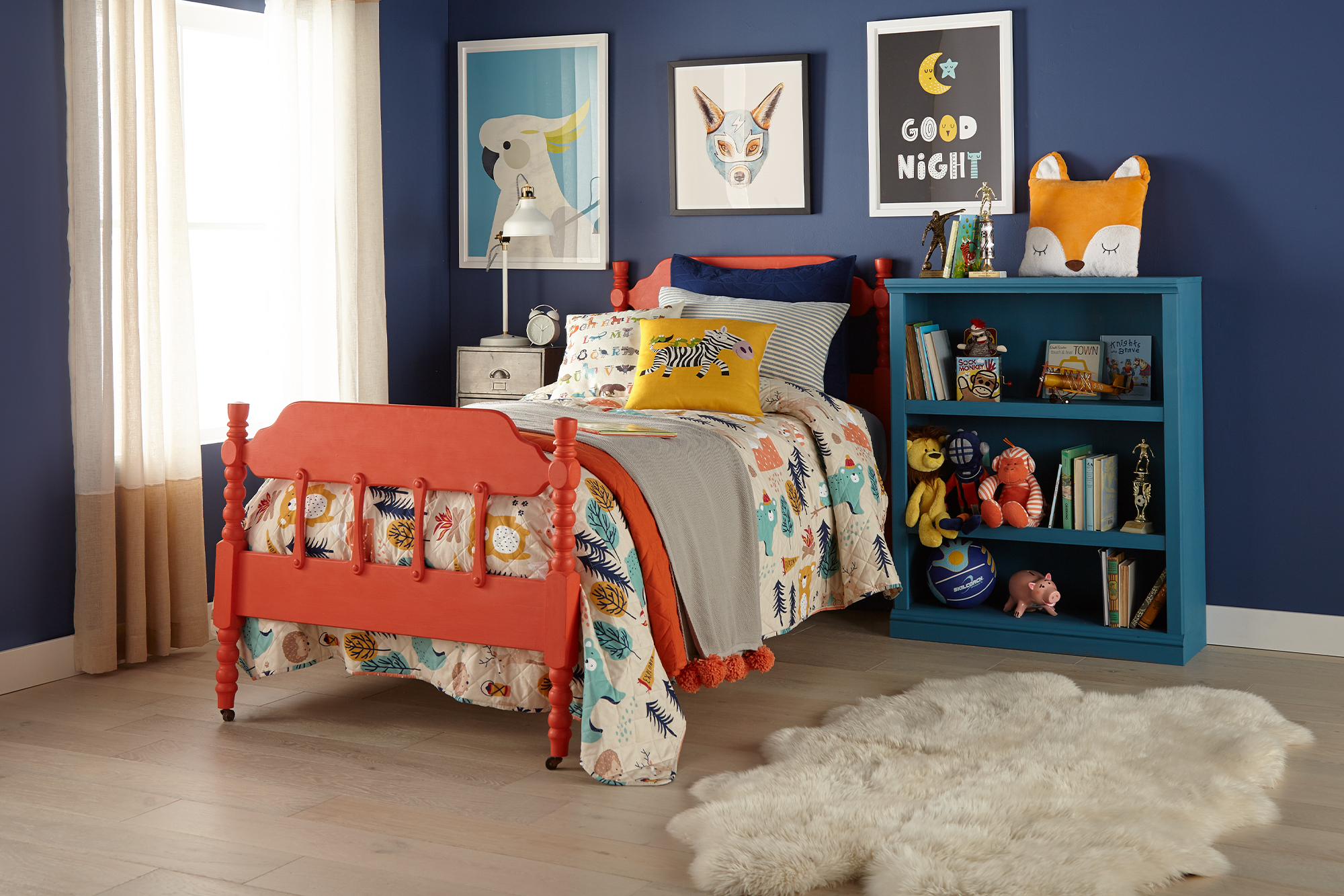
We finish our look back at the series with the primary bedroom remodel. This room’s biggest issue was that it had a large ceiling stain from water damage. Our pros didn’t let this stop them, and instead, used KILZ RESTORATION® Interior Primer to cover and seal the stain and a beautiful terracotta color paint to transform this room into a warm and luxurious space. To finish the look, they upgraded the old closet with a custom, built-in storage unit with a hidden TV display, painted in a complimentary forest green. We couldn’t be more pleased with the result, which reminds us of a chic and cozy desert retreat.
Note: The cause of the water damage had been remedied prior to our pros coming in to fix the cosmetic side.
See the full project here.
This was another great year for home makeover inspiration, and even though the year is winding down, our motivation is full steam ahead. Whether you’re taking it easy or busy organizing next year’s DIY game plan, we hope these projects inspire you to bring your dream home to life. Thanks for spending the year with us. We can’t wait to see what you choose to tackle in 2024.
Always remember to refer to our website kilz.com or product back labels for additional information on which primer is right for your project and detailed instructions on how to apply our products. Check out our Coverage Calculator to understand your estimated paint needs for your upcoming project.
RELATED ARTICLES
get inspired:
FOLLOw us:
@kilzbrand
SHOP
PRODUCTS
MINI RENI – A TIMELESS RENOVATION
August 21, 2023Welcome back to the KILZ® Perfect Finish blog. Today we are going to talk about Joanna Gaines’s first Mini Reni project, where she renovated a house without undergoing a major demo day. The home featured in this mini reni belongs to a couple who just welcomed a baby into their family and were looking to refresh their space under a budget. Watch as Joanna is able to transform this family’s living and dining room by using some primer, paint, and new décor.
With less than $5,000 to spend in the living room, Joanna chose to embrace the space and make it modern with some fresh paint and key design elements.
The home’s original living room had shiny wood paneled walls and a white tiled ceiling with wooden beams, which really dated the area. To update the room, the wall panels were sanded and primed using KILZ® Original Oil Primer, which covered up the knots in the wood grain, creating a flat surface that was ready for paint. Once the wood was prepped, the walls and ceiling were painted in one of Joanna’s favorite interior paint colors, Cottage Grove (in eggshell finish) from the Magnolia Home by Joanna Gaines® Castle Collection.
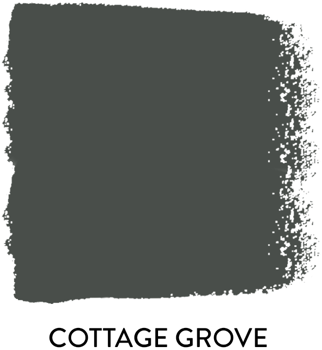 |
“A rich blend of navy and green, this color can take on either tone in different light, which makes it both dramatic and cozy all at once.” |
By bringing the paint up to the ceiling and decorating the living room with a large area rug, plants, and tonal furniture, Joanna was able to transform the entire space into an elevated yet cozy room ready for entertaining guests or fun family nights.
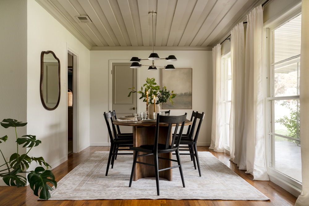
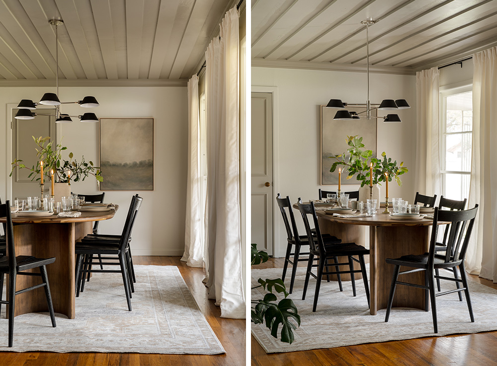
The home’s original dining room started out as a plain white box, which allowed for lots of opportunity, but with a small budget in place, Joanna had to get creative. By bringing in fresh colors and textures, she was able to completely update the room.
To create some visual interest, crown molding and wood panels were installed on the ceiling and painted in the interior paint color Drawing Room, a soft gray from the Magnolia Home by Joanna Gaines® Castle Collection. The plain wood door also was renovated, turning it into one of the focal points of the room, by adding some trim and painting it in the same Drawing Room color.
 |
A soft French gray. |
The walls were painted with a coat of One Horn White, making the room feel fresh and new again. In order to create contrast with the soft paint colors, the lighting was updated from an old fan to a new modern light fixture with black accents. Final decorative touches included dark dining table and chairs, along with long velvet curtains and an ivory rug to ground the area.
 |
One Horn White is a warm white with a light beige tint. |
This home was brought back to life and elevated by a few simple changes, adding KILZ® Primer, Magnolia Home by Joanna Gaines® Paint, and new decor. You don’t always need a large renovation to make your home look and feel new!
Encouraged to tackle a project using one of the Magnolia Home by Joanna Gaines® paint colors? Check out the link below to explore more.
Complementary Palette

Castle Cream

Plaster

Estate

Step Stool Green

Vintage Crown
“Where can I buy Magnolia Home by Joanna Gaines Paint?”
These paint colors are now available at Ace Hardware, Lowe’s, and Magnolia.com/shop.
Always remember to refer to our website kilz.com or product back labels for additional information on which primer is right for your project and detailed instructions on how to apply our products. Check out our Coverage Calculator to understand your estimated paint needs for your upcoming project.
RELATED ARTICLES
get inspired:
FOLLOw us:
@kilzbrand
SHOP
PRODUCTS


Meet Jared and Jason: The Pros of Destination Restoration
April 18, 2023Are you looking for inspiration for your next home renovation project? Look no further than Destination Restoration, a new mini-series from KILZ that celebrates the power of restoration. Meet the talented Pros, Jared Foster and Jason Lai, who bring their expertise in design and painting to restore a fourth-generation family home. With their unique blend of skills and passion for craftsmanship, they transform old and outdated spaces into something new and beautiful using primer and paint.
 Jared Foster is a master painter, builder, and business owner with over a decade of experience in the industry. He’s known for his attention to detail, his skilled craftsmanship, and his ability to turn even the most challenging of spaces into beautiful homes. Before finding his passion for home improvement, Jared was a Grammy-nominated singer-songwriter, traveling the country and touring with some of the biggest names in the music industry. Now, he channels his creativity into building projects that are both functional and beautiful.

Jason Lai has over 15 years of experience in the design industry and owns his own design firm. He’s worked on a wide range of projects, from contemporary homes to traditional spaces, and everything in between. Jason’s clients appreciate his adaptability, relatability, and humility while also acknowledging his confidence in standing by his recommendations. Having worked with such a variety of clients and spaces, Jason brings a unique perspective to each restoration project he’s a part of.
Together, Jared and Jason make an unstoppable duo, with skills that complement each other perfectly. Throughout the series, viewers get an immersive behind-the-scenes look at each restoration project, from painting over water stains to painting bathroom cabinets using KILZ primers.

Whether you’re a DIY enthusiast or simply looking for home inspiration, Destination Restoration is a must-watch series that showcases the beauty of home restoration. Jared and Jason bring their passion, expertise, and eye for design to each project, and show viewers how to transform old and outdated spaces into something incredible. Tune in to Destination Restoration and start your journey to creating your dream home today.
RELATED ARTICLES
get inspired:
FOLLOw us:
@kilzbrand
SHOP
PRODUCTS
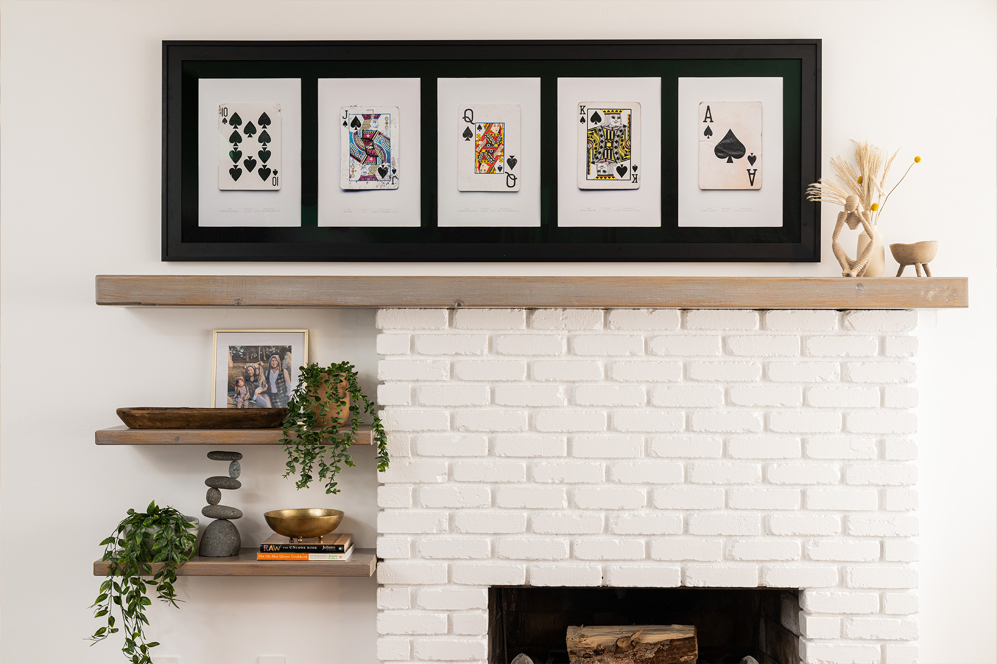
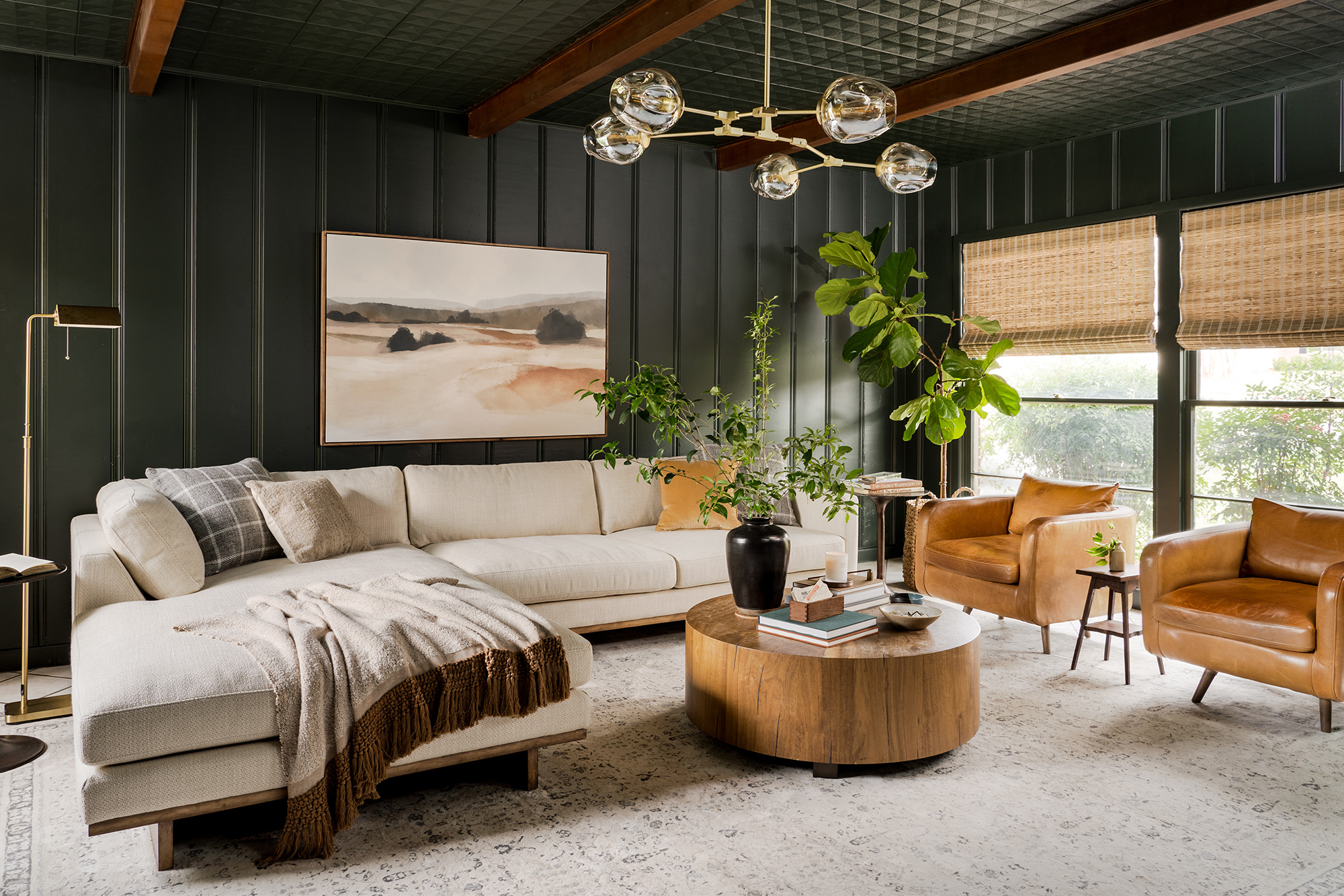
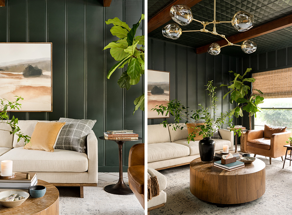
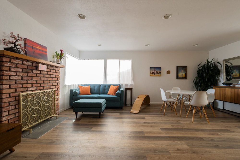
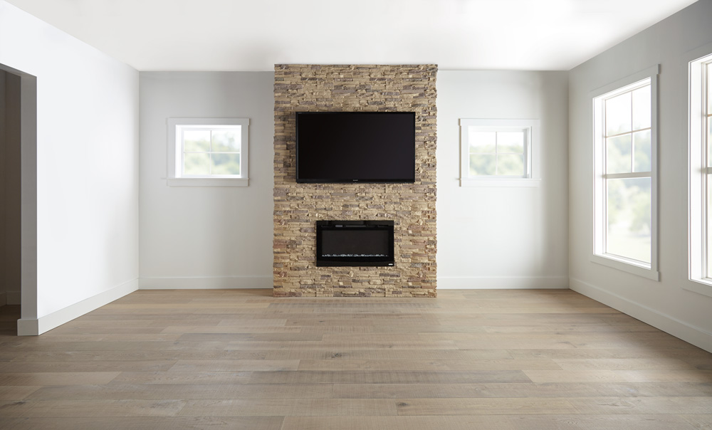
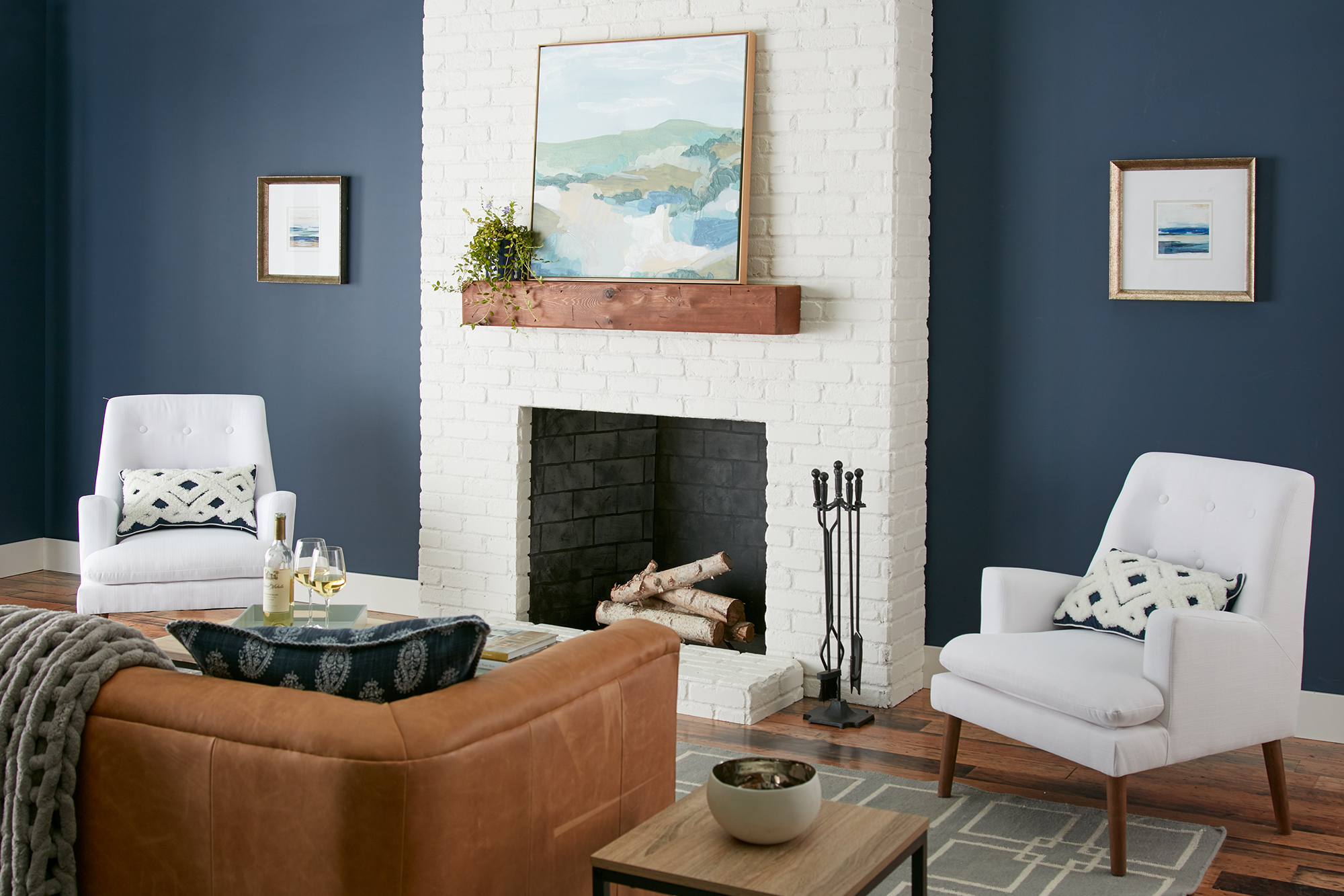
An Outdated Living Room Gets a Facelift
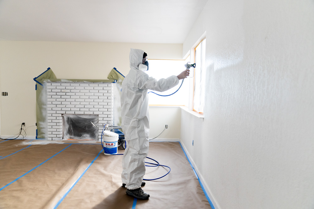
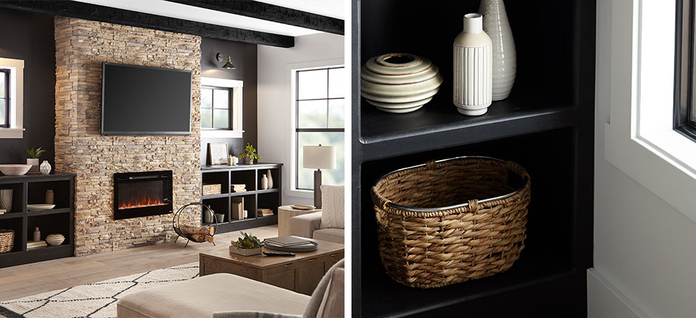
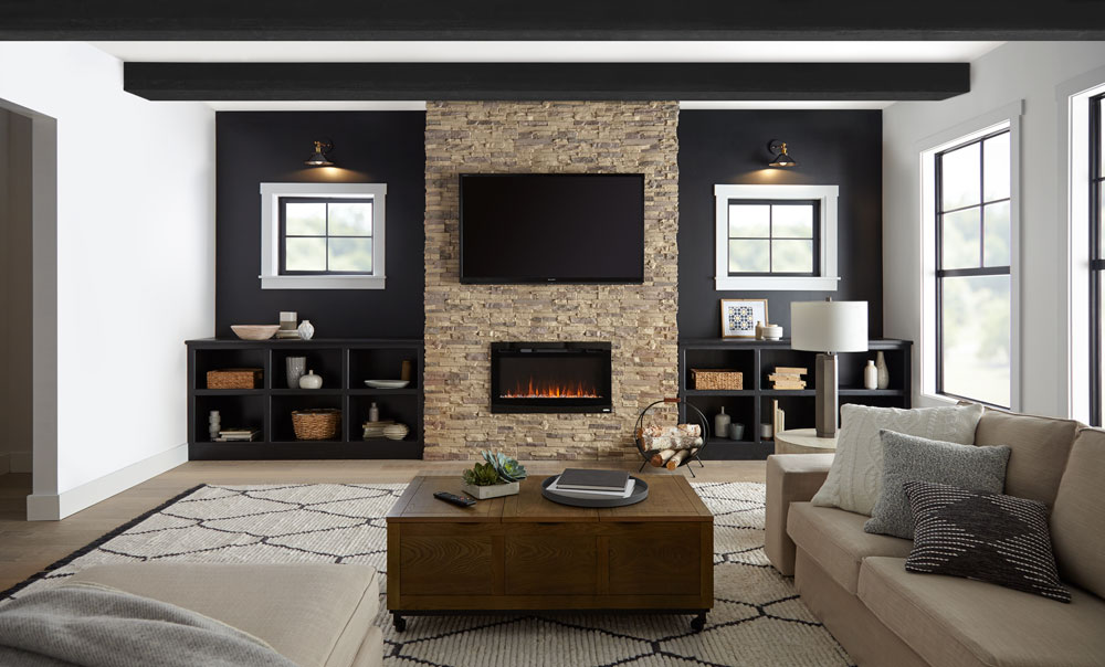
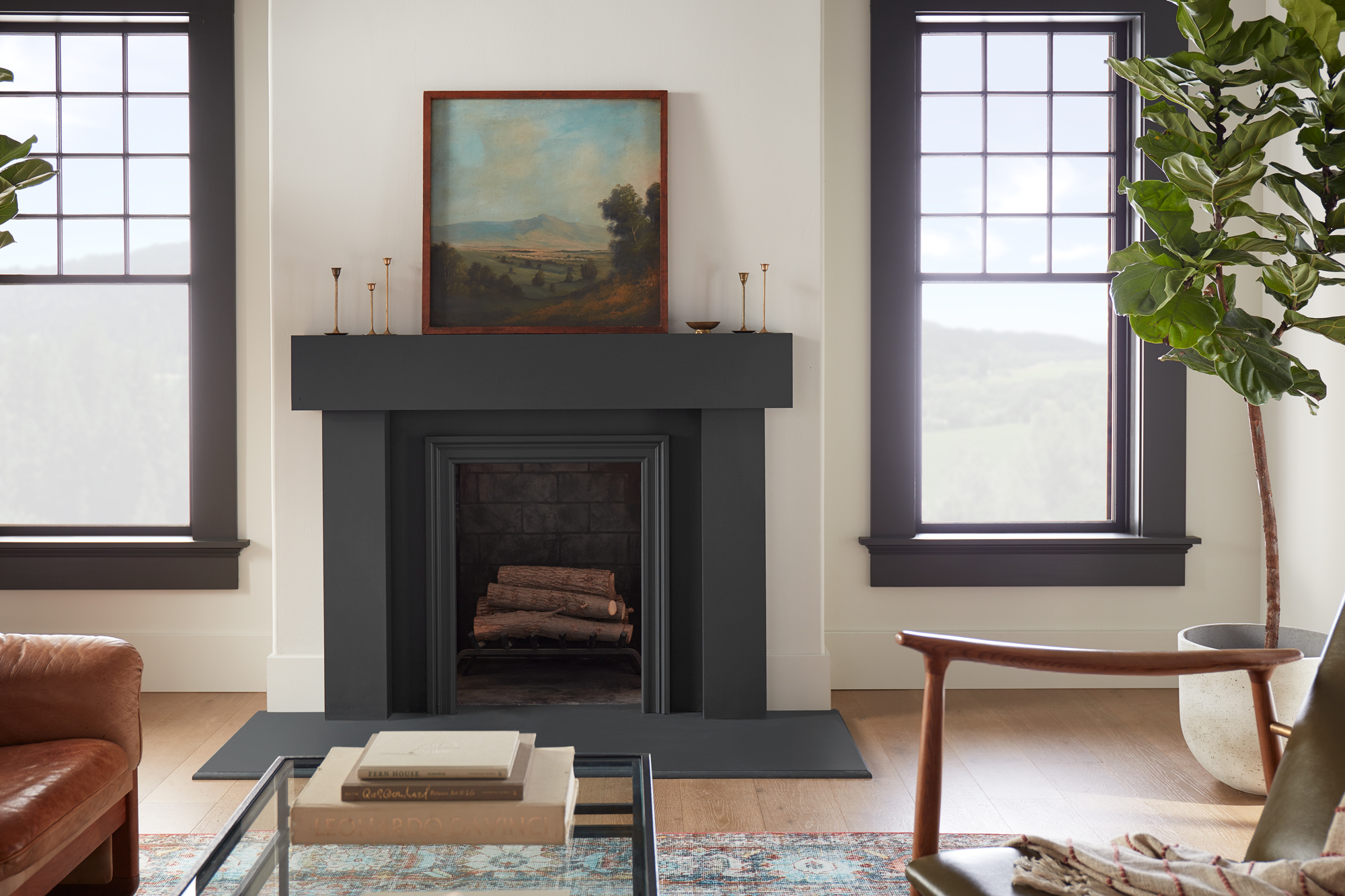
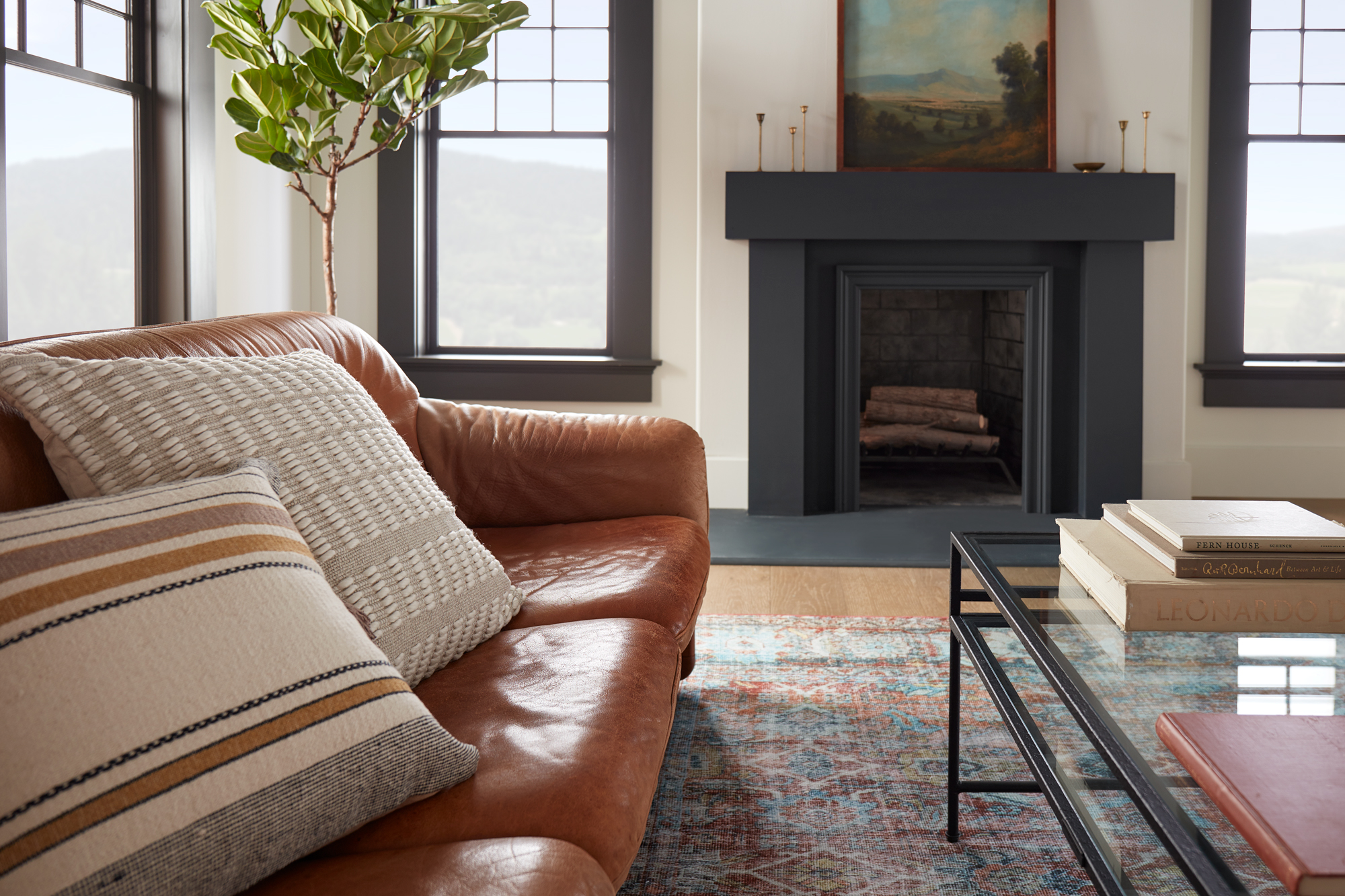
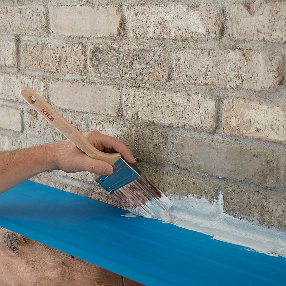
April 17, 2023On this episode of Destination Restoration, we upgraded an open concept family living/dining room, while demonstrating the power of primer in a striking fireplace restoration. Rather than putting this 4th generation home through a full gut rehab, our pros, Jason Lai (interior designer) and Jared Foster (contractor/pro painter) worked to reimagine the space and rejuvenate it for another generation. This series demonstrates how you can breathe new life into an older home while keeping its structural integrity intact.
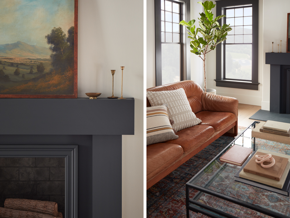
Jason and Jared worked together to take this space from ordinary to inviting, contemporary, and cheerful with a few tweaks. Keeping in mind aesthetics and functionality, the goal was to avoid tearing things out and starting from scratch, and instead, add value to the existing room. They updated the décor, primed, and painted the fireplace, added new lighting, built a convenient storage unit in the dining area, and overall, made the space look chic and feel cozy.
We’ve broken down each area below so you can get a more detailed look into the upgrades we made. If you’re not sure where to start, we’ve included a step-by-step guide of how to paint brick fireplaces like the one here.
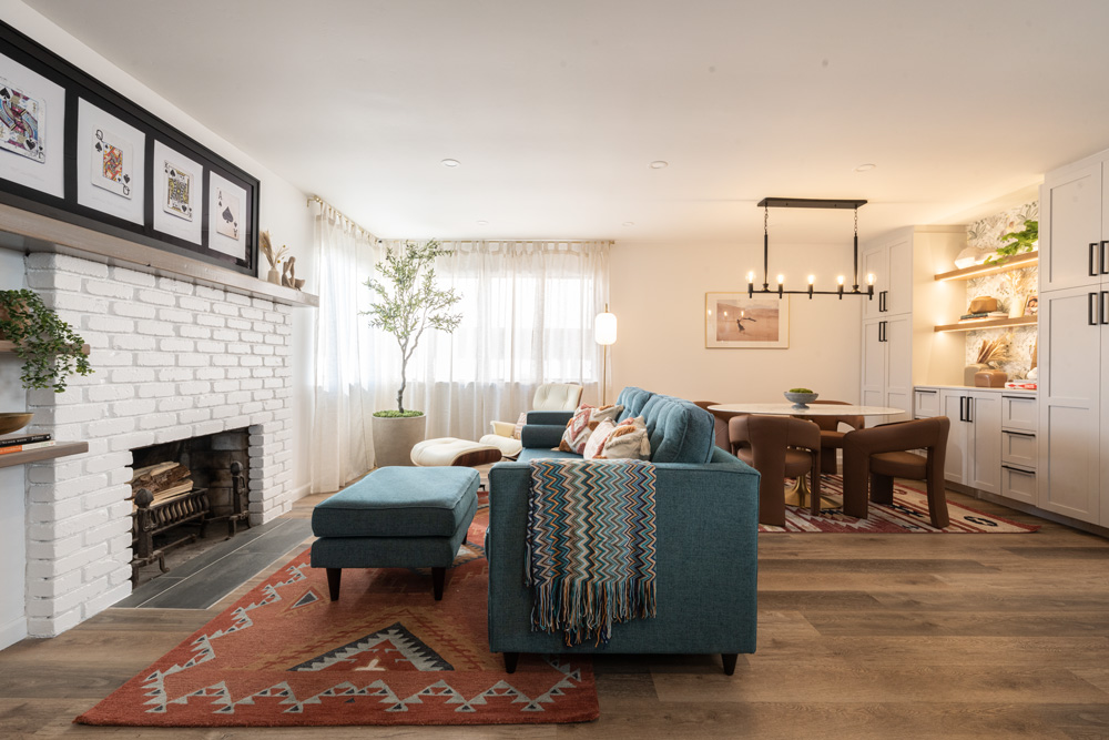
Living Area
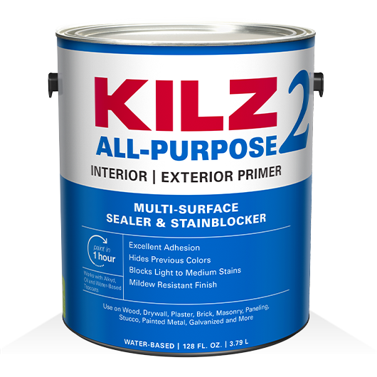
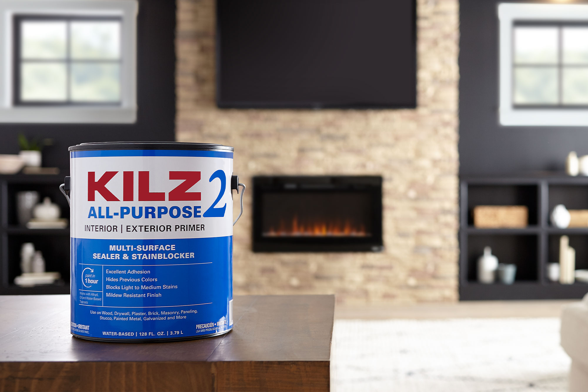
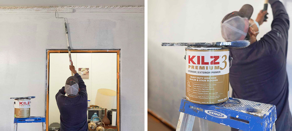
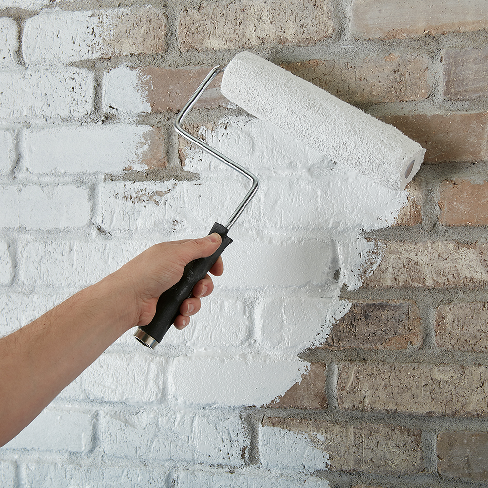
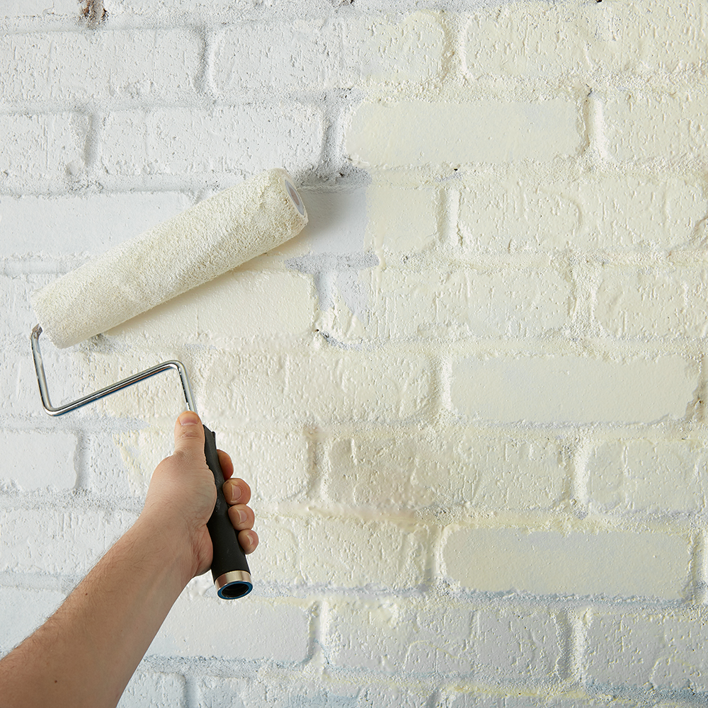
First, we primed the fireplace and front door using KILZ 2® All-Purpose Primer. For living room paint colors, the front door was painted Chic Grey and the fireplace Whipped Cream, both colors by Behr Paint. We also replaced the front door hardware for a more modern look. Using the beam we removed from the kitchen ceiling, we stained and repurposed it to extend the mantle out to the left of the fireplace. Finally, we added floating shelves just underneath. These shelves were the result of leftover pieces from the kitchen beam, which were also stained to match.

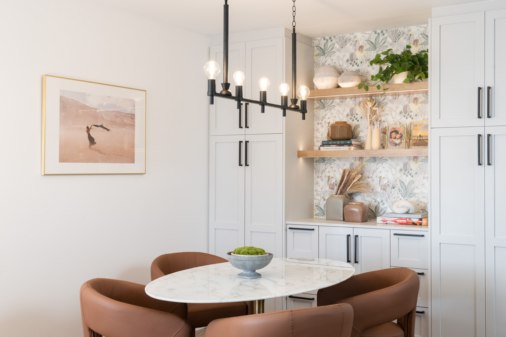
Dining Area
To spruce up the old dining area, we replaced the buffet cabinet with a larger, built-in storage unit, and brightened it up with under cabinet lighting and a linear chandelier (by Kichler Lighting) over the dining table.
Other Changes
Our interior designer, Jason, added touches of new furniture and décor throughout this space to bring it into the modern day. He chose to keep the existing couch and update the throw pillows and blanket, as well as rearrange the furniture to create a distinct living and dining area within the space.
Why Do You Need to Prime?
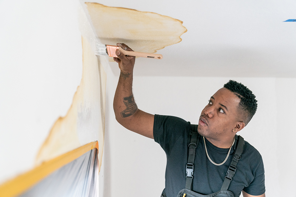
Priming is essential for proper surface preparation for any paint project. It’s the difference between a job done and a job done right. Priming helps solve a wide range of problems, including highly porous surfaces, stains, odors, uneven surfaces, texture differences, and adhesion problems.
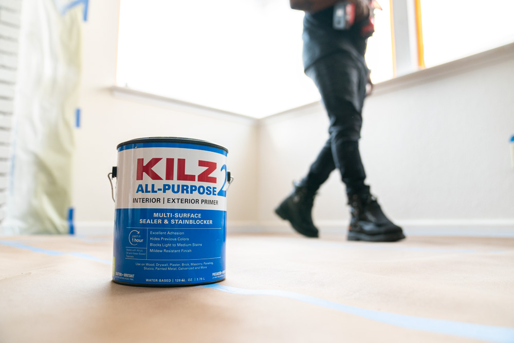
For the purposes of this project we used, KILZ 2® All-Purpose Primer because it dries fast and can be used on many surfaces, including brick. It’s also a great stain blocker with excellent adhesion, mildew resistance, sealing properties and a very mild odor. Its enhanced hiding formula makes it ideal for changing colors, like in the case of our fireplace, and helps lessen the number of coats of paint required, saving you time and money.
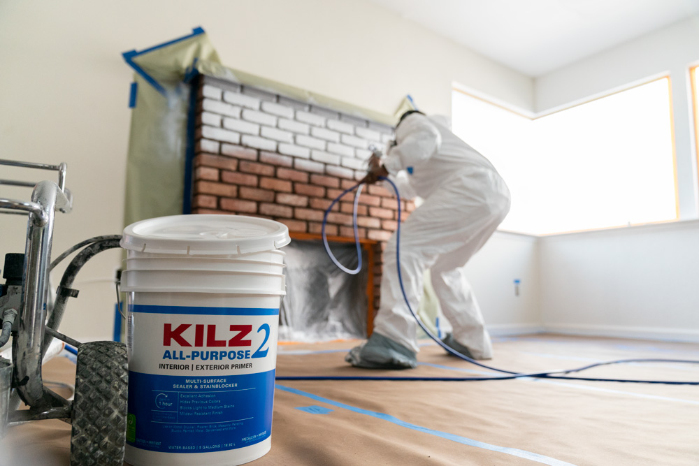
Step-By-Step Guide for a Brick Fireplace Makeover:
A primed and painted fireplace requires a few basic steps from start to finish. Here’s an easy guide to follow for your next project:
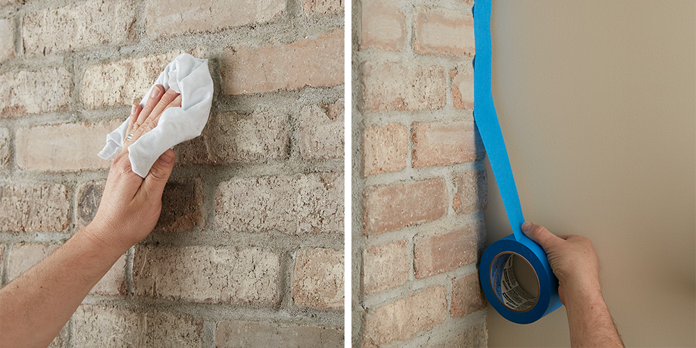
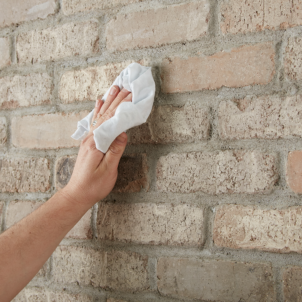
1. Clean the bricks. If it’s extra dirty, start with a vacuum and use the crevice tool attachment to clean between the bricks. Next, wipe down the fireplace with a damp cloth to ensure all surfaces are clean and free of any lingering dust. Allow to dry.
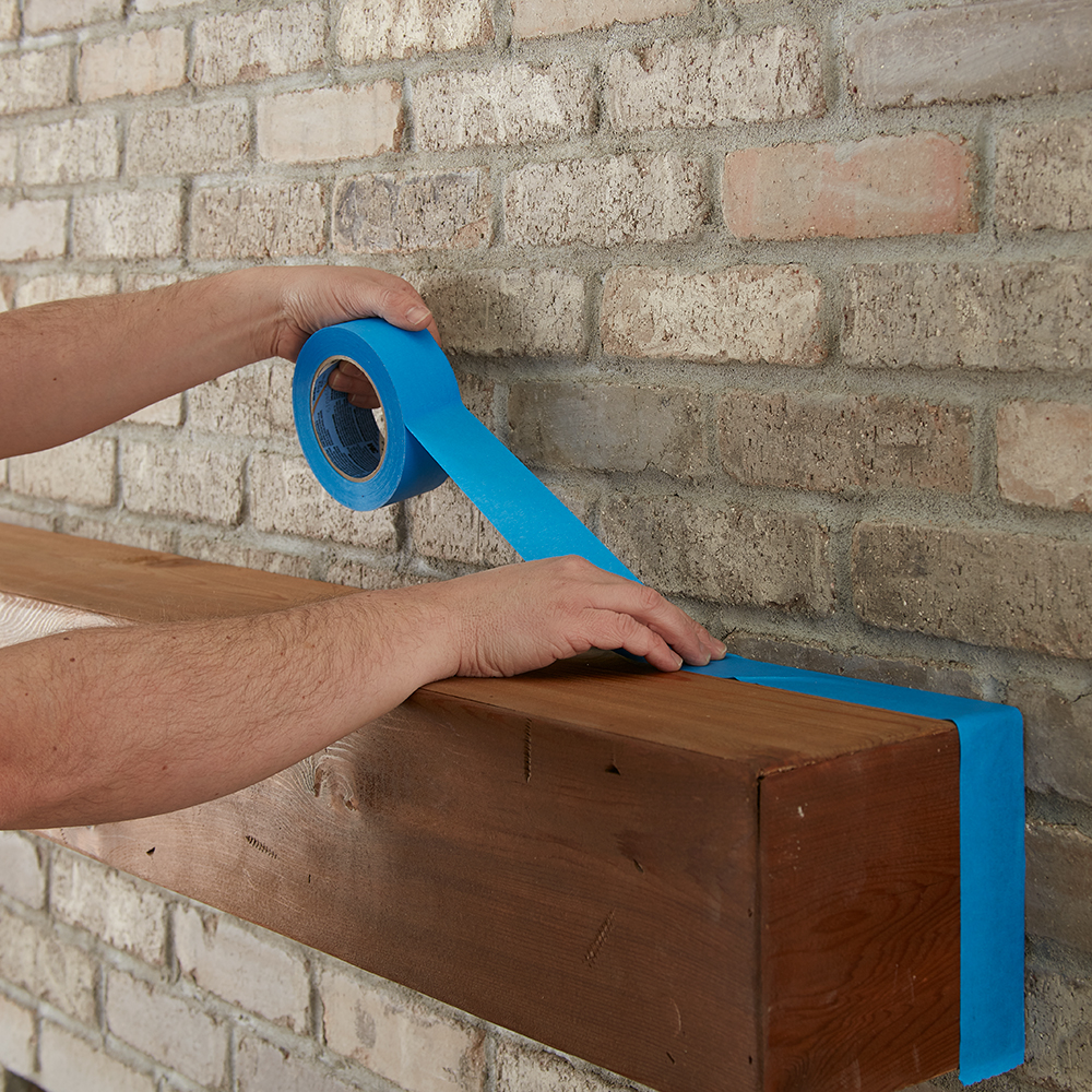
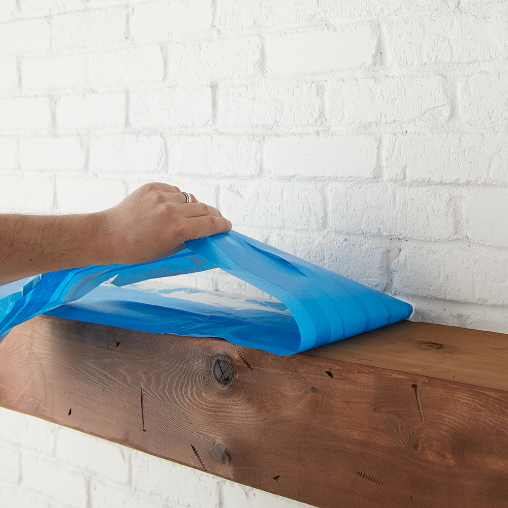
2. Tape around the fireplace to protect the walls and floor. Also tape around the mantel and where the brick meets the firebox (the inside where the wood goes!) to keep that area protected from paint and primer.
3. Protect your floors from paint and primer by covering it with a drop cloth.
4. Now it’s time to prime! Using KILZ 2® All-Purpose Primer, start with an angled brush to cut in around the mantle and edges of the fireplace.
5. Next, use a roller to cover the brick faces with primer.
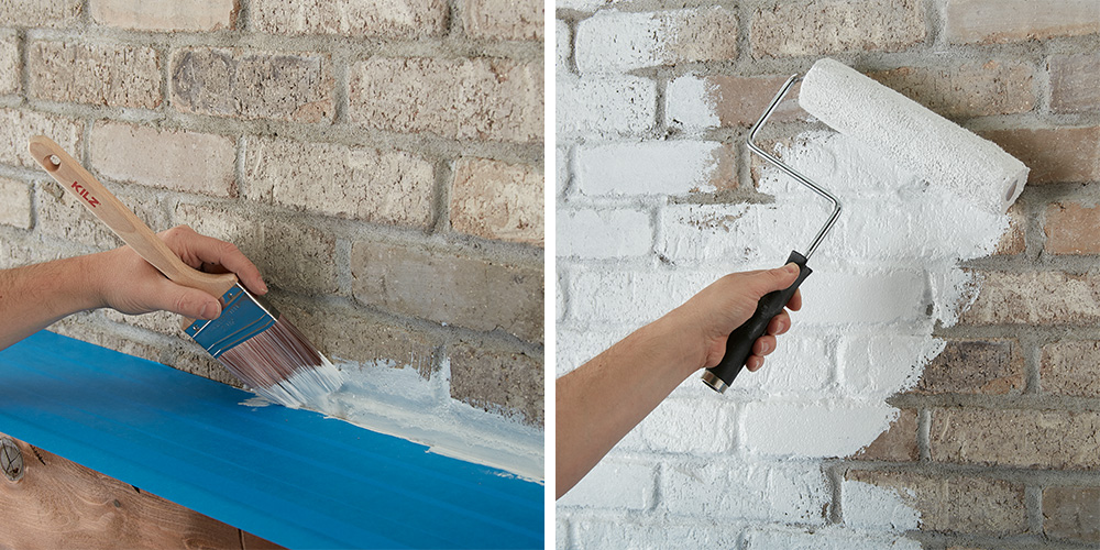
6. Go back with a small, angled brush to fill in any remaining grout areas and crevices in the bricks.
7. Allow to dry for 1 hour.
8. Once the primer is dry, apply paint of your choice using the same application process at the primer.
9. Remove the painter’s tape before your paint is fully dry.
You Will Need:
• Vacuum and rags to wipe dirty and dusty surfaces
• Painter’s tape
• Drop cloths, canvas, or other reusable material
• Paint roller, angled brush, and paint tray
• Paint of choice
We hope this episode of Destination Restoration inspires you to tackle your own living room remodel this year. Be sure to keep KILZ® products in mind for your next project, and come back for more ideas, tips, and project inspiration.
If you loved this restoration, be sure to check out the other episodes of Destination Restoration. Jason and Jared took on the Kitchen, Primary Bedroom and Primary Bathroom.
Always remember to refer to our website kilz.com or product back labels for additional information on which primer is right for your project and detailed instructions on how to apply our products. Check out our Coverage Calculator to understand your estimated paint needs for your upcoming project.
RELATED ARTICLES
get inspired:
FOLLOw us:
@kilzbrand
SHOP
PRODUCTS
Creating a Family Room that Brings People Together
August 1, 2022Ready to breathe new life into the heart of your home this year? Start your family room renovation before the holiday chaos, and enjoy a space that feels cozy and bright all year long. Your family room should invite people in, feel comfortable, and encourage togetherness, and with the right template, you can create a room that’s not only gorgeous, but also practical, warm, and perfect for gathering with loved ones.
With so many family room designs to choose from, it’s up to you to find the perfect one. We were inspired by a modern farmhouse look, which we achieved with soft white paint, dark accents, and carefully styled décor. Taking our room from light to dark required that we first primed the walls for a better paint application, so we chose KILZ 2® All-Purpose Primer, which simplified the job thanks to its multipurpose formula.
It’s fast drying, water-based, and able to be used on multiple surfaces—such as plaster, drywall, wood, and brick. Great at blocking stains, it also has excellent adhesion, and is mildew resistant with a very mild odor. KILZ 2® All-Purpose Primer helps lessen the number of coats of paint required—a perfect solution for making over your family room quickly and professionally with minimal disruption to your life.
Once primed and dried, we got to work painting our accent walls and cubbies with BEHR® Interior Paint in Carbon N520-7. We also added this color to the inner window framing, to add a bit of depth, and to the beams across the ceiling to further complete the farmhouse look.
For contrast, we used BEHR® Interior Paint in two shades of white to brighten up the rest of the space. For the walls, we chose Shoelace OR-W13, and Ultra Pure White® for the trim and ceiling. The dark accents work to draw focus to the back wall—housing the fireplace and TV—and allowed us to situate the furniture in a way that creates a natural gathering space inside the room. From here, it was time to get creative and have fun with the décor.
Choosing a neutral color palette was an easy decision because it worked well with the existing brick detail and created an added layer of warmth. We wanted the room to feel relaxed and cozy, yet modern and sophisticated, which our beige couch and area rug help achieve. We brightened up the cubbies with a few wicker baskets, ceramic bowls, and vases, and sprinkled in a bit of greenery around the room. Our wooden coffee table pulls focus to the room’s center, while hints of blue and gray in the pillows and throw help to create a finished farmhouse look.
As always, we hope you find this room transformation inspiring. It’s easy to start any project—big or small— with the help of any KILZ® Primer. Whether you choose to embark on this project with friends or family, or go at it alone, once completed, your beautiful, new family room will reward you with memories for years to come. With a bit of time and effort, it’s easy to give your loved ones the gift of togetherness this year.
Always remember to refer to our website kilz.com or product back labels for additional information on which primer is right for your project and detailed instructions on how to apply our products. Check out our Coverage Calculator to understand your estimated paint needs for your upcoming project.
RELATED ARTICLES
get inspired:
FOLLOw us:
@kilzbrand
SHOP
PRODUCTS
Magnolia Home: Classic and Cozy Living Room
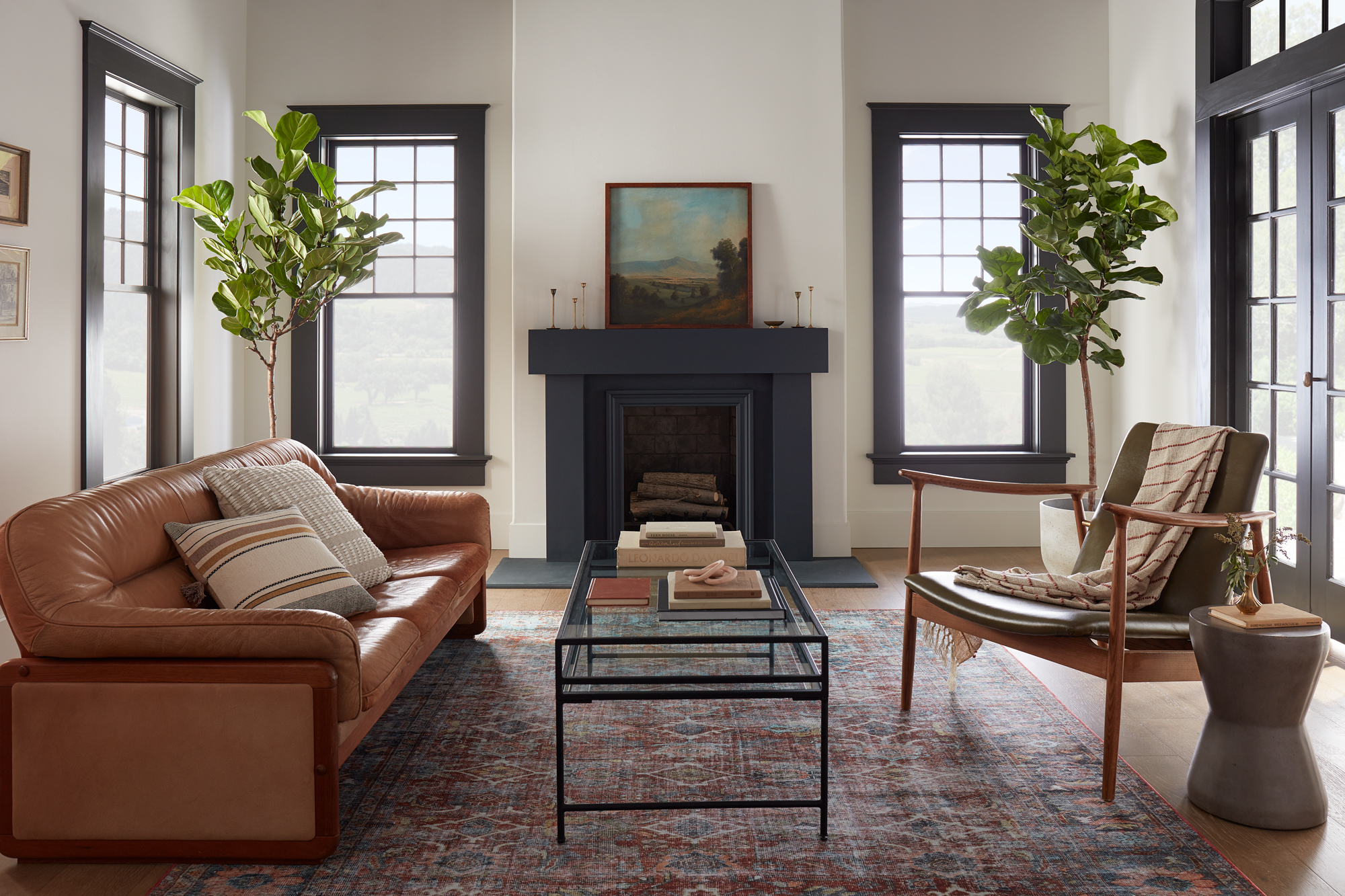
August 2, 2021Contrasting dark and light colors in a room’s design can make a classic statement. In this modern living room featuring Magnolia Home by Joanna Gaines® paint, a softer take on the traditional black and white paint pairing offers a modern yet welcoming feel.
“The contrast of the dark trim and light walls brings this room to life, giving it both a traditional and a modern feel.” – Joanna Gaines
The fireplace was a natural focal point for this living room design and painting it a darker hue was an easy way to make it stand out in the large and open space. The chosen color from the Magnolia Home by Joanna Gaines paint line, Prairie Smoke, is a softer almost black with green undertones. It pairs perfectly with the wall’s creamy weathered white paint color, Shiplap – a can’t-go-wrong neutral from the Market Collection palette. A curated collection of 25 colors personally crafted by Joanna Gaines, the Market Collection takes the guesswork out of choosing coordinating colors.
Painting the windows and large French doors in the same dark color complements the fireplace, while still letting it draw the eye. The black and white backdrop created by the chosen paint colors offered many design possibilities for the living room’s furniture and décor items. A warm-toned leather sofa and plush neutral throw pillows bring a sense of relaxation and coziness into the open and airy living room.
A jewel toned area rug, sleek metal and glass coffee table and a modern wood and leather armchair create a welcoming space for conversation. And to bring the outdoors in, two large Fiddle Leaf Fig trees flank either side of the fireplace, topped with a beautiful landscape painting.
Inspired by this modern living room and looking for colors that complement a black and white color scheme for your own space? The curated palette below offers shades that complement Prairie Smoke and Shiplap.


Magnolia Home by Joanna Gaines paint is available at select Ace Hardware store locations, and online at AceHardware.com and Magnolia.com.
RELATED ARTICLES
get inspired:
FOLLOw us:
@kilzbrand
SHOP
PRODUCTS
Smart Spaces with Emily Henderson
February 19, 2021One of the biggest design “trends” we’re seeing as we move into this new year is multi-functional spaces. We put “” around the word trends, simply because while we are seeing plenty of beautiful multi-purpose spaces pop-up, the trigger for these transformations is often an essential need. The need for a place to log on to your zoom calls that isn’t your couch or kitchen island, the need for kiddos to have a place to do their schoolwork that doesn’t devour the dining room table, and even the need to have a place for some peace and quiet (meditation corner anyone?) since the local yoga studio is still closed.
Functional spaces are key to thriving in 2021, so why not make them beautiful too! One of our favorite interior designers and great friend of the KILZ® Brand, Emily Henderson, is a true pro when it comes to designing spaces that not only look amazing but work hard to meet her client’s needs. And like any seasoned designer, Emily knows that proper prep work is essential to professional quality results for every project both large and small. We sat down with Emily to get her tips and tricks for creating multi-functional spaces, learn how she properly preps her projects and get a sneak peek at a home office reveal she’s currently overseeing.
Hi Emily! We’re so excited to have you on the blog today. You’ve been a KILZ fan for some time, can you share what you love most about KILZ and why you trust KILZ products for your own projects and for your clients?
Hiya, thank you! A couple things: first – and I think this is the biggest one – it’s just a huge time saver. And it emboldens us to take more risks. And lastly, I guess it’s just a good, functional product. I can elaborate!
I think it’s a pretty commonly shared opinion that painting is the most affordable, most impactful thing you can do to change the look of the space. I agree with that! But if you want to make sure that your paint job actually looks good, you’re going to want a great blank canvas behind it. KILZ is the brand that all of our painting contractors use to prime our spaces, so there was a default level of trust there already – if you’re ever on a construction site before paint goes up, I’m sure you’ll see tubs of KILZ everywhere – but they use it because it makes their lives easier. Walls are smoother, paint sticks better, some of the primers even have mold- or mildew-fighting properties. (We used one of those primers in our windowless basement bathroom.) Instead of schlopping on coat after coat of paint and hoping for even coverage, it’s nice when you can just prime and then roll out two coats.
But also, it’s fun to have KILZ in your back pocket. My team in particular has been able to go crazy with paint in their apartments – you know, like green trim in the bedroom or purple stripes in the bathroom, but done tastefully! – with the knowledge that they’ll be able to change it back easily when they move out without losing their security deposit. We are genuinely big fans.
What’s one project in particular that you couldn’t have completed without KILZ? And which primer did you use?
Oh boy, where do I begin? Top of mind would be this living room that my team, lead by Julie Rose, just finished. It was in a historical LA building, right off the first-floor courtyard, and it was dripping with charm…but that black accent wall wasn’t doing any favors. It was just bumming us out. There was only one window in the space, which faced into the heart of the building, and it just made the room feel dark and depressed.
There were a couple problems in the space that we all deal with – not a ton of storage, a pass through layout, you know, the classics – but the main one was really that this wall was overshadowing everything in the space…literally. So we settled on painting the whole space, including the trim, in ‘Chalk Gray,’ brought out our painting contractor and he primed the whole wall in under half an hour – our photographer, Sara Tramp, had popped in to grab progress shots and he had already almost finished by the time she was set up and ready to go.
Those photos were taken after one coat. One coat! Do you know how long that would have taken to cover up with just white paint? We ended up priming every wall in the apartment so we’d have a nice, even base and a clean backdrop for our new gray walls and by the time we finished, it was such a beautiful space. The before and afters were staggering. It was like we had breathed new life into the architectural details – once everything had been cleaned up, you could finally see the beautiful moulding and the warm wooden details actually stood out. I’m so proud of how this one turned out.
Now let’s talk about prep. What is your advice for a novice DIYer looking to take on a painting project? How much time should they allocate to prep and what steps should they absolutely not skip?
If you’re painting the whole room, take the time to do it right. Sure, you can change paint, but not in the same way that you can swap out a throw pillow or blanket. Before doing anything else, I’d recommend taking 10 minutes to look around and to find and fill all your tiny nail holes or hairline cracks. If you ignore these things and paint straight over them, your eye is going to be drawn straight to them every time you walk in.
My team is split on the value of painter’s tape – actually, my photographer recently painted all of her closet trim freehand after installing a gorgeous wallpaper, out of fear that any tape would pull it off – so I think that if you have a pretty steady hand and a couple of baby wipes, you should feel free to go proceed without taping. You can also throw down drop cloths and make sure to move all your furniture out or to push it to the middle of the room and cover it!
From there, I’d recommend jumping straight into priming. For an average sized room – let’s say 11’ x 12’ – it should take about an hour or two, plus it’ll save you a ton of time on the back end, since you won’t need to paint as many coats to achieve vibrant coverage. The whole process, from filling holes to moving pieces to priming, shouldn’t take more than half a day and it’s definitely worth it.
Like we mentioned in the intro, you’re a true pro when it comes to designing multi-functional spaces. What are the key things you consider when presented with a project to create a room that will meet various needs?
Wow, thank you! There are three big questions to ask: who is using the space? What are the functional requirements? And how do you want it to feel?
For example, a multi-functional space shared exclusively by children, like a playroom or a homework room, and a multi-functional space that needs to work for the whole family, like a rec room, need to be designed differently. A room for kids will have softer pieces to abate the potential for injuries, more open floor space to encourage play, more nooks for alone time, etc. whereas you may float more pieces in a whole family space to encourage smaller zones for each task at hand.
Once you’ve nailed down who is using the space and what it’s for, the most important thing to figure out is how you want it to feel. Try to pick a few words that describe the vibe you’re going for. On my team, some favorites recently have been “warm grandpa library,” “bright art deco discotec,” and “moody old world restaurant.” Picking how you want it to feel when you walk in will really help dictate pieces, layout, and will remove a layer of design analysis paralysis that I think we all struggle with occasionally.
Home offices are by far one of the most popular spaces we’re seeing people DIY. What is your favorite office project you’ve completed recently? (And did you use primer?!)
Did we use primer? You jest. Of course we did! My team, again led by Julie Rose, recently finished this teenager’s bedroom makeover, which obviously had to include a multifunctional office space for some homeschooling. I actually designed this space about a decade ago, so it was thrilling to be able to work on its update.
We ended up choosing this vanity in particular because of its size and storage – it wasn’t too heavy for the space and it can pull double duty as the perfect sized desk for a high school student who’s currently just learning from her laptop.
I guess that rolls into my main tips for folks looking to build an office or WFH space. Look for pieces that can serve a few purposes that you’ll still want to look at after you’ve returned to work or school. If you’re able to, try to grab a desk that’s the appropriate scale for your room. This one is a great size for a teen, though I know that some adults will need more space and closed storage. Finally – and the tip I love the most, as a stylist – see how you can accessorize your WFH or homeschooling space to make it feel a little less sterile. The mirror above this desk in question is across from the windows, so in addition to being a great place to get ready in the morning – there’s a cabinet with closed storage in the room, too, in case you’re wondering where the non-school products are kept – it also does a great job of bouncing light around the room.
You know I couldn’t leave without a paint transformation photo. Just such a bright, happy, serene bedroom and homeschool space!
One of the biggest woes of a home-office-lacking DIYer is that they just don’t have space for an office. What creative hacks or solutions have you seen to create an office in a small or unique space?
OH BOY. Let me tell you about the project we’re working on right now with one of my favorite new designers, Keyanna Bowen! She’s figured out an incredible way to separate her space and I can’t wait to see it all finished.
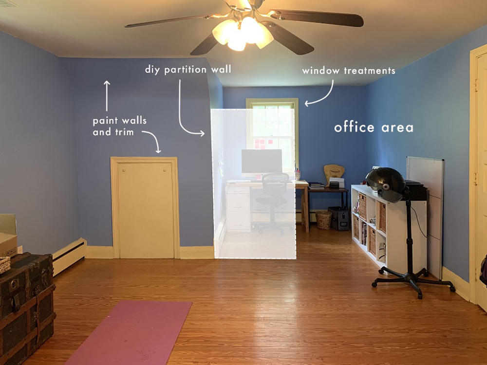
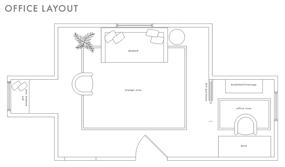
Here’s where we’re starting from. Beautiful! Just kidding – there’s obviously a ton of charm in this room, but it just needs a little bit of a boost. Keyanna wants this space to still serve as a guest room and as a yoga space, so we can’t go all-in on just decking it out as an office. I’m sure that’s a problem most folks at home are familiar with, too! Key’s plan, though, is awesome: she’s planning on building a rope wall partition. A rope wall partition! It’ll hang from the ceiling and it will still let in light while defining the office as its own separate space.
Over the past year, I think my favorite WFH spaces or DIY offices have been the ones where folks have turned their closet into a whole desk setup (long live the cloffice!) or folks who, like Key, have figured out a functional way to use a previously-awkward nook. I’m so inspired! If you aren’t blessed by architecture, though, the idea still stands: is there a way to carve out a corner of your home with privacy screens? Can you hang a similar partition in your living room to give the illusion of a separate workspace? The possibilities are endless.
A word we hear a lot when talking about multi-functional room design is zoning. Can you share what exactly that is and some tips to do it right?
I love a zone! I talked about it a little earlier, but it’s really about figuring out how to clearly define the different functions that take place in each part of a room. The best part: it’s very easy to do! You can set up separate zones in minutes by anchoring areas with different rugs. Key does it beautifully above, with the office and lounge areas both being really clearly defined by their rugs. It makes total sense, because when our brains see different flooring, they think, “oh, different room.”
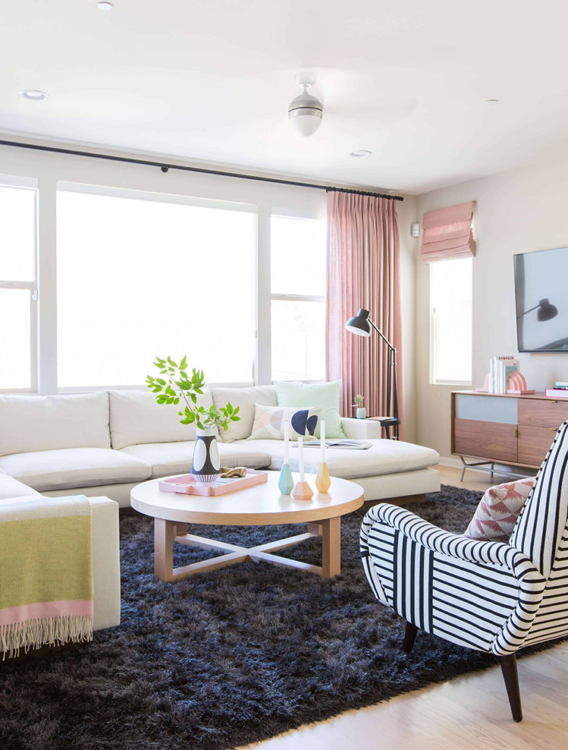
Zoning is really essential for folks with open concept layouts – especially now! So in this project – from 2016, oh my gosh, though it’s still one of my all-time favorites – we created a huge and comfortable family room by flanking this super-soft rug with a huge, u-shaped sectional and two graphic chairs. It’s bright and open, but still definitively its own space.
A few feet away, and anchored by a flat, easily-cleanable dhurrie rug, is the dining area. You’ll probably notice a lot of repeating elements: graphic hits of black and white, light woods, and pastels. Keeping a cohesive color palette isn’t always necessary – I am all for exploring, playing, and getting weird – but it does make the design process easier and it’ll make your rooms feel more relaxed and comfortable.
Switching gears to home-school rooms and kid’s study spaces. What was the biggest hurdle in creating a functional space for little ones?
Making spaces so that kids will actually use them! I think that a lot of the time, design-minded people like myself can get really hung-up on the vision. We want to make something beautiful and impressive and worth sharing, but kids don’t necessarily share those same motivations. They just want a fun place to play, learn, and explore.
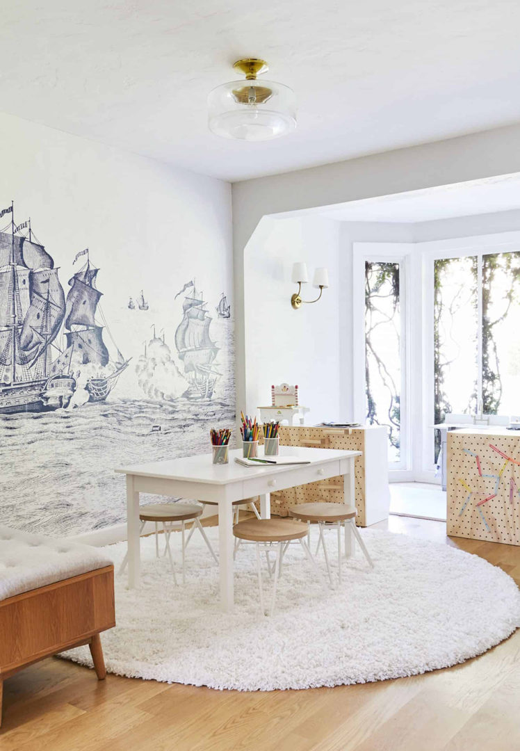
The playroom is actually the space I struggle with most. My kids are still very young – 5 and 7 – so we’re early in the homeschool process, but they love art and playing with legos, so once I chose to design for those two hobbies in particular, it immediately became more functional and the kids used the space way more.
To that end, I’d ask: what do your kids like doing? How does your child actually study or do homework? If they love drawing, give them a space for that and relinquish your dreams of them ever actually wanting to play with the enormous dollhouse you bought in the hopes that you could play with it together. (Speaking to myself, here.) If you build it, with your kids and their specific tastes and interests in mind, they will come.
Can you share a recent personal or client projects you’ve done that included a room for kids? And of course, we want to know how primer came into play!
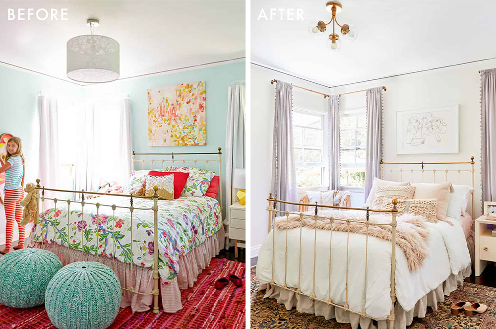
I’m in love with this room that my team, again led by Julie Rose (are you sensing a theme here?), recently completed for a little girl. We wanted to make a magical bedroom with a specialty art area and I think we really made it sing.
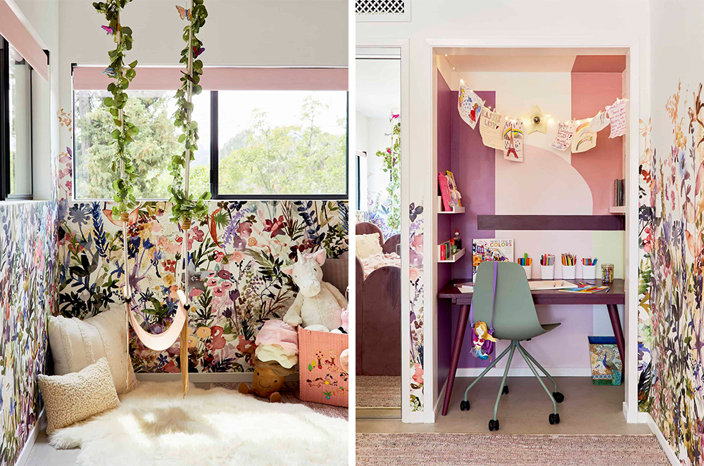
As for how we used primer – it went everywhere! We actually primed underneath the wallpaper, per our installer’s recommendation. It covered up the previous paint and served as a plain backdrop so that the white pieces of wallpaper would appear clean and fresh, but it also worked as a bit of a barrier so that the wallpaper paste didn’t bond with the walls too much. While wallpaper is pretty permanent, priming first can make the removal process a bit less painful in that you won’t need to worry about ripping off chunks of drywall by accident.
We also obviously had to prime that art nook so that all of our magical, fairy-inspired colors would show up. We love the way it turned out and so did the family.
Before we wrap up, let’s talk about the project that we’ve partnered with you on… that also includes your design mentee Key! Can you tell us about her, the project and give us any sneak peeks?
Woops, I guess I already spilled the beans a little bit on this one, but I’d love to talk more about Key! Earlier this year, my team and I decided to take on a mentee – I’ve been so incredibly fortunate to find success in this field and I’m now surrounded by people who are experts in editorial and social and more, so I wanted to share the wealth and hopefully, help more folks find long-term career stability in this weird world of internet design and influencing.
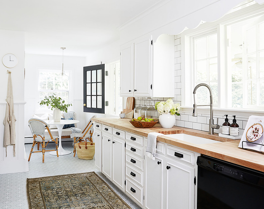
Key was an instant, unanimous pick from the team. She’s an incredible interior photographer in her own right, but we knew once we read her writing and peeked at her own DIY rental renovations – that’s her kitchen above – that she would be the next big thing. She’s warm and creative but she’s also detail-oriented with a perfectionist mindset, which is what it takes to make and shoot and share beautiful spaces for the internet!
We’ll be making her office over – the periwinkle one I shared above – and we’re so excited to work with KILZ because it’s actually covered in oil-based paint, which you can’t cover without using a specialty primer. We’ll have an official update in a few weeks, but I can share the general design direction which is going to knock your socks off…
My team and I have been working with Key to secure all the main furniture pieces and BOY, they’re great. (Also, do you see that rope wall partition on the bottom right? It’s so good, isn’t it?) I know it’s only February, but I have a feeling that this is going to be one of our top makeovers of the year. We’re so thrilled to reveal it to you all and so grateful that KILZ has given us the opportunity to work on such a fun project, together. Cheers to beautiful and multifunctional rooms in 2021!
Author is paid sponsor of KILZ Primer. Always remember to refer to our website kilz.com or product back labels for additional information on which primer is right for your project and detailed instructions on how to apply our products.
RELATED ARTICLES
get inspired:
FOLLOw us:
@kilzbrand
SHOP
PRODUCTS
Mid-Century Modern Living Room Makeover
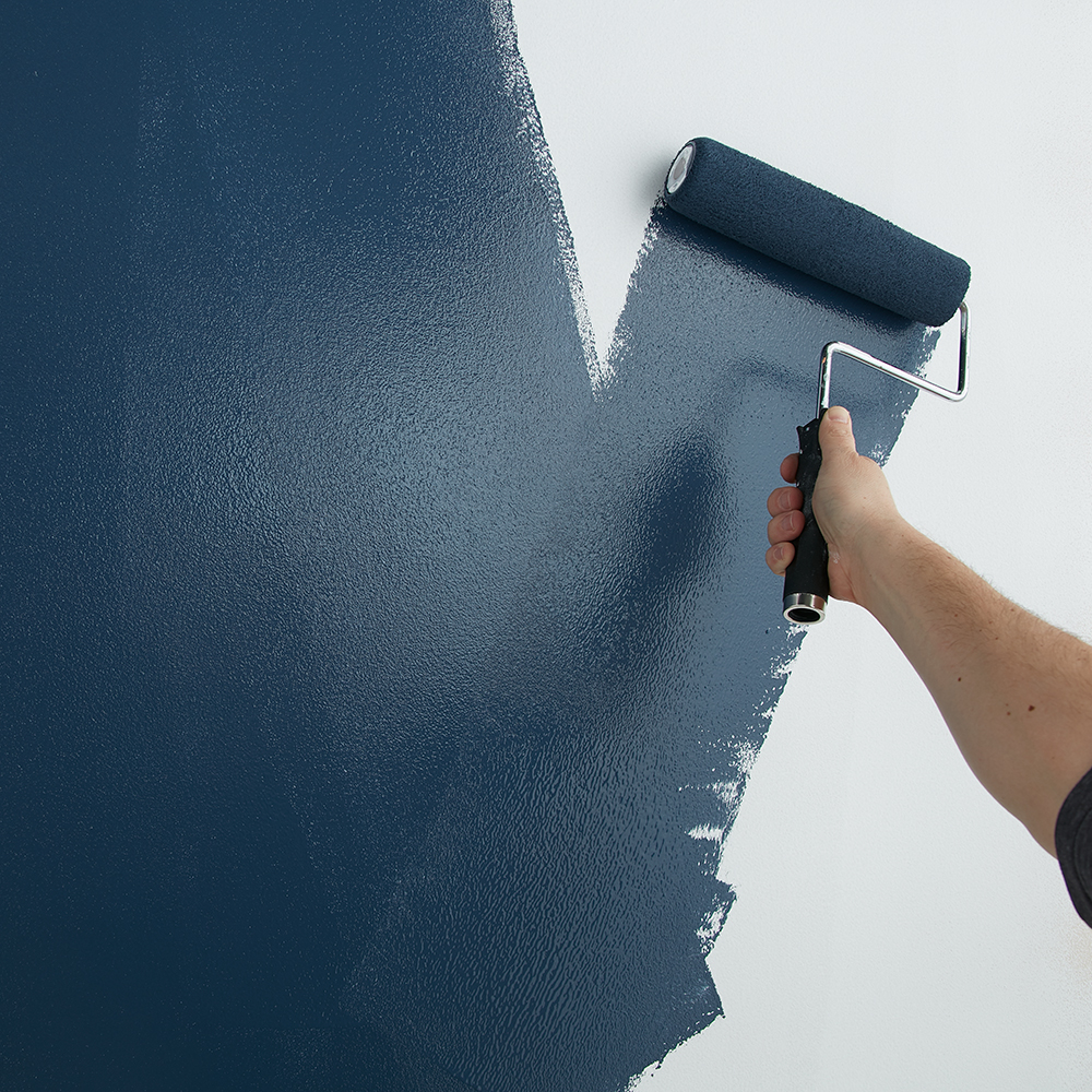
January 19, 2021A lackluster living room is warmed up with new modern design elements, including a spark of mid-century style and a freshly primed and painted fireplace that pops against on-trend navy walls. For this painting project that includes sealing porous brick and covering an old wall color, KILZ 2® All-Purpose primer is perfect for the job as it’s formulated for a variety of surface types.
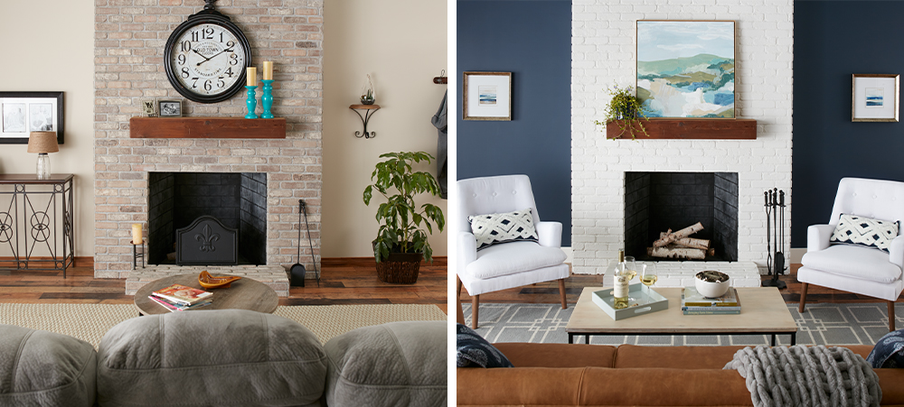
Brick is a naturally porous surface and will typically soak up a lot of paint if not properly sealed with the right primer, making proper prep essential when painting a fireplace. KILZ 2 All-Purpose is the right choice for the job, as the versatile multi-surface sealer is able to work overtime and coat both the fireplace and walls. Even when painting a darker color over a light color, it is essential to prime first to ensure that the new dark shade appears as the exact color you’re expecting.
Once the fireplace and walls are properly primed and allowed to dry, it’s time for paint! KILZ Tribute® in Architectural White TB-08 transforms the fireplace into a creamy white focal point for the large living room, highlighted by walls painted in a stylish navy shade – Ruling Royalty TB-50.
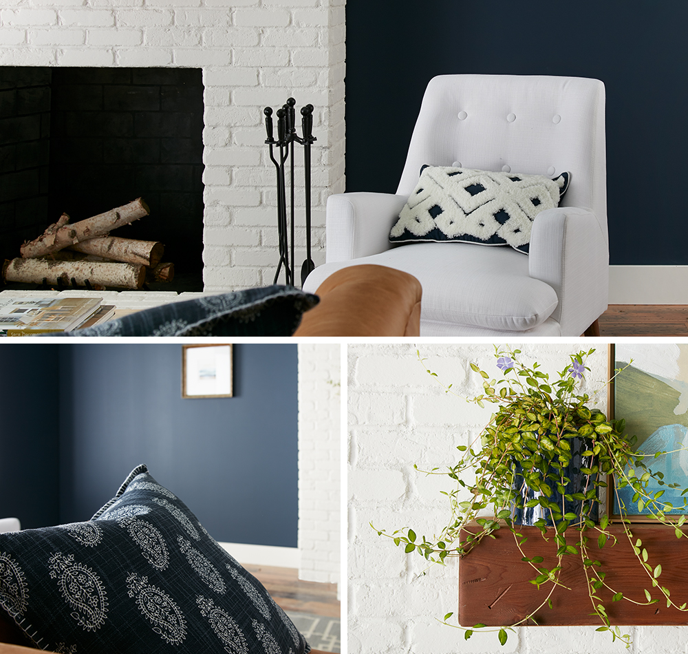
Primer and paint make a huge impact in this living room makeover and create the perfect setting for contemporary furniture and décor. A warm leather couch and two snowy-white armchairs flanking the freshly painted fireplace evoke a mid-century feel, while pops of navy in pillows and artwork are the perfect companion for the new navy walls.
Read on below for step-by-step instructions to prime and paint living room walls and a brick fireplace.
WALLS
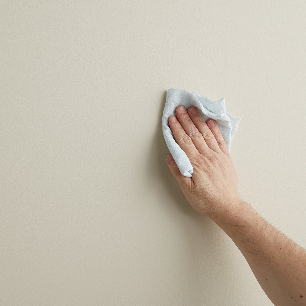
Step 1:
Wipe down walls with a damp cloth to ensure they are clean and free of dust. Allow to dry.
Step 2:
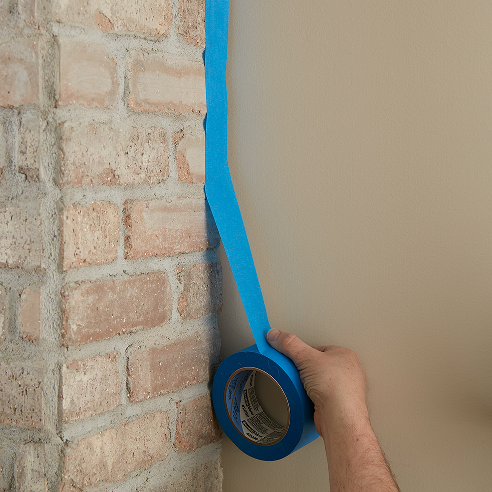
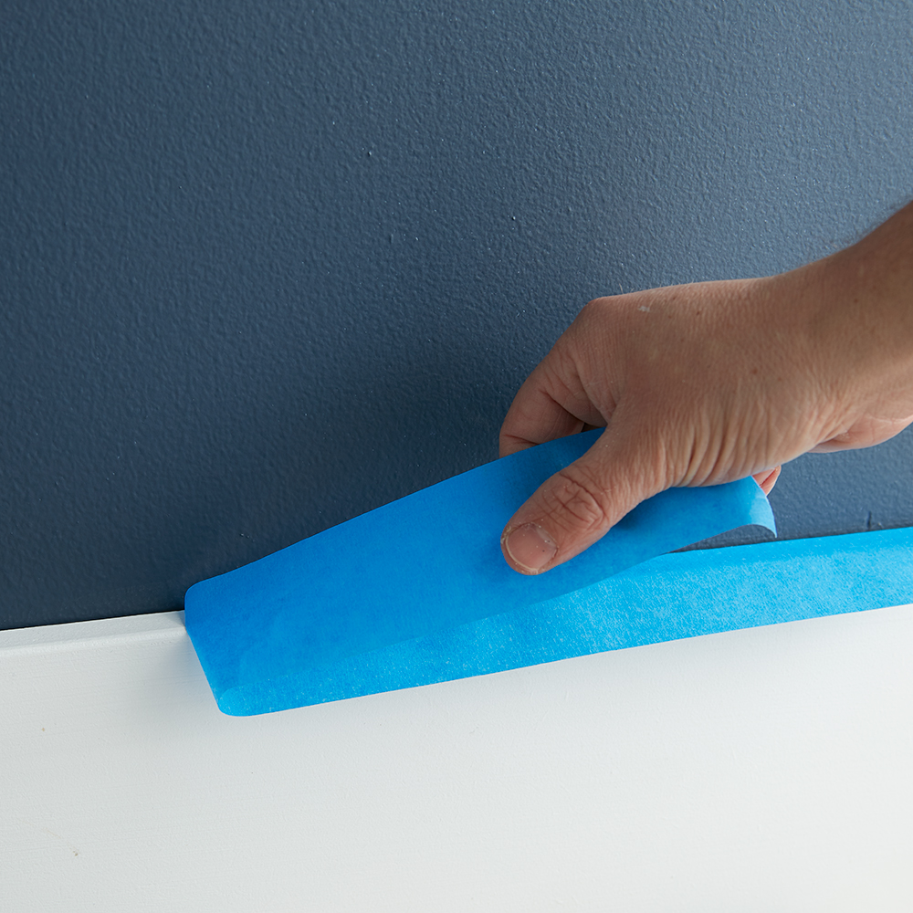
Tape around the fireplace, baseboards and moldings with painter’s tape to ensure you don’t get primer or paint where you don’t want it!
Step 3:
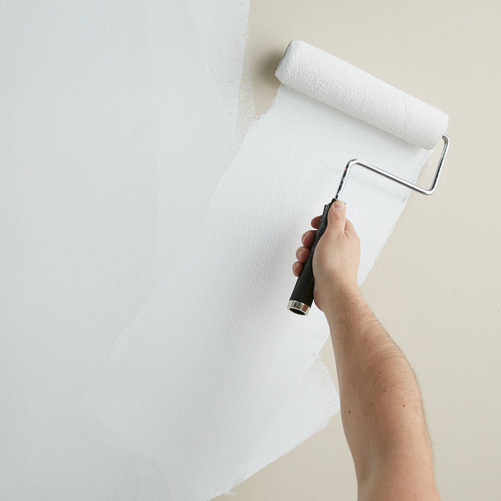
Next, apply 1 coat of KILZ 2® All-Purpose (stirring thoroughly before and occasionally during use) to the walls and allow to dry. Apply primer using a brush first to “cut in” around the edges, then use a roller to fill in.
Step 4:
Once primer is dry, apply KILZ Tribute® in Ruling Royalty using the same application method as the primer (using a brush first to cut in around the edges 4 to 6 feet at a time, then use a roller to fill in those sections before moving along).
Step 5:
Remove the tape before the paint is fully dry.
FIREPLACE
Step 1:
First, you’ll want to clean the old brick fireplace. If it’s extra dirty, start with a vacuum and use the crevice tool attachment to clean between the bricks. Next, wipe down the fireplace with a damp cloth to ensure all surfaces are clean and free of any lingering dust. Allow to dry.
Step 2:
Tape around the fireplace to protect the walls and floor. Also tape around the mantel and where the brick meets the firebox (the inside where the wood goes!) to keep that area protected from paint and primer.
Step 3:
Now it’s time to prime! Using KILZ 2® All-Purpose primer, start with an angled brush to cut in around the mantle.
Step 4:
Next, use a roller to cover the brick faces with primer. If needed, go back with a small angled brush to fill in any remaining grout areas. Allow to dry.
Step 5:
Once your primer is dry, apply KILZ Tribute® in Architectural White using the same application method as the primer (use a brush first to cut in and then use a roller).
Step 6:
Remove the painter’s tape before your paint is fully dry.
Always remember to refer to our website kilz.com or product back labels for additional information on which primer is right for your project and detailed instructions on how to apply our products.
RELATED ARTICLES
get inspired:
FOLLOw us:
@kilzbrand
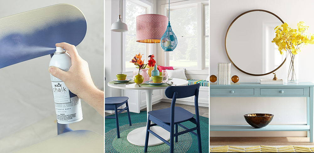
Chalk Style Paint Accent Furniture
June 1, 2020
Upcycling accent furniture pieces with paint is a fun and easy DIY project that can be completed in as a little as a day. From bookshelves to small tables and chairs, a coat of paint can instantly give new life to thrift store furniture find. And if that one piece of furniture doesn’t fit your new color scheme, paint it!
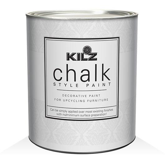
One of our favorite paints for small furniture projects is KILZ® Chalk Style Paint. It adds history and character to any piece, goes on thick for excellent hide and requires very little surface preparation. Depending on the furniture piece, you might want to lightly sand it prior to painting; and always ensure your surface is clean and free of dust before you paint.
If picking up a paint brush isn’t your style, KILZ Chalk Spray Paint is another great choice for painting accent furniture. Ideal for small indoor and outdoor project, KILZ Chalk Spray Paint delivers a premium matte finish with enhanced adhesion. Available in six beautiful colors, including two of our favorite blue hues – Authentic Navy and Blue Juniper.
![]()
To enhance durability of your chalk style paint project, we recommend sealing the surface afterward with KILZ Clear Sealing Wax. Or for a more antique look, seal with KILZ Dark Sealing Wax.
RELATED ARTICLES
get inspired:
FOLLOw us:
@kilzbrand

join the conversation:
SHARE this post: