Tag: Gray
THE CASTLE COLLECTION: CONSERVATORY
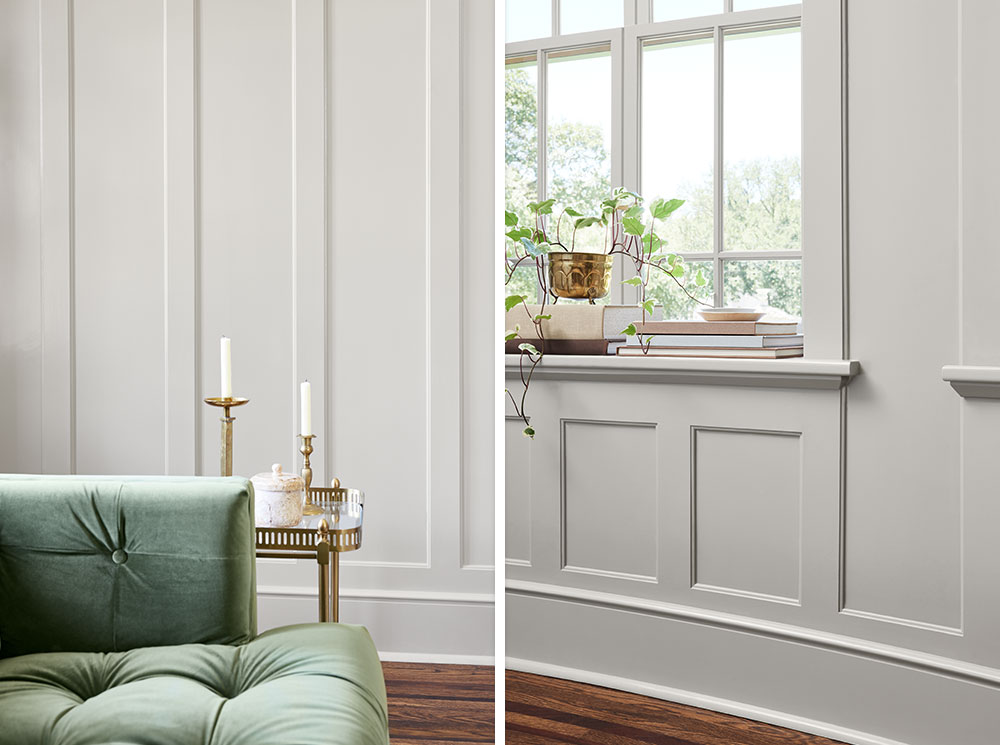
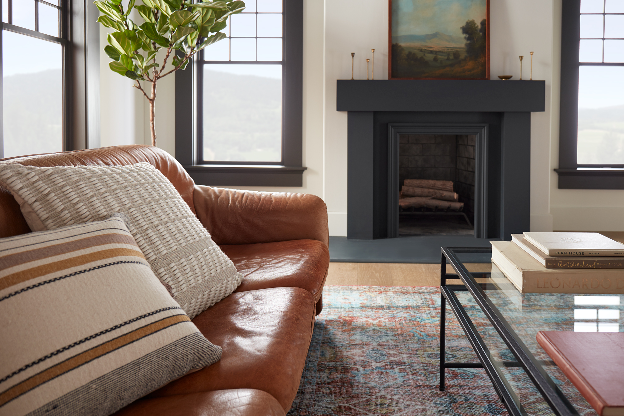
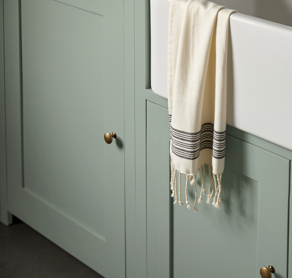
October 25, 2023Rich, warm and dark are some of the words used to describe this moody gray. A quick fan favorite, Conservatory, was inspired by the Castle renovation and transformed the once dull room into a vibrant space full of life.
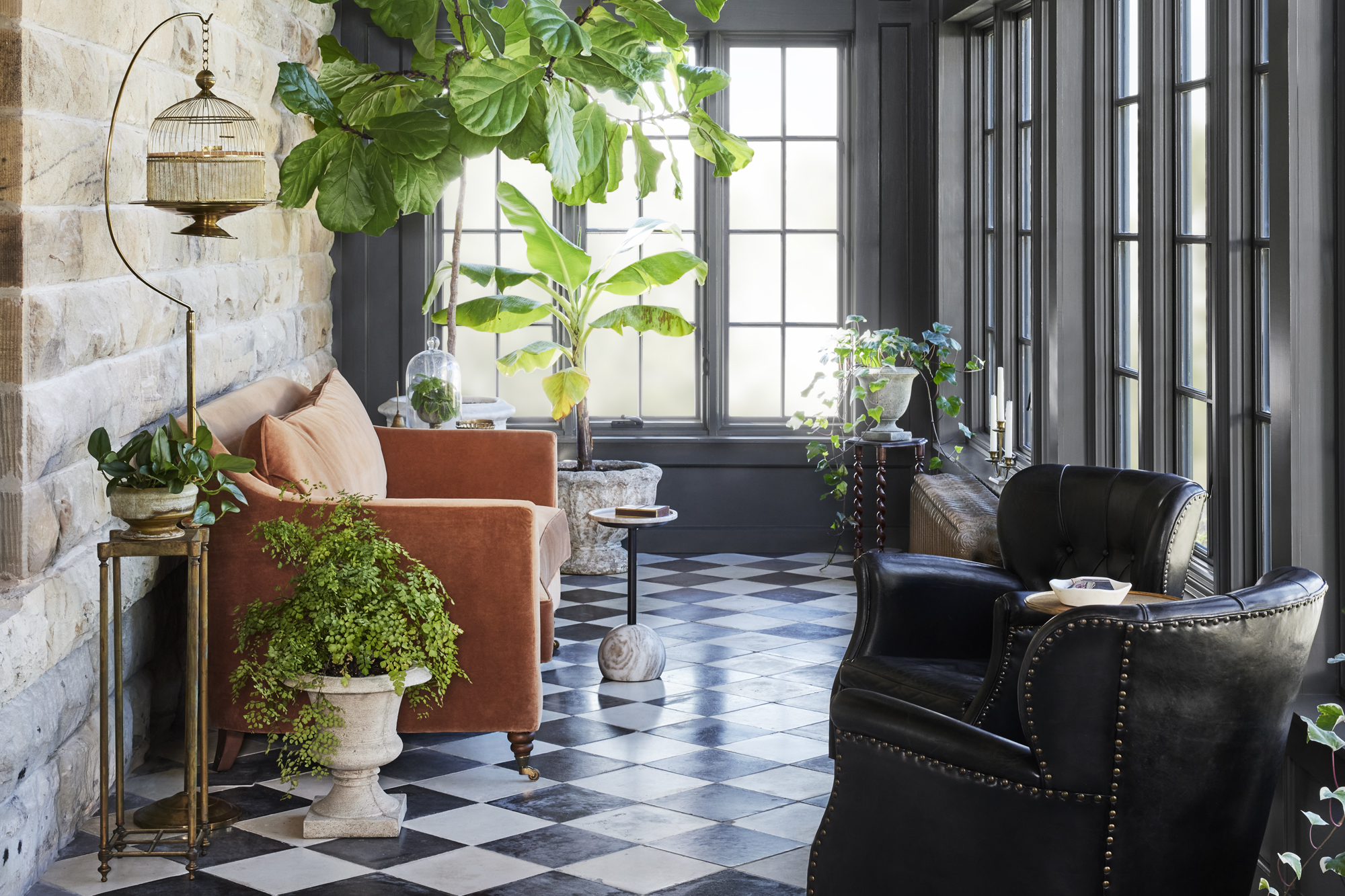
Conservatories, also known as sunrooms, are a nice choice for those looking to add some extra living space to their homes. What started out as a greenhouse in the original castle floorplan was eventually demolished, leaving this room to be built from scratch and converted into a conservatory and entertainment space. While this is the smallest room in the castle, it’s packed with charm and history.
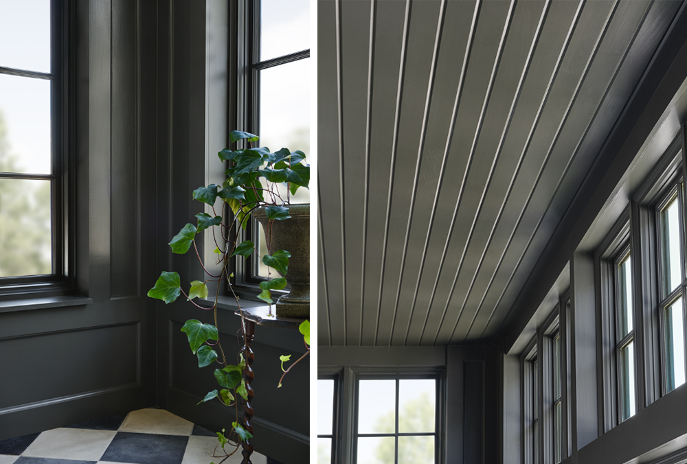
The color Conservatory, which was named after the room itself, is a rich and warm dark charcoal gray that elevates any room and can bring in a unique contrast between your walls and décor.
While the paint itself is on the darker side, the large windows illuminate this room giving it a cozy feel, and fun balance between enjoying the inside while feeling like you are outside. This color will make even the smallest rooms feel spacious and elegant.
 |
“The understated beauty of a deep charcoal gray adds just the right amount of sophistication and versatility.”- Joanna Gaines |
 Refurbished concrete tiles, from a historic chateau in France from the same time period as the castle pair perfectly with the deep walls, bringing its history back to life. Full of natural light, plants, and a complimentary terracotta couch, the Conservatory is the perfect place to relax and enjoy a cup of coffee at dawn.
Encouraged to tackle a project using Magnolia Paint, color Conservatory? Check out the pallet below that compliments and coordinates with its rich and warm tones.

Silos White

Blanched

Sage Stem

Secondhand Find

Gold Moss
“Where can I buy Magnolia Home by Joanna Gaines Paint?”
These paint colors are now available at Ace Hardware, Lowe’s, and Magnolia.com/shop.
Always remember to refer to our website kilz.com or product back labels for additional information on which primer is right for your project and detailed instructions on how to apply our products. Check out our Coverage Calculator to understand your estimated paint needs for your upcoming project.
RELATED ARTICLES
get inspired:
FOLLOw us:
@kilzbrand
SHOP
PRODUCTS
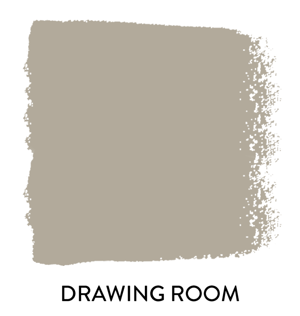
THE CASTLE COLLECTION: DRAWING ROOM
June 1, 2023Today, we are back highlighting another Castle Collection color from the Magnolia Home by Joanna Gaines® paint line!
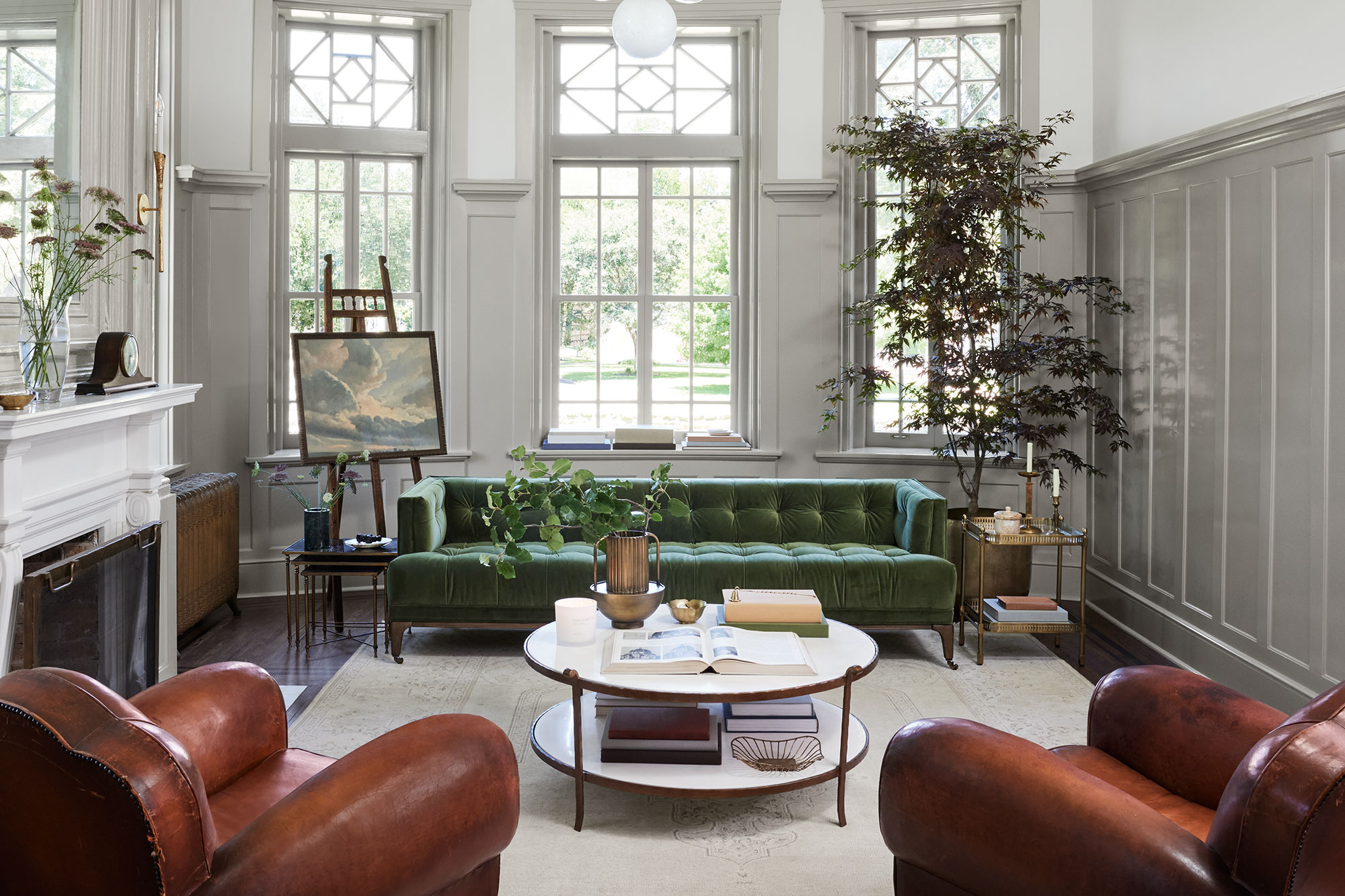
In this edition, we will be talking about the Drawing Room. The beauty of this room is its ability to create a balance between aesthetic appeal without losing comfort, it invites you to step into a world of modern times while preserving its charm.
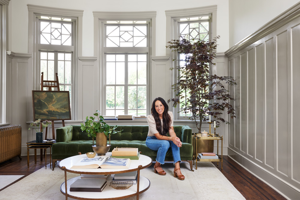
The Magnolia Home by Joanna Gaines Castle Collection paint color, Drawing Room, by Magnolia Home by Joanna Gaines was inspired by the room’s elegance and timeless style. The color is a soft French gray, that refreshes and uplifts this room while keeping the sophistication from the Castle’s original era.
“Named after one of my favorite rooms in the castle, I love the subtle character and charm this gray shade brings to a space.” – Joanna Gaines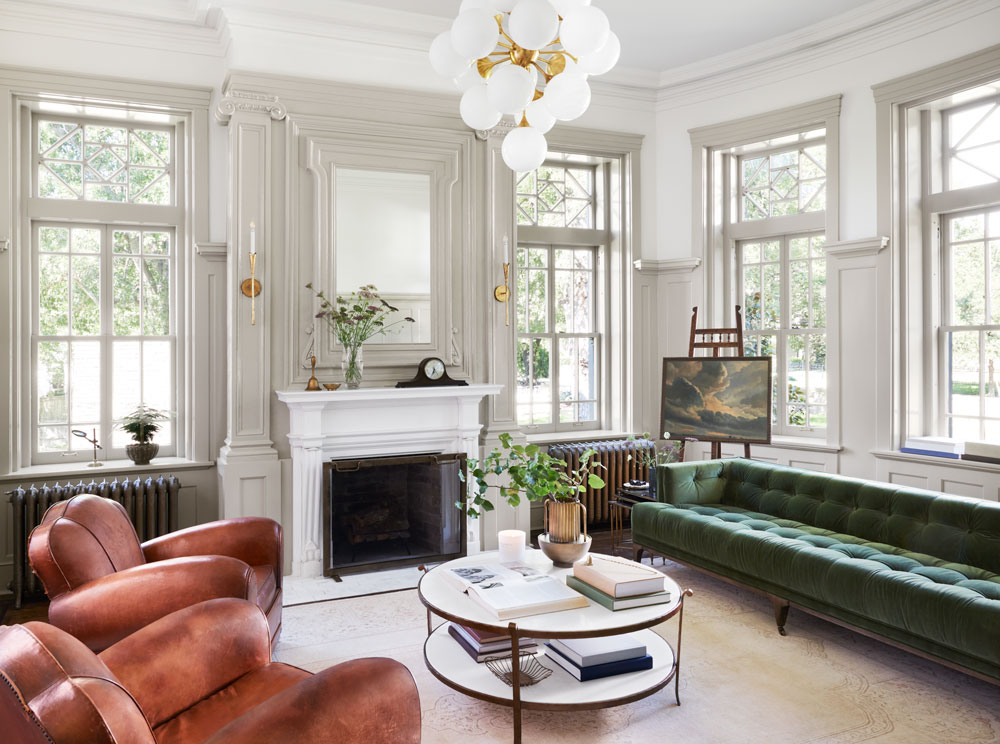
Using the Magnolia Home by Joanna Gaines interior paint to highlight certain features of the room like the window trim and wall molding gives the room contrast against its white walls. It makes the fireplace (one of the seven in the castle) a focal point, serving as a timeless centerpiece and adding to the calm and cozy feeling of this area.
This drawing room has embraced a modern design while preserving its traditional charm. Contemporary furniture like the coffee table and the green velvet couch coexists with antique pieces like leather chairs and some of the décor creating the perfect blend between old and new. With big windows brightening this space, the color Drawing Room brings character, charm, and coziness to this space.
In case you missed it, the full Castle Collection color palette was created by Joanna Gaines for the Magnolia Home by Joanna Gaines paint line. Made of ten new colors, from moody accents and warm neutrals, this palette was inspired by the historic castle restoration project in Waco, Texas and it is featured in the Fixer Upper: The Castle season.
Check back here at the Perfect Finish to learn more about the rooms in the castle and their specific colors and descriptions. Read about the Butler’s Pantry here.
Encouraged to tackle a project using one of the Magnolia Home by Joanna Gaines paint colors? Check out the palette below that complements the Drawing Room and coordinates with its soft gray color.

Pond Stone

Bright Days

True White

Locally Sown

Dutch Tulip
“Where can I buy Magnolia Home by Joanna Gaines Paint?”
These paint colors are now available at Ace Hardware, Lowe’s, and Magnolia.com/shop.
Always remember to refer to our website kilz.com or product back labels for additional information on which primer is right for your project and detailed instructions on how to apply our products. Check out our Coverage Calculator to understand your estimated paint needs for your upcoming project.
RELATED ARTICLES
get inspired:
FOLLOw us:
@kilzbrand
SHOP
PRODUCTS

Updating a Kitchen for a New Generation
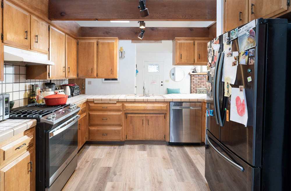
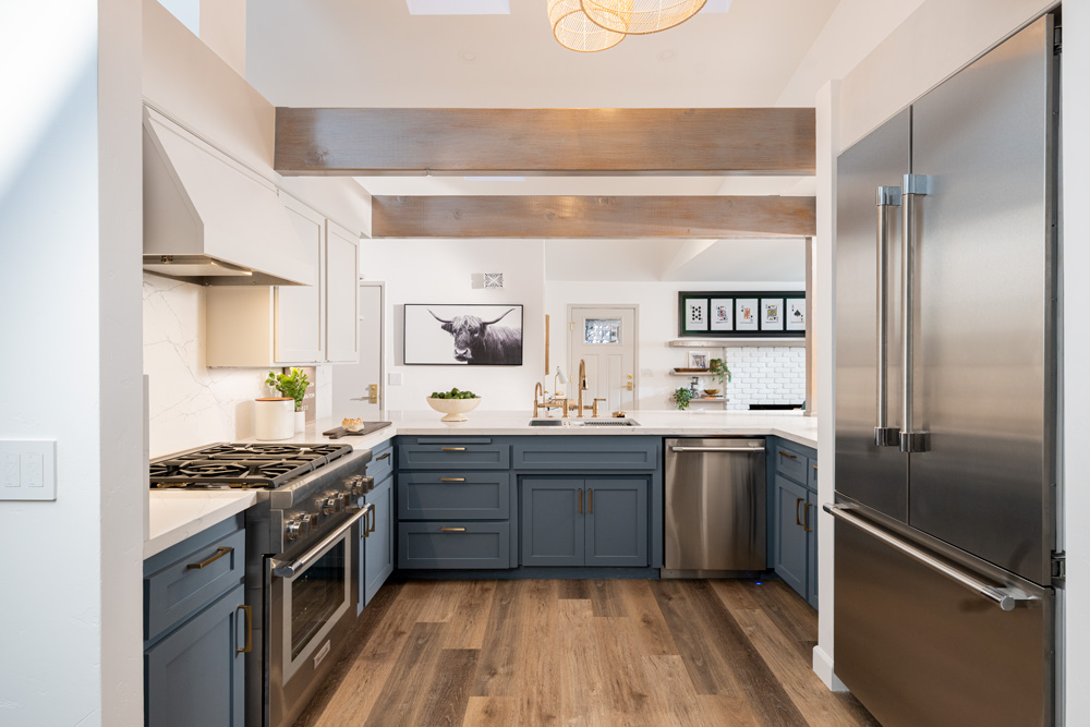
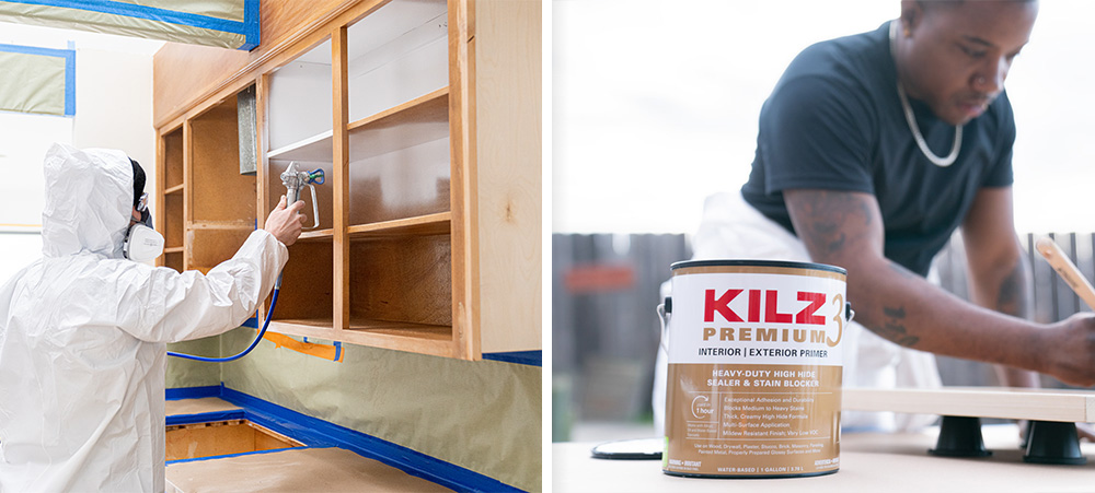
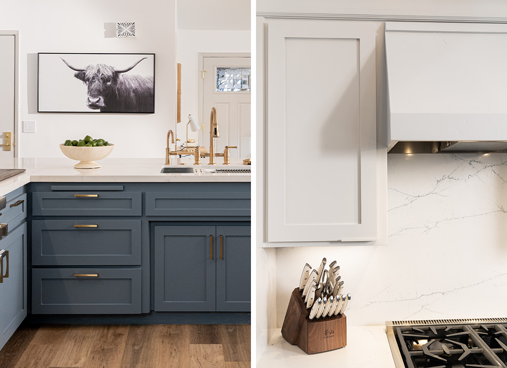
April 17, 2023We’re excited to share details from our Destination Restoration series with an inspired kitchen refresh that doesn’t require gutting the entire kitchen. This series demonstrates how you can breathe new life into an older home (in this case, a 4th generation family home), while keeping its structural integrity intact.
Our expert design and restoration team — Jason Lai (interior designer) and Jared Foster (contractor/pro painter) — worked together to transform a kitchen that was well past its prime. They first conceptualized which cosmetic changes would make the most impact, and then rather than gutting the entire room and starting from scratch, they repurposed and restored. By refreshing dull wooden cabinets, creating bar seating with a stunning new look, replacing heavy black appliances, and updating hardware, countertops, and backsplash, they transformed a dark and dated kitchen into a bright, airy, and modern one, renewing it for years to come.
If it’s your first time restoring a kitchen, it can feel like a big undertaking, which is why we broke down what we did below, so you can get a more detailed understanding of how we upgraded the heart of the home. We’ve also included a step-by-step guide on how to paint kitchen cabinets for a refresh.
Cabinetry
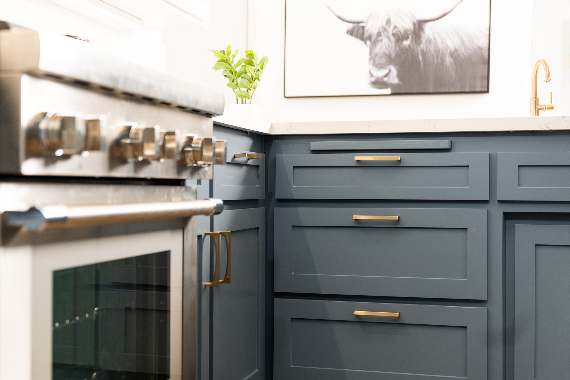
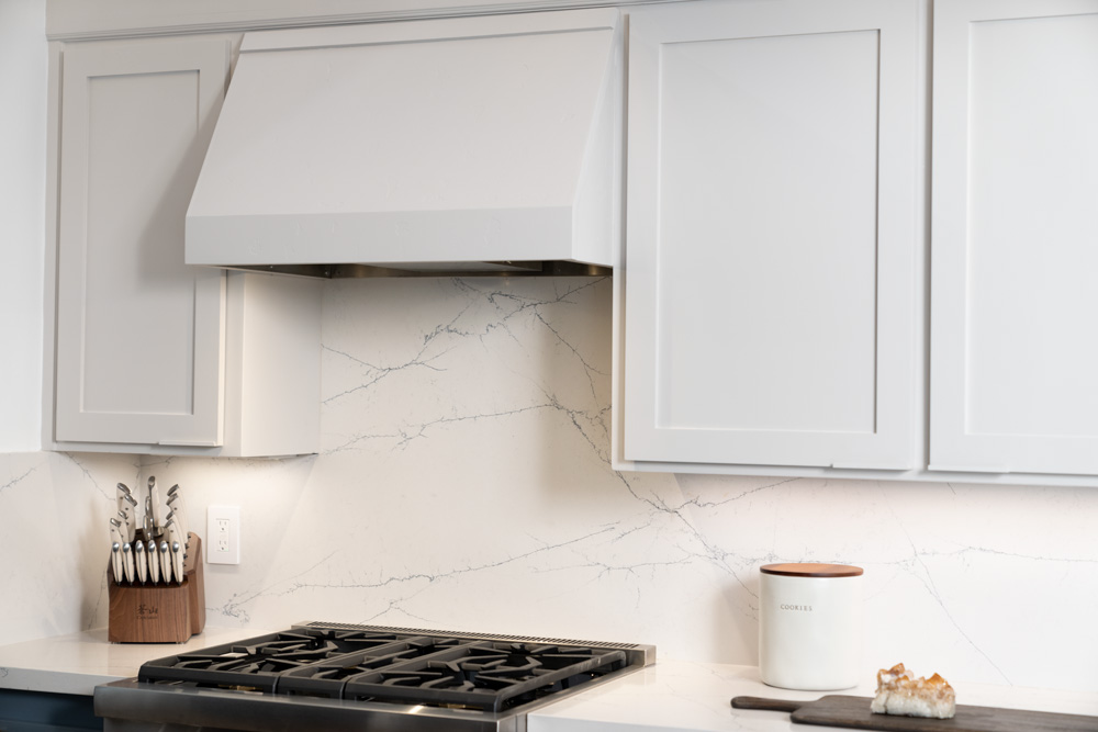
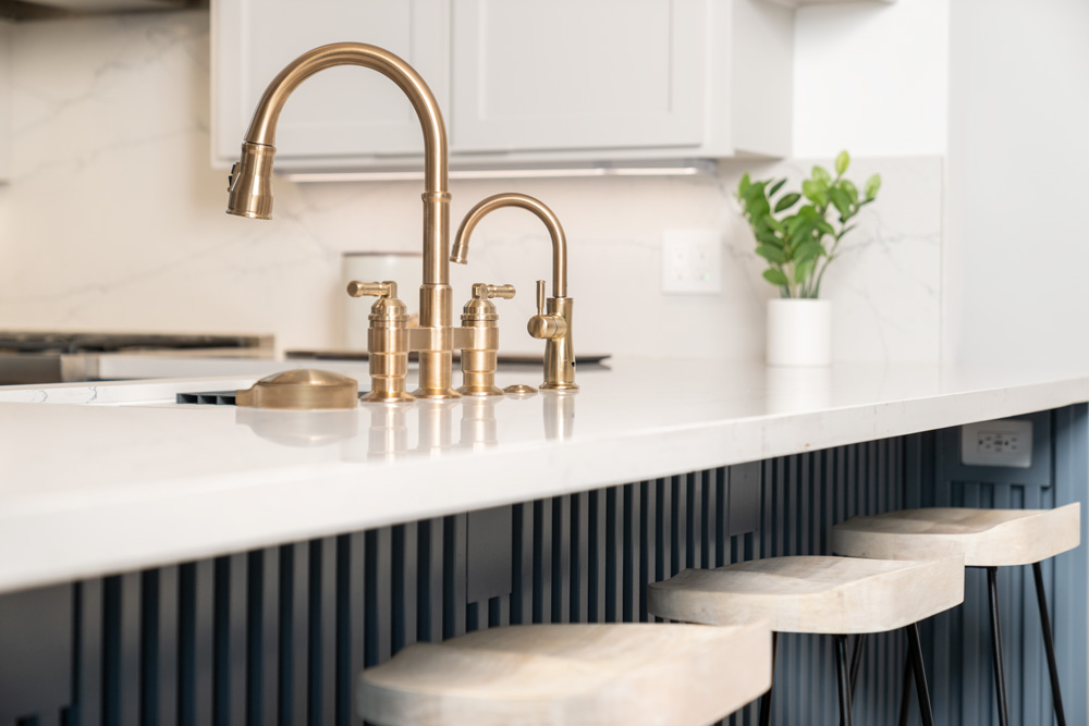
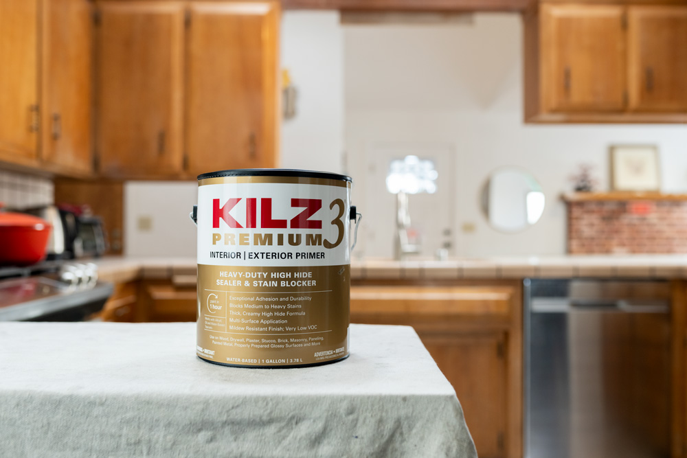
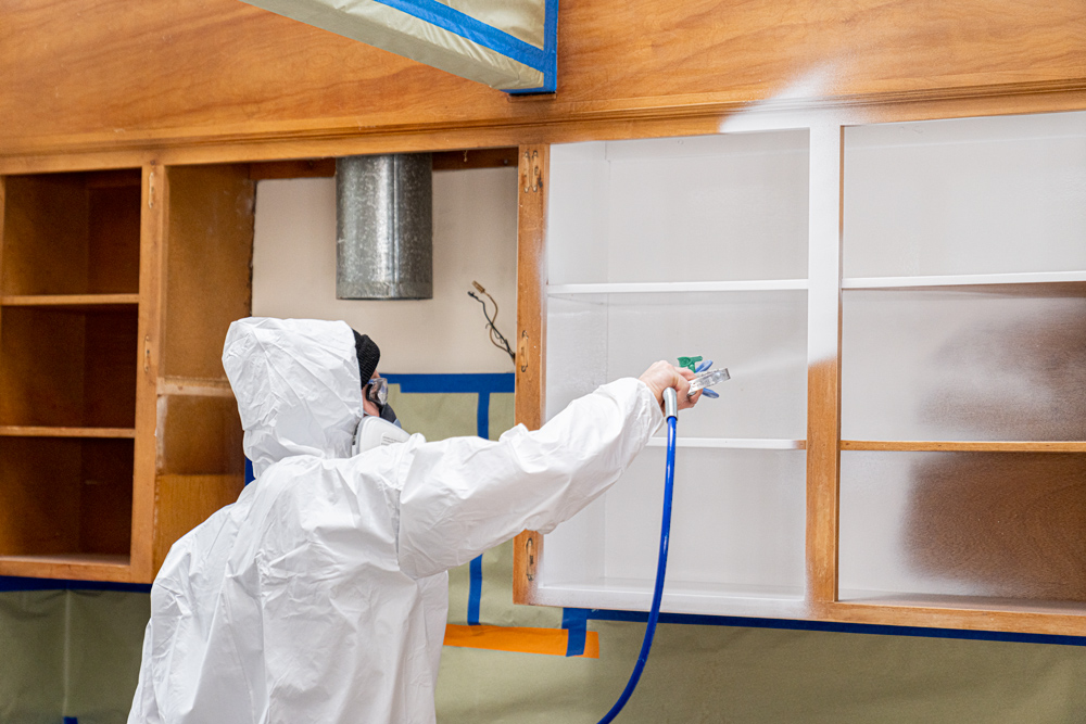
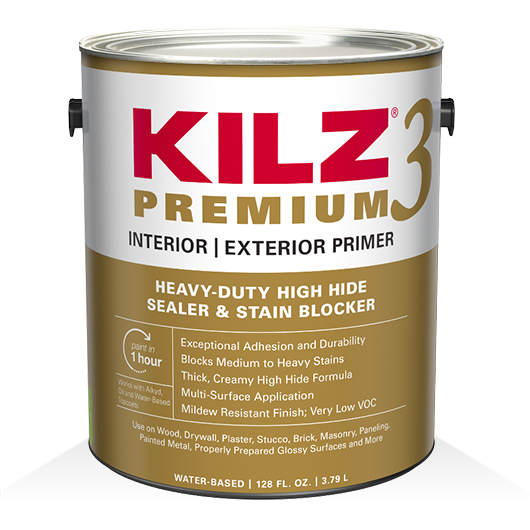
Rather than ripping out and replacing the cabinetry, which can be costly, we gave them a brand-new look and feel with a few simple updates. We removed some of the upper cabinets and modernized the rest by making them shaker style. Then we used KILZ 3® Premium Primer to prep them for a fresh coat of paint. To create some contrast and brightness in the room, we chose Charcoal Blue for the lower cabinets and Chic Grey for the upper, both colors by Behr Paint. Finally, we fitted them with all new hardware.
Ceiling
Because it wasn’t structural, we removed the center beam and stained the remaining beams to match the floors. (Check out the Living/Dining Room restoration to see where that center beam ended up!) We also installed recessed lighting by Kichler Lighting and rattan pendant lights.
Appliances & Additional Lighting
We updated the hood vent, oven, dishwasher, and refrigerator with stainless steel appliances for a sleeker, modern look. To ensure the hood vent matched the upper cabinets, we plastered, primed (again using KILZ 3 Premium Primer) and painted it using the same Chic Grey (a color by Behr). Finally, we installed under cabinet lighting by Kichler, added new electrical outlets throughout, and updated all electrical switches.
Other Changes
We updated the tile countertops and backsplash with a modern, white marble finish. To extend the bar, we added rounded lower cabinets and primed them (using KILZ 3 Premium Primer) for paint (Charcoal Blue by Behr) to match the others. Lastly, we added a 1×1 rail texture detail under the counter with hidden outlets. The sink, faucet, glass rinser, filtered water faucet, and hardware were all updated new products by Delta Faucet to complement the new look.
Why Do You Need to Prime?
Priming is essential for proper surface preparation for any paint project. It’s the difference between a job done and a job done right. Priming helps solve a wide range of problems, including highly porous surfaces, stains, odors, uneven surfaces, texture differences, and adhesion problems.
For this kitchen cabinet facelift we used, KILZ 3® Premium Primer, which is ideal for high-touch surfaces and humidity protection. It was perfect for our cabinet refresh thanks to its exceptional adhesion and ability to hide blemishes, stains, and other imperfections, which can accumulate over time, especially in older, generational homes like this one.
Step-By-Step Guide to Refinish Kitchen Cabinets:
Painting wood kitchen cabinets requires a few basic steps to get the smoothest finish and lasting results. Here’s an easy guide to follow for your next project:
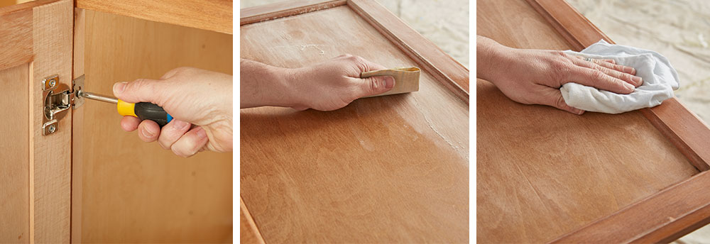
1. Use a screwdriver to remove the cabinet doors and drawers from the cabinet frames and to remove all door handles and hardware.
2. Sand the surfaces of the doors, drawer faces, and cabinet frame to create a smooth surface for priming. Do a first pass with 100-150 grit sandpaper then finish with a second pass of 180-220 grit sandpaper. Remember, the higher the “grit” number, the smoother the finish.
3. When sanding, move the sandpaper in the same direction as the wood grain. If you go against the grain, you will end up with a lot of scratches that will show through your topcoat.
4. After sanding, wipe down the surface with a damp cloth to remove any dust or residue. Allow to dry.
5. Protect your floors and workspace from paint and primer by covering it with a drop cloth.
6. Now it’s time to prime! Using KILZ 3® Premium Primer, use a brush to make smooth strokes that go in the same direction as the wood grain.
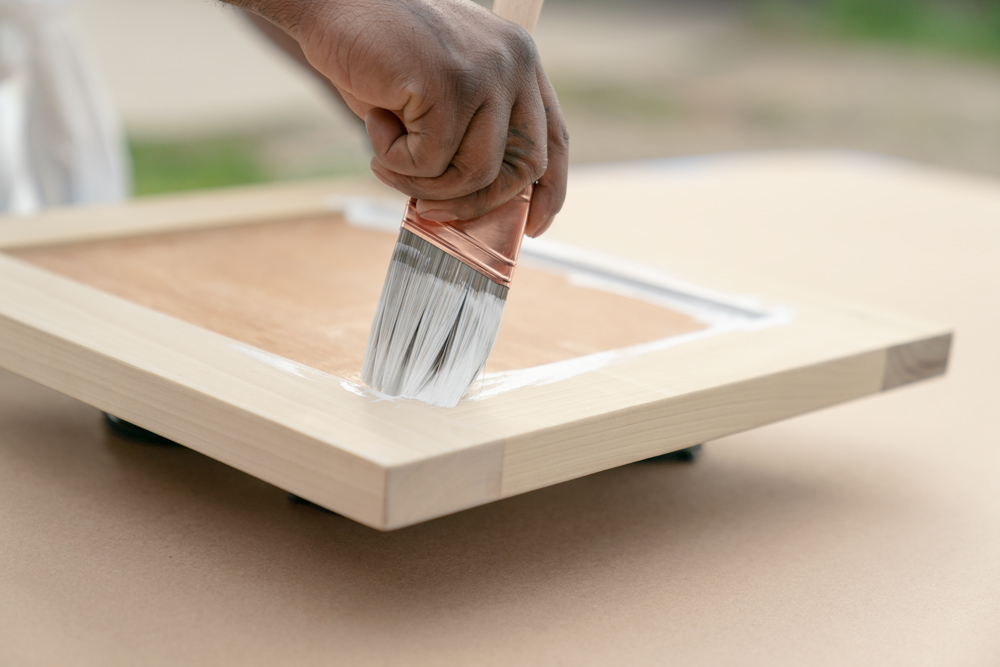
• Pro-tip: To get better coverage along the sides of your door, raise it off your work surface with bricks.
7. Allow to dry for 2 hours.
8. Once the primer is dry, apply your kitchen cabinet paint of choice using the same application process at the primer.
• Pro-tip: For a really great result, apply primer and paint with a sprayer.
You Will Need:
• Screwdriver
• Dust mask
• 100-150 grit and 180-220 grit sandpaper
• Step ladder for hard-to-reach areas
• Rags to wipe dirty and dusty surfaces
• Painter’s tape
• Drop cloths, canvas, or other reusable material
• Paint roller, brush, and paint tray
• Paint of choice
We hope this episode of Destination Restoration inspires you to take on your own kitchen remodel this year. Be sure to keep KILZ® products in mind for your next project, and come back for more ideas, tips, and project inspiration.
If you loved this restoration, be sure to check out the other episodes of Destination Restoration. Jason and Jared took on the Primary Bedroom, Primary Bathroom, and Living/Dining Room.
Always remember to refer to our website kilz.com or product back labels for additional information on which primer is right for your project and detailed instructions on how to apply our products. Check out our Coverage Calculator to understand your estimated paint needs for your upcoming project.
RELATED ARTICLES
get inspired:
FOLLOw us:
@kilzbrand
SHOP
PRODUCTS
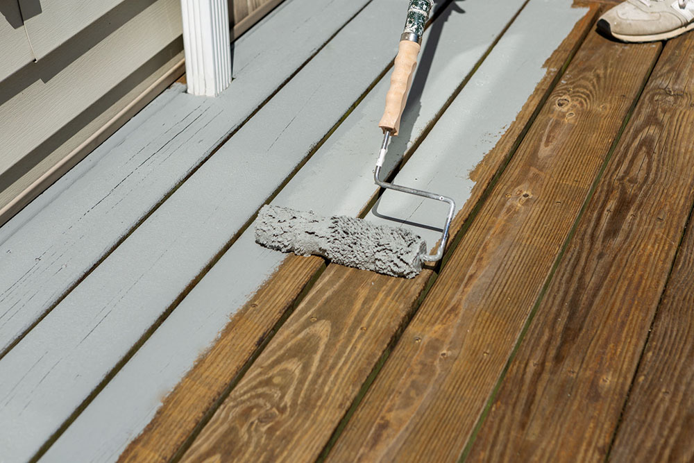
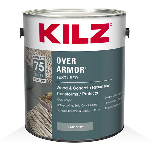
Patio Transformation to Kick Off the Summer
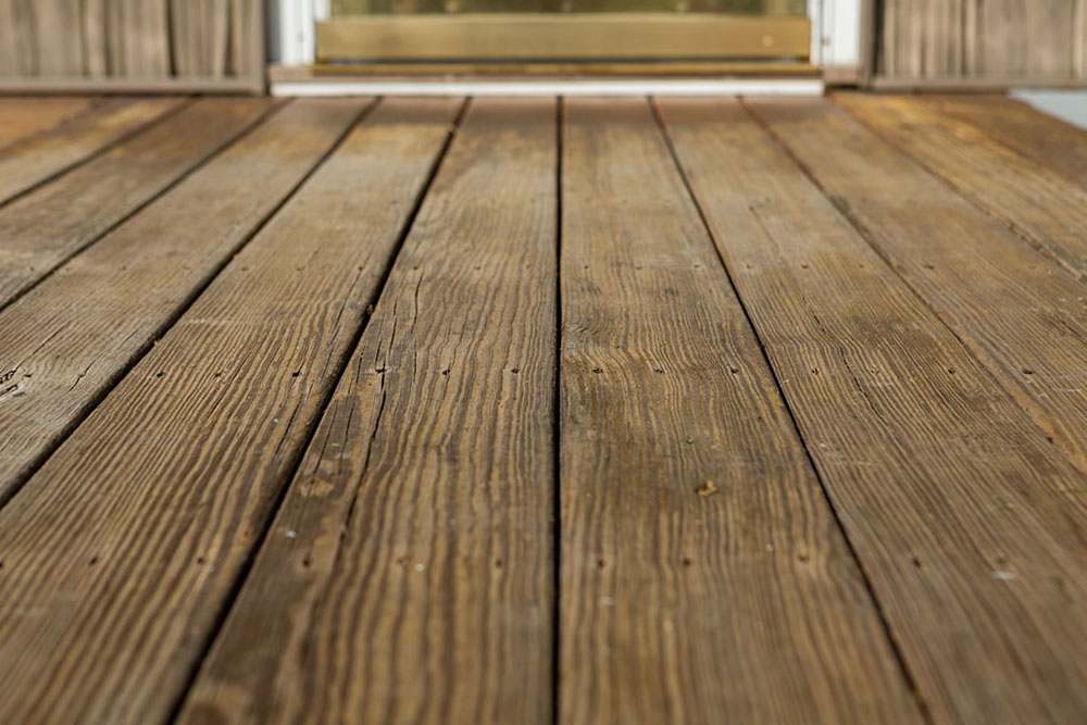
July 11, 2022A tired deck is hardly an inviting place to kick off the warm-weather season with friends and family. So don’t let another summer go by without transforming your outdoor living space into something fresh and vibrant. Cracks and splinters, stains, and mildew are sure signs your deck is ready for a new finish.
Follow along for step-by-step instructions to transform your deck into a beautiful space for you to enjoy all summer long.
Cleaning & Preparation: Before applying a new finish on your deck, be sure clean it to remove any trace of the old finish, stains, and mildew. After all, you don’t want tough stains like that old BBQ sauce Uncle Jim spilled last Labor Day to be there forever.
• Step 1: Use a wood stain and finish stripper to remove remnants of an old coating and follow it with a wood cleaner and brightener to neutralize the wood.
• Step 2: Rinse the surface thoroughly with a garden hose or a pressure washer. Pro tip, use the broadest spray pattern while keeping the nozzle at least 24-inches away from the surface.
• Step 3: Allow the area to dry for 24 hours, and sand the surface to remove any remaining stray fibers.
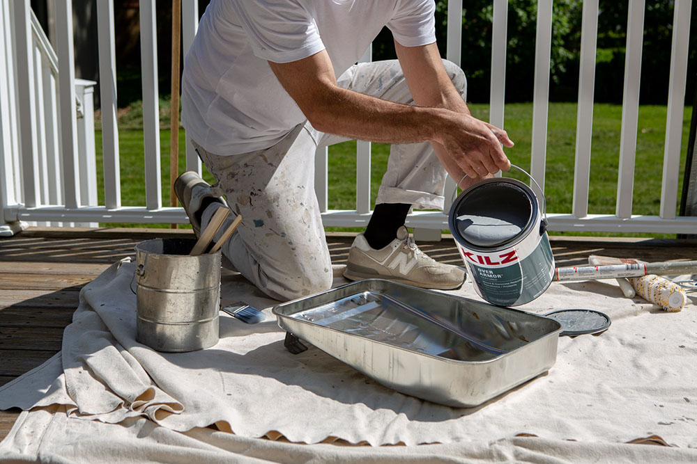
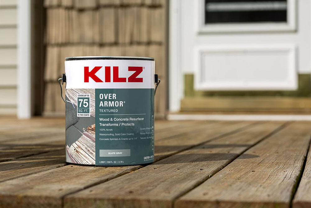
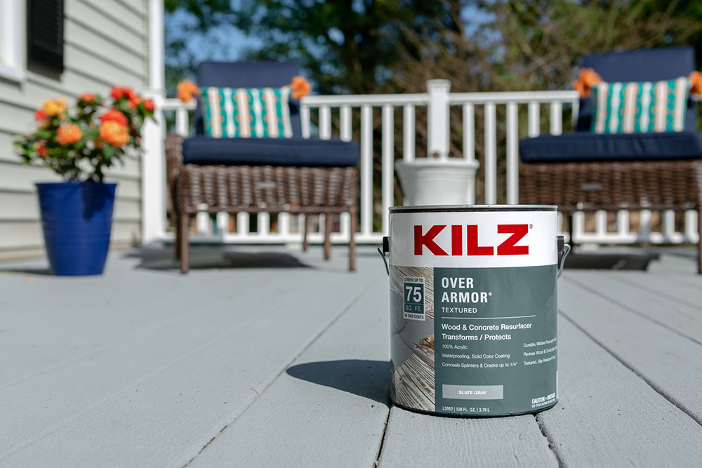
Application: Use KILZ® Over Armor® Textured or KILZ Over Armor Smooth Coating to take your deck to the next level. The solid color coating was designed to cover cracks, hide other imperfections, and provide a textured, non-slip or smooth surface. It’s the perfect choice for breathing new life into old, weathered wood and transforming your deck into a stunning outdoor space that brings the family together making it the envy of the neighborhood.
• Step 4: Stir KILZ Over Armor Coating and intermix cans of the same color to ensure color uniformity
• Step 5: Using the newly mixed coating, fill in any cracks or holes. Next, apply the first coat using a ½” nap roller
• Step 6: Let dry 4-6 hours, then apply second coat. Allow 24 hours before subjecting to light traffic and allow 72 hours before subjecting to full cure
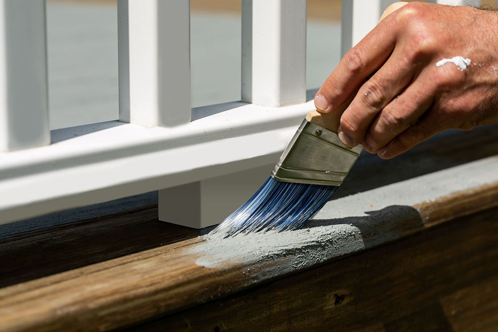
Available in several nature-inspired colors, this deck features Slate Gray. This deep hue blends well with the home’s light gray vinyl siding, black shutters, and white vinyl deck railing. In addition, the neutral gray tone of this area is the perfect canvas for new colorful accessories.
New furnishings can always add a pop of color and give you a chance to add your own personal style. Navy seat cushions, summery striped throw pillows, and a potted rose bush add vibrancy. But, of course, you can always change out décor pending your mood or season.
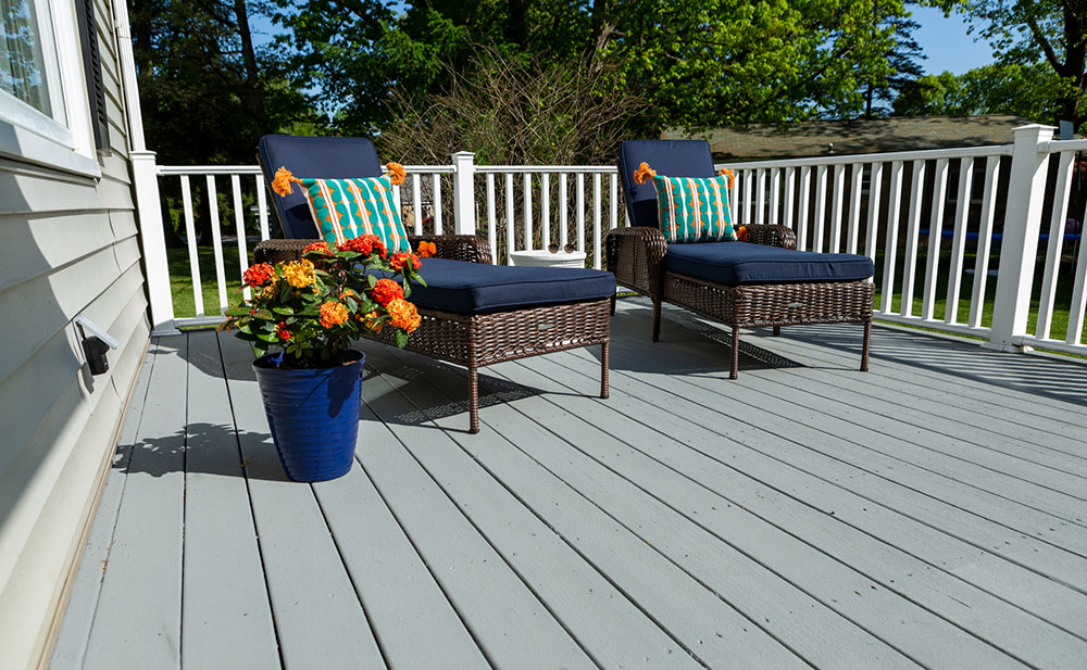
Don’t just paint the deck. Transform the space into a relaxing, fun environment to share with your world.
Features of KILZ® Over Armor Textured Coating
• Use on wood, composite, or concrete
• Suitable for horizontal or vertical surfaces
• Bridges gaps up to ¼”
• Conceals splinters
• Provides a slip-resistant finish
• It fully cures in 72 hours
• Cleans up with water
Always remember to refer to our website kilz.com or product back labels for additional information on which primer is right for your project and detailed instructions on how to apply our products. Check out our Coverage Calculator to understand your estimated paint needs for your upcoming project.
RELATED ARTICLES
get inspired:
FOLLOw us:
@kilzbrand
SHOP
PRODUCTS
A Quick Color Change: Angela Cacace
October 18, 2021The bedroom. It’s the first space on this earth that an individual can claim as their own. There is that pivotal moment in every person’s life when they find themselves covering yesteryears’ painted walls with any cool poster or sticker they can find. And what’s left? A hodgepodge of a room that doesn’t fully reflect their newfound identity in the world as they leave their formative years and enter their tween years. With so much going on in the world today, I can only imagine what todays’ kids are having to cope with as they have navigated through this last year and a half. So as a designer and contractor for a remodeling company, I can’t think of a more deserving clientele in need of a space of refuge to call their own.
After a year of a pandemic that kept her out of school, my tenacious client, Saegan, was ready to tackle a fresh, new beginning. Excited at the prospect of finally being able to throw sleepover parties and hang out with her best girlfriends, she needed a major bedroom update. This room was going to be epic. A full reflection of the young woman she is growing up to be, I was so excited to help her find her design voice and style.
So where to begin? Few projects provide transformation in a bedroom but paramount to the small list is paint. A quick color change is exactly what this makeover so desperately needed to literally set the tone of the room.
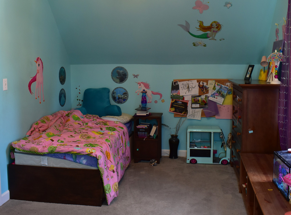
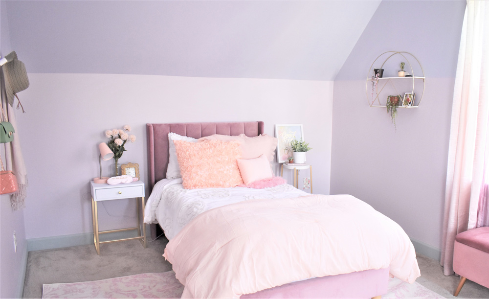
Quite on-trend, Saegan wanted a two-tone wall, because why settle for one color when you can have two?! This technique is achieved by painting the area on the lower half of the wall (typically below standard chair rail height which is around 32”+) a different color than the upper half of the wall. This painting technique was not only beneficial in decision-making for a dynamic tween, but it was also a great choice for her dormer-walled room. Dormers are an architectural detail commonly found in the cape-cod style of home that Saegan’s family lives in. Along with a fun window nook, these types of rooms in a home boast steeply angled walls that follow the roof’s pitch. So in addition to providing visual interest, this two-tone technique worked with the shadows and angles of the walls rather than against them.
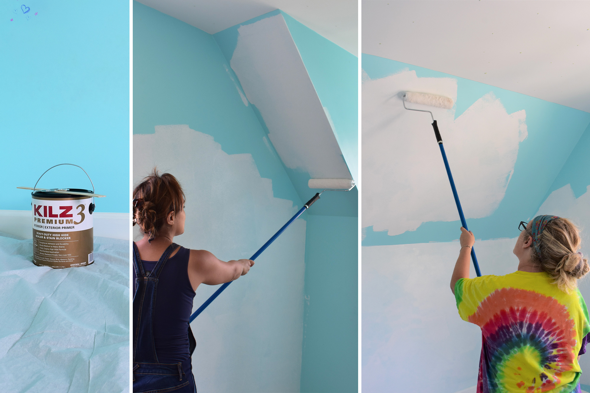
Sagean knew she wanted to paint colors that were lighter, brighter, and full of girl-power. So, after a quick field trip to the local paint store, Saegan decided on her two colors. She chose “In Bloom” and “Cement Pots” from the Magnolia Home by Joanna Gaines® Paint Collection.
Bringing your paint swatches into the space and purchasing a sample to test it out on your walls is a must. Lighting differs from house to house and room to room, so it is crucial in ensuring that you have chosen the right color. However, in Saegan’s room, this step was not so simple because there was no way the reflection of her brightly colored room was going to allow us to see the true color in her space. With bright teal paint on the existing walls and stickers and doodles abound, good prep was a must to ensure a favorable outcome.
With proper prep in mind, we purchased KILZ 3® PREMIUM primer. This is the ideal primer when you are going from a darker to lighter paint color. And in Saegan’s case, we wanted to make sure that her new softer, more mature colors showed true without having to apply multiple coats to cover up the intense teal paint. Also, this primer’s thicker high hiding formula hides surface imperfections like marker artwork! Now, having grown out of wall scribbles and sticky hands, this very low VOC, water-based primer-sealer-stain blocker provided the clean slate we needed for a fresh start.
Kids’ rooms always seem to have a layer of gunk and grime, so a good wipe down of the walls is first on the list. Now, we were set to cover up years of scuff marks, stains, and “artwork”. After scraping stickers, filling holes in the wall, and removing screws and nails, we scraped off loose paint and lightly sanded it for a smooth finish. For the application, a high-quality nylon/polyester roller with a 3/8-1/2″ nap is recommended on smooth surfaces, like Saegan’s. If you are prepping a semi-rough or porous surface, you will want to go with a 1/2-3/4″ nap.
After an even primer application, we were left with a bright, clean surface that served as the perfect blank slate to begin. And best of all, it was dry to the touch in only 30 minutes, and we were ready to begin applying our new colors in an hour!
The break in the dormer walls was the perfect guide for where to separate our two colors. Using painter’s tape and a steady hand, we applied our soft color palette to the primed walls. After the addition of plenty of blush tone furniture and fabrics and gold accents, Saegan’s room transformed. Prepping the walls to ensure a beautiful finish, the two paint colors provided the perfect foundation to bring her lighter and brighter blush tween room to life.
*This is a paid partnership with Angela Cacace.
Always remember to refer to our website kilz.com or product back labels for additional information on which primer is right for your project and detailed instructions on how to apply our products.
RELATED ARTICLES
get inspired:
FOLLOw us:
@kilzbrand
SHOP
PRODUCTS
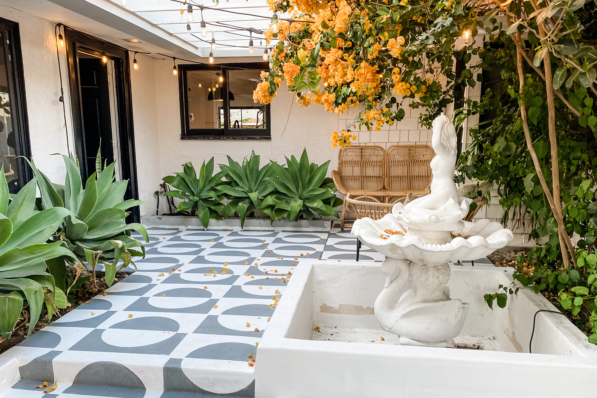
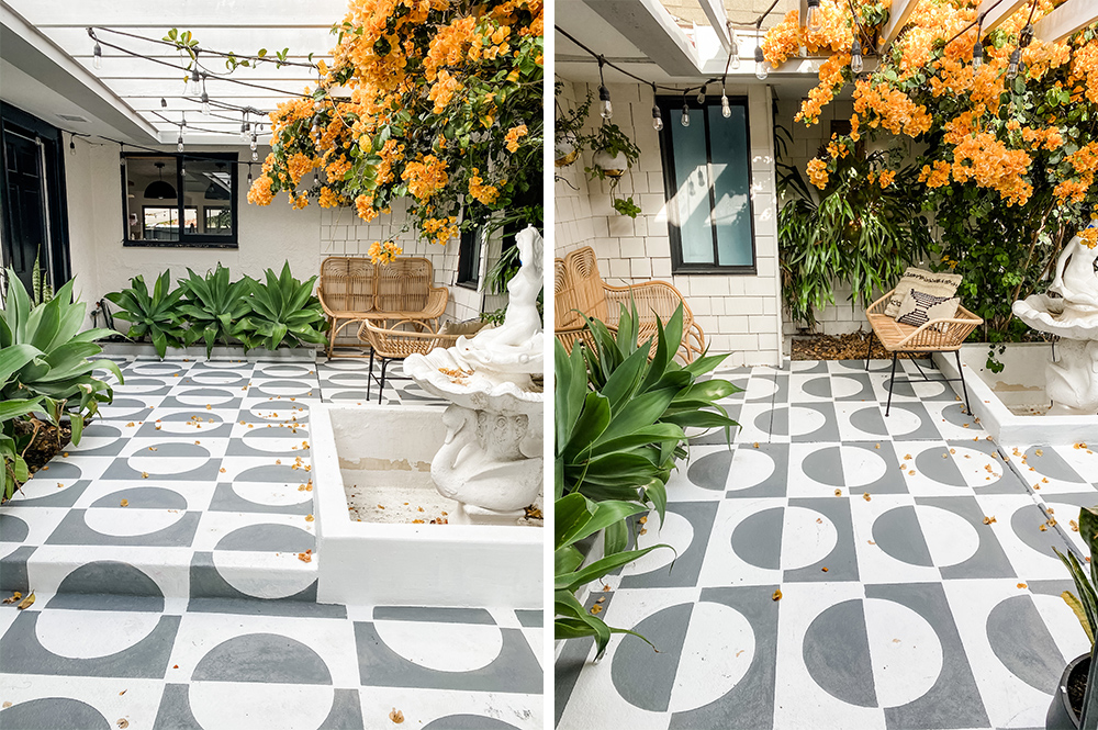
Pro Spotlight: Jesi Haack’s Mid-Century Courtyard Makeover
September 20, 2021 This month on The Perfect Finish, we have an inspiring Q&A to share that includes a stunning stenciled courtyard makeover. A friend of the KILZ team, Jesi Haack is a talented event designer with some serious interior design skills as well. Jesi’s full-service event design company, Jesi Haack Design, transforms traditional events into trendy affairs. She is also the Co-Founder of SLAACK Productions, a corporate event production company specializing in creative & interactive design experiences & installations.
Jesi recently completed a jaw-dropping makeover of her home’s front courtyard, and it inspires some serious DIY envy. Read on to learn more about Jesi and how she completed this gorgeous transformation.
Before we talk about your stunning patio project, we’d love to delve into your DIY/designer background. You own an event design and production agency, and on top of that you’re a super talented DIY-er and interior designer. Tell us how you first got into interior design and DIY’ing and how that led to where you are now.
Well, I’ve always loved making things look cool. Whether it’s for events or in my home. So once Covid hit and turned the lights out on our busy production company, I suddenly had a ton of time on my hands and no creative outlet. Pair that with buying our first fixer home and a huge income hit, I became a DIY’er! Hahaha! I just started figuring stuff out on my own because of boredom, lack of funds and a need for creativity. Once I started sharing my projects on social media, I didn’t anticipate so many people would like what I was doing! And then they started asking me to help with their homes, offices, and projects! It’s been a blast!
Where do you find inspiration for your DIY home improvement projects? Has work for your event design business inspired any of your interior design projects?
I’m inspired by so many different outlets and people. I follow a bunch of different types of builders and creators (I think of them as more than DIY’ers because it truly is an art what they do) and other people’s work is truly an inspiration. And yes! My event installation background is a huge aspect to my work and my style. I try to think outside the normal interior design box and bring in more three-dimensional aspects to interiors. More like art installations that make a big impact. At least that’s where my thought process is.
Let’s talk about your recent patio project. What inspired the design and what was the overall process?
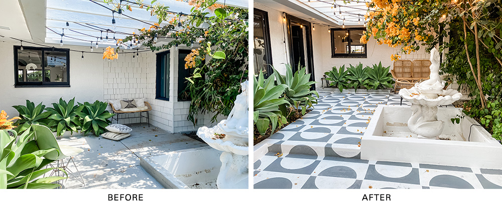
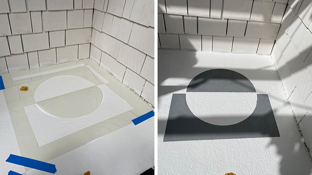
I’ve spent a ton of time in Palm Springs for work and am so inspired by the architecture there and the mid-century design style. Our patio was so basic and the concrete so ugly, I knew I wanted to bring it alive with a pattern. I also knew it was an area I didn’t want to play it safe with. I wanted it to make people stop for a sec and notice before entering our home! It was a pretty simple process: clean – prime – stencil – seal!
Which KILZ product did you use for the patio makeover and why? How do you think it impacted the project?
I used KILZ 3® Premium Primer and KILZ Over Armor® concrete coating. Kilz primers are my literal go to for any project because they seal the surface I’m working on. For this one in particular, a quality primer was clutch for covering up chipped paint and giving me a blank canvas to use for my stencils.
How did you first learn about KILZ? Have you used KILZ primers for any other projects?
I think my dad told me about Kilz long ago when I started creating. I’ve literally used the primer on everything! My baseboards which got rid of water stains and still have kept them away! Lots of painting projects for our events, the primer helps keep our wood sets from warping in outdoor settings.
When completing any DIY or interior design project, what are your tips and tricks for success?
A tough lesson I have learned is don’t rush! This is so hard for me. I love diving in and getting to the end result. But don’t skip prepping! Properly taping off and using primer will make your project look more legit in the end and will save you touch up work when all is said and done!
Jesi Haack’s Step-by-Step Directions for a Mid-Century Courtyard Makeover
1. Power wash cement.
2. Use a cement cleaner and pour it on with a plastic watering bucket. Don’t use metal! Scrub with a stiff bristle brush.
3. Let dry completely, typically a day or two.
4. Prime! Use a roller to get a smooth layer. I did 3 coats because I was using Kilz primer as my base coat. Wait a few hours between coats.
5. Map out your pattern with chalk line. (I skipped this step and I regret it). This will ensure each time placement lines up and is straight. Make squares that are the size of your stencil.
6. Time to stencil! Lay stencil down on each square. Use an angled brush to paint on cement paint. I had two stencils so I would alternate so it would give the paint on the stencil a bit of time to dry so it wouldn’t transfer the paint that got on the stencil to the new square. Wash off your stencil every so often to keep your lines nice and clean. Don’t stress too much about lines, you can touch up at the end!
7. Touch up messy lines and spot clean where needed.
8. Let cure for 72 hours.
9. Paint on a cement sealer! Wait 24 hours before using!
Always remember to refer to our website kilz.com or product back labels for additional information on which primer is right for your project and detailed instructions on how to apply our products.
RELATED ARTICLES
get inspired:
FOLLOw us:
@kilzbrand
SHOP
PRODUCTS
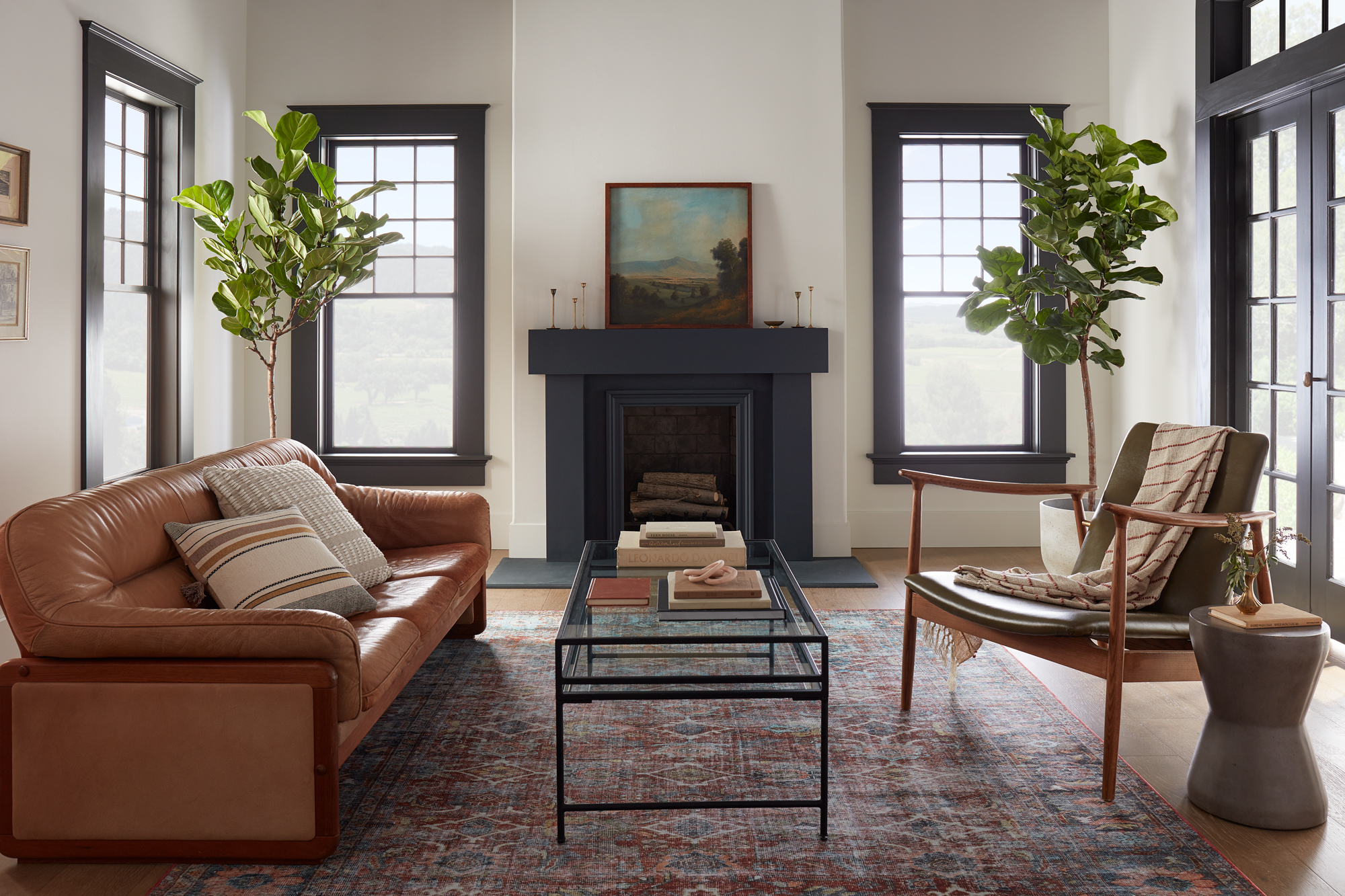
Magnolia Home: Classic and Cozy Living Room
August 2, 2021Contrasting dark and light colors in a room’s design can make a classic statement. In this modern living room featuring Magnolia Home by Joanna Gaines® paint, a softer take on the traditional black and white paint pairing offers a modern yet welcoming feel.
“The contrast of the dark trim and light walls brings this room to life, giving it both a traditional and a modern feel.” – Joanna Gaines
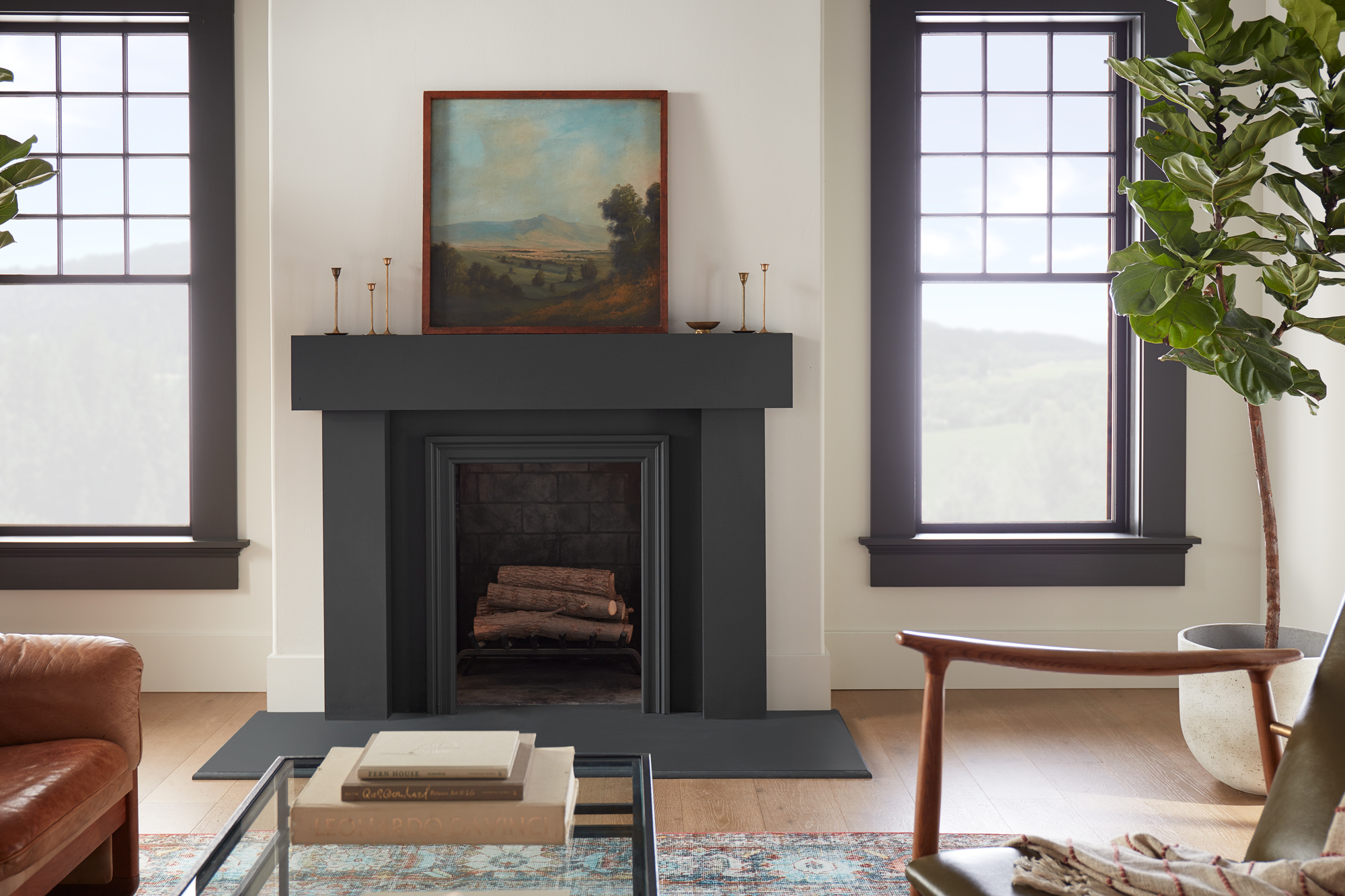
The fireplace was a natural focal point for this living room design and painting it a darker hue was an easy way to make it stand out in the large and open space. The chosen color from the Magnolia Home by Joanna Gaines paint line, Prairie Smoke, is a softer almost black with green undertones. It pairs perfectly with the wall’s creamy weathered white paint color, Shiplap – a can’t-go-wrong neutral from the Market Collection palette. A curated collection of 25 colors personally crafted by Joanna Gaines, the Market Collection takes the guesswork out of choosing coordinating colors.
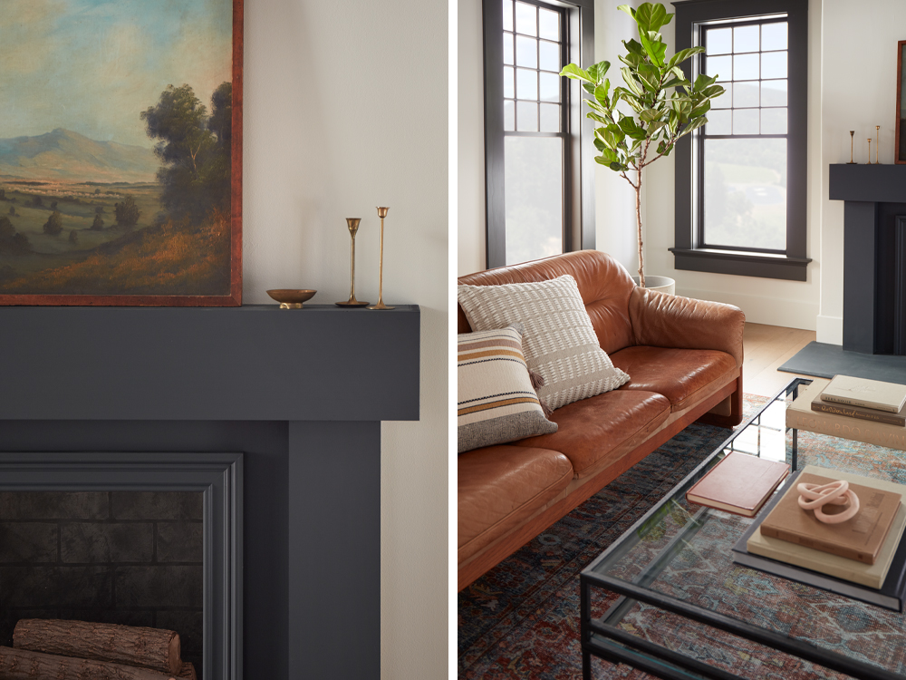
Painting the windows and large French doors in the same dark color complements the fireplace, while still letting it draw the eye. The black and white backdrop created by the chosen paint colors offered many design possibilities for the living room’s furniture and décor items. A warm-toned leather sofa and plush neutral throw pillows bring a sense of relaxation and coziness into the open and airy living room.
A jewel toned area rug, sleek metal and glass coffee table and a modern wood and leather armchair create a welcoming space for conversation. And to bring the outdoors in, two large Fiddle Leaf Fig trees flank either side of the fireplace, topped with a beautiful landscape painting.
Inspired by this modern living room and looking for colors that complement a black and white color scheme for your own space? The curated palette below offers shades that complement Prairie Smoke and Shiplap.


Magnolia Home by Joanna Gaines paint is available at select Ace Hardware store locations, and online at AceHardware.com and Magnolia.com.
RELATED ARTICLES
get inspired:
FOLLOw us:
@kilzbrand
SHOP
PRODUCTS

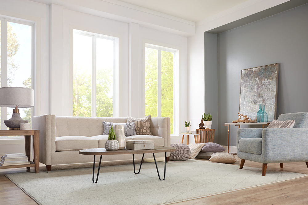
Living Room Makeover with Meditation in Mind
June 21, 2021In this living room makeover, we set out to create a comfortable and functional meditation area that could be stored away when not in use. The living room’s large windows made it a perfect light and airy space to relax in, but the feeling of the room was weighed down by the old paint color and dark, heavy furniture. It was time to say goodbye to dull yellow walls and breathe new life into this living room with primer and a fresh coat of paint in calming colors.
For the primary walls and mullions, we began with a coat of KILZ 2® All-Purpose Primer, a dependable choice for covering up previous paint colors. The pros know that a quality primer acts as the perfect foundation for any paint job; and in this case, KILZ 2® All-Purpose Primer provided coverage to hide the old yellow paint, while its adhesion properties made it a breeze for our new paint colors to glide over the walls effortlessly. KILZ 2 primer also adds amazing longevity and durability to painted walls by working as a sealer and stain blocker.
Once our primer dried, it was time to start painting. Sometimes a too-bright white can seem harsh in a sunny room, so we chose KILZ® Tribute® Paint in Contemporary White (TB-02) for the walls and ceiling. This particular shade of white has a subtle blue undertone that cooled down the brightness just a notch, while providing a gentle, reflective backdrop for the sunlight streaming in.
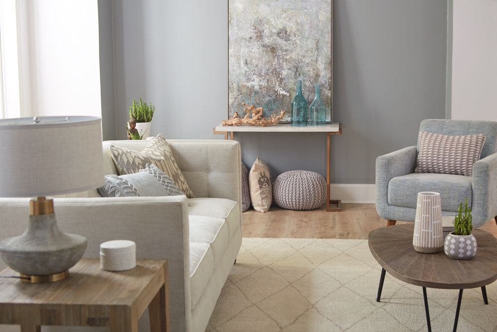
We followed the same steps — primer followed by a coat of paint — for our accent wall, choosing this time a contrasting color: KILZ® Tribute® Paint in Stone Cold (TB-66), a medium-dark gray with subtle pale green undertones. This neutral gray created a calming effect, while toning down the brightness of the white walls and ceiling.
As you can see in the “before” photo, nothing looks duller than a bland expanse of carpet, so it was an easy choice to replace it with luxurious gray hardwood flooring, topped with a plush cream-colored rug quilted in an attractive diamond pattern.

Because we wanted to maintain a light, airy feel, we chose contemporary style furnishings in complementary colors, including an understated, quilted-back sofa with soft plump cushions and a cozy armchair in a fabric that matches our accent wall to perfection. We added a bit of diversity with a natural wood finish coffee table that stylistically hints at Danish Modern, and a simple butcher block end table.
We accessorized with a couple of wood accent tables, including an attractive console table that we used to support a stunning modern painting that reflects both of the room’s primary colors. We upped the comfort level several notches by adding overstuffed pillows in complementary shades.
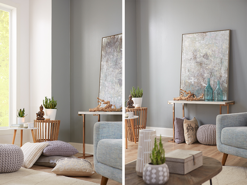
Given the stresses of this past year, our goal for this room was to create a calm, soothing oasis for rest and relaxation. To accomplish this goal, we used an empty corner space to create a meditation station, complete with comfortable, oversized pillows and a few decorative items. Pillows are ideal for creating an on-the-spot meditation corner in any room, because once you’re done, you can easily remove them and store them away — in this case, under the console table.
Primer and a coat of paint are the two valuable tools you can have for a DIY makeover project. Primer protects and enhances your paint job, while a coat of gleaming paint can transform any space. Once you choose the right colors for your design scheme, you can add to the ambience with a few carefully chosen pieces of furniture and accessories.
Always remember to refer to our website kilz.com or product back labels for additional information on which primer is right for your project and detailed instructions on how to apply our products.
RELATED ARTICLES
get inspired:
FOLLOw us:
@kilzbrand

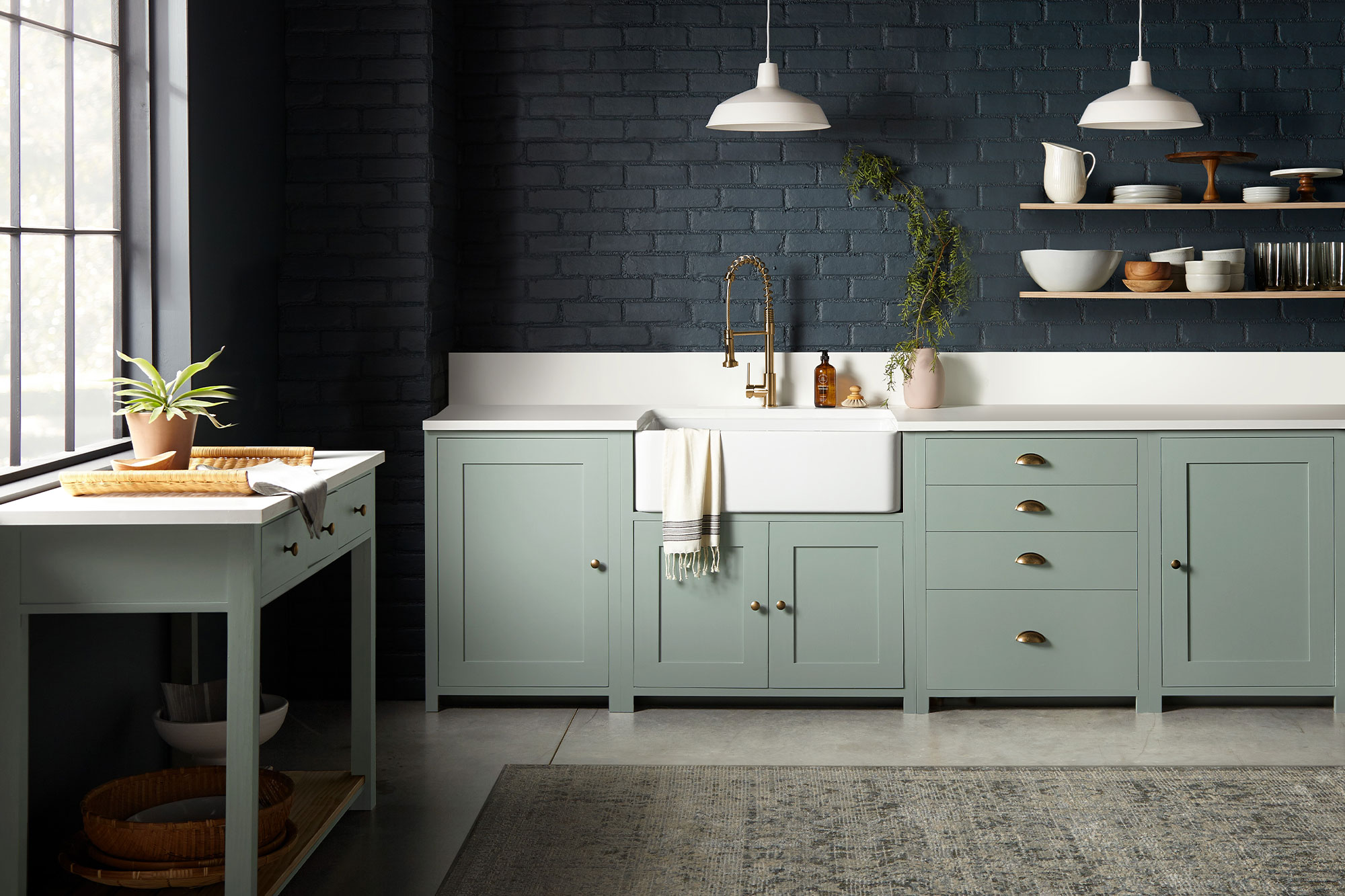
Magnolia Home: Bold Kitchen Colors
May 11, 2021While a bright white kitchen is a timeless and classic look, sometimes adding a dash of dark color in your space can be the secret ingredient to achieving an elevated design style. In this kitchen, the open and light-filled layout was ideal for a bold color choice on the walls or cabinets.
“Going with a dark paint color for a space might feel intimidating to some, but when you find deep, rich tones like these that beautifully elevate the space, the risk is worth it.” – Joanna Gaines
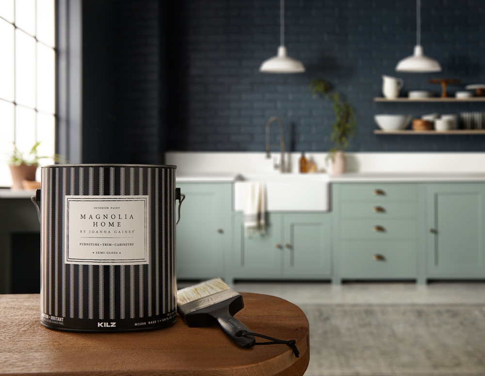
The brick walls in this kitchen had a beautiful natural texture that combined with the light pouring in from the large open window, made for an ideal surface to hold a darker paint shade. The chosen color, Magnolia Home by Joanna Gaines® paint in Coffee Nook, offered the depth desired (a dark, smoky gray) with a softness that comes through in the blue undertones.
To complement the deep and dark walls, the cabinets were coated in a paint color with a similar gray hue but in a much lighter shade. The chosen color, Clean Slate, brought together a perfect pairing of cement gray and blue undertones. A white farmhouse sink and bright white countertops added airiness to the space, while minimalist open wood shelves added interest to the dark, brick wall.
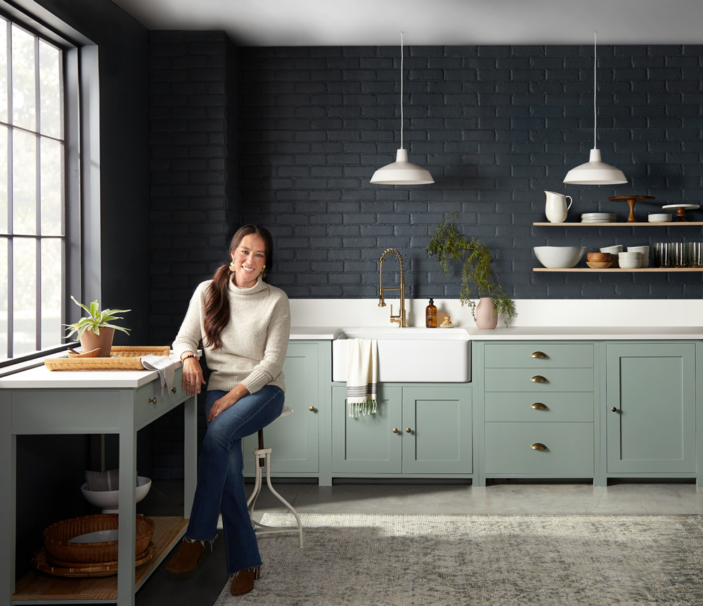
This resulting kitchen is a design and culinary masterpiece, and proof that bold and dark color choices can be just the thing to take a design from simple to decadent. If you’re looking to explore using bold colors in your space and aren’t sure what to pair them with, explore the palette below of shades that complement Coffee Nook and Clean Slate.


Magnolia Home by Joanna Gaines paint is available at select Ace Hardware store locations, and online at AceHardware.com and Magnolia.com.
RELATED ARTICLES
get inspired:
FOLLOw us:
@kilzbrand
join the conversation:
SHARE this post: