Category: Inspiration
Magnolia Home: Bold Kitchen Colors
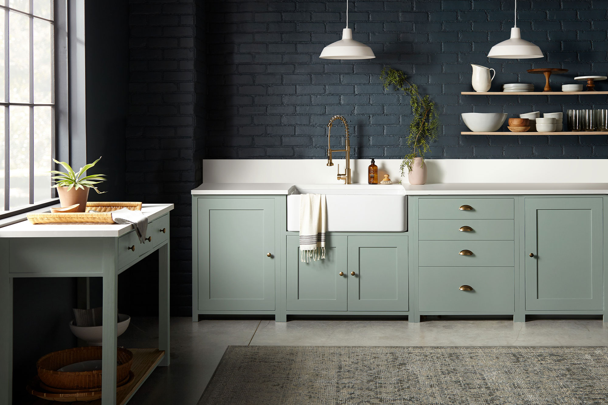
May 11, 2021While a bright white kitchen is a timeless and classic look, sometimes adding a dash of dark color in your space can be the secret ingredient to achieving an elevated design style. In this kitchen, the open and light-filled layout was ideal for a bold color choice on the walls or cabinets.
“Going with a dark paint color for a space might feel intimidating to some, but when you find deep, rich tones like these that beautifully elevate the space, the risk is worth it.” – Joanna Gaines
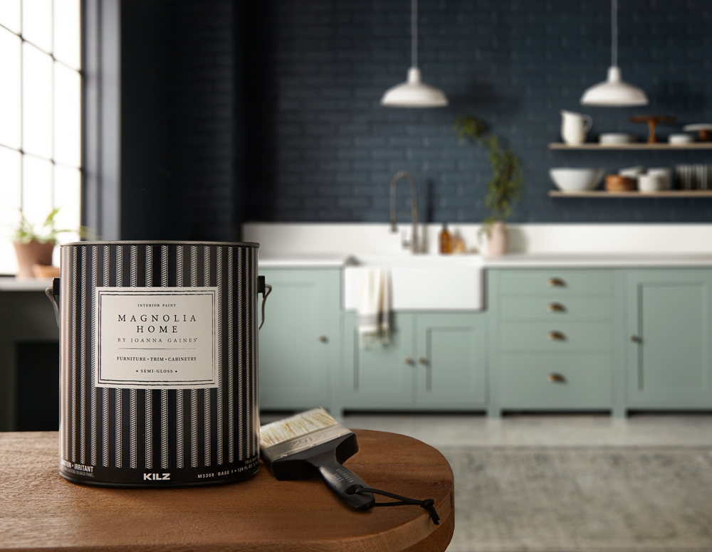
The brick walls in this kitchen had a beautiful natural texture that combined with the light pouring in from the large open window, made for an ideal surface to hold a darker paint shade. The chosen color, Magnolia Home by Joanna Gaines® paint in Coffee Nook, offered the depth desired (a dark, smoky gray) with a softness that comes through in the blue undertones.
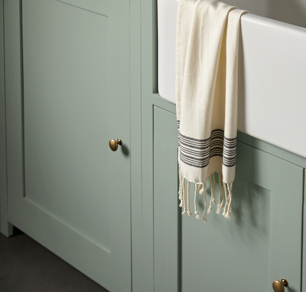
To complement the deep and dark walls, the cabinets were coated in a paint color with a similar gray hue but in a much lighter shade. The chosen color, Clean Slate, brought together a perfect pairing of cement gray and blue undertones. A white farmhouse sink and bright white countertops added airiness to the space, while minimalist open wood shelves added interest to the dark, brick wall.
This resulting kitchen is a design and culinary masterpiece, and proof that bold and dark color choices can be just the thing to take a design from simple to decadent. If you’re looking to explore using bold colors in your space and aren’t sure what to pair them with, explore the palette below of shades that complement Coffee Nook and Clean Slate.


Magnolia Home by Joanna Gaines paint is available at select Ace Hardware store locations, and online at AceHardware.com and Magnolia.com.
RELATED ARTICLES
get inspired:
FOLLOw us:
@kilzbrand
SHOP
PRODUCTS
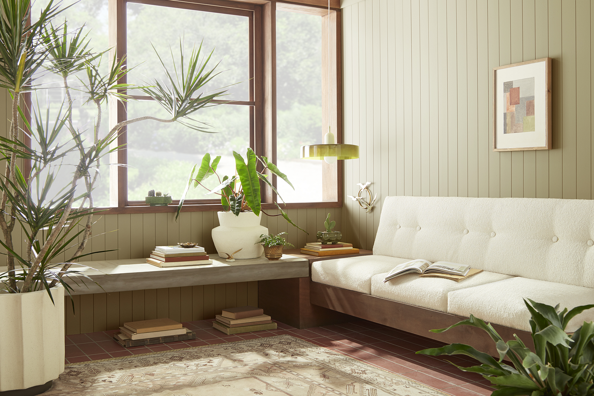
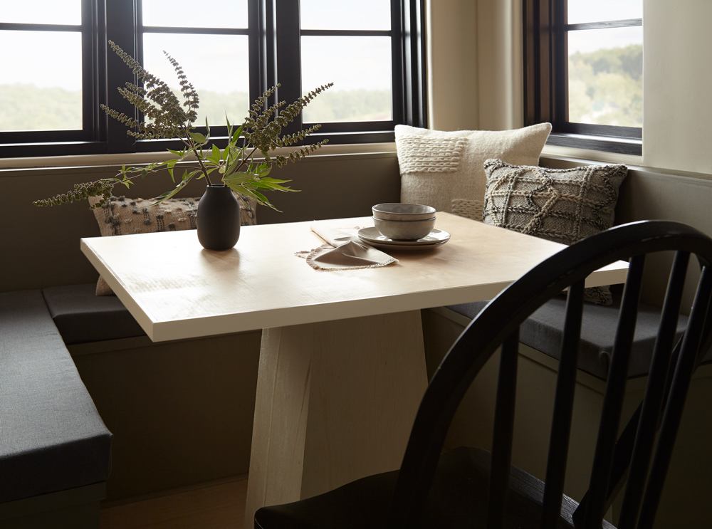
Magnolia Home: Modern Breakfast Nook
April 19, 2021Gathering with family or friends for a meal is one of the best ways to connect, and the experience is made even richer with a cozy and inviting environment – like this beautiful breakfast nook. A combination of modern tones and natural textures, this space proves that neutral colors can still make a design statement. The muted browns and golden grays in this eating area are a perfect recipe for a relaxing space.
“These grays bring a warm, grounding color to the walls, giving this breakfast nook a modern yet natural feel.” – Joanna Gaines
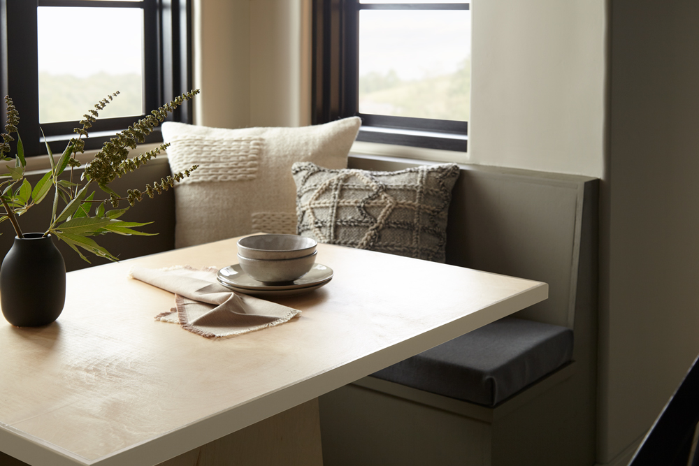
The impact of neutral paint colors is often determined by their undertones. A white shade with cool undertones might evoke a feeling of renewal or energy, while a neutral hue with a warm undertone can instill a welcoming coziness to a space. In this breakfast nook we used Magnolia Home by Joanna Gaines® paint in Gatherings, a golden gray with warm amber undertones, for the walls.
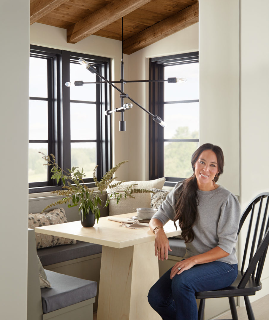
The built-in bench was coated in Reclaimed Wood, a muted smoky brown that added just the right amount of depth to the dining space. Looking for more neutral paint pairings? Explore the palette below of six shades, all picked to coordinate with Gatherings and Reclaimed Wood. And for additional color inspiration, explore all 150 colors in the Magnolia Home by Joanna Gaines paint line on kilz.com/magnolia.


Magnolia Home by Joanna Gaines paint is available at select Ace Hardware store locations, and online at AceHardware.com and Magnolia.com.
RELATED ARTICLES
get inspired:
FOLLOw us:
@kilzbrand
SHOP
PRODUCTS

Transforming a Boring Bedroom into a Relaxing Oasis
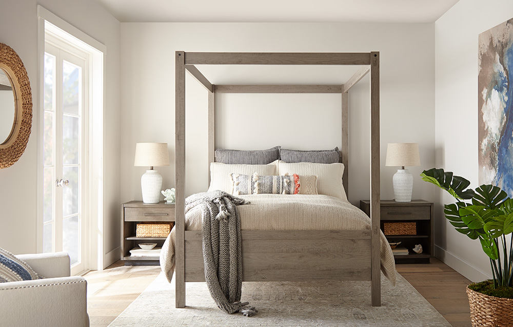
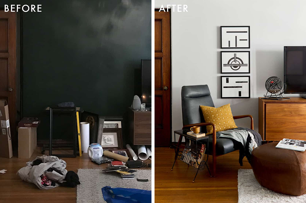
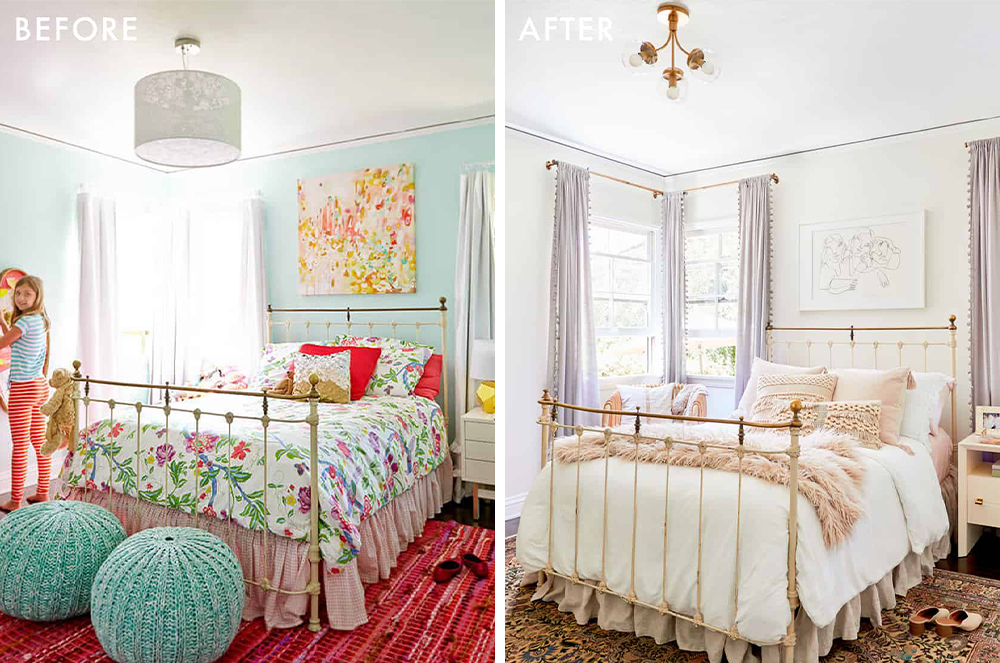
April 8, 2021Nothing dulls the spirits more than a boring, dated bedroom design. That’s why we couldn’t wait to lift the spirits of this depressing bedroom with new colors and textures to make it sparkle with freshness.
Color has a huge impact on mood and energy levels; and especially given the stresses of the past year, it’s more important than ever to promote a healthful, stress-free atmosphere in all areas of your home — and most particularly, your bedroom. That’s why we chose creamy off-white colors that create a soothing atmosphere of calm and relaxation, while opening up the space visually so it doesn’t feel as stuffy and confined.
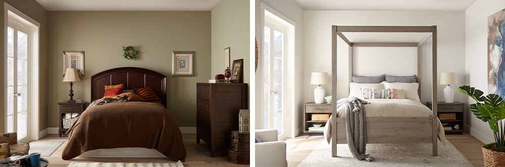
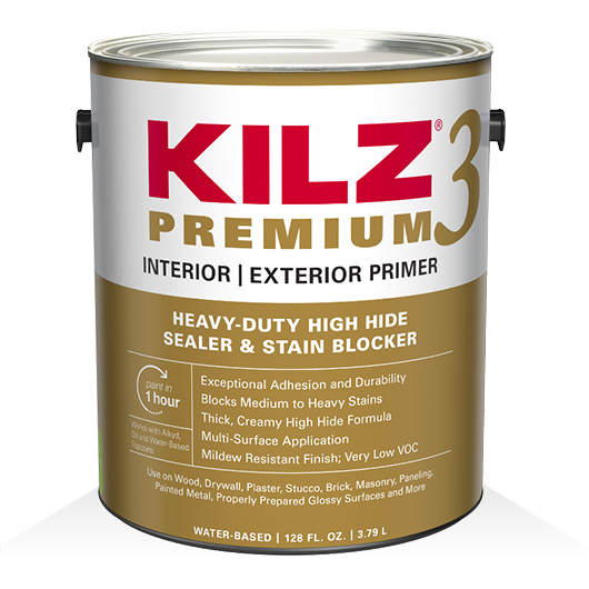
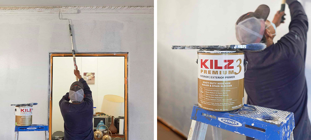
We began our project with the most valuable tools for any DIY makeover — primer and a coat of paint. For this makeover, we chose KILZ 3® Premium Primer, which did an amazing job of covering the old, drab olive-green paint and creating the perfect foundation for the new fresh white paint. KILZ 3 Premium Primer offers excellent adhesion and durability, allowing the new paint to glide on smoothly and adding to the longevity of your paint job.
Next, we added a coat of KILZ® Tribute® Paint in Collector’s White (TB-31). This is a creamy, barely-there white with subtle undertones of greige (gray/beige) to take the brightness down a notch, making it ideal for reflecting the sunlight filtering in from the glass doors in this master bedroom. Because of its cool undertones, we were able to use Collector’s White throughout the entire bedroom, creating a soothing, gently glimmering sparkle without a hint of harshness.
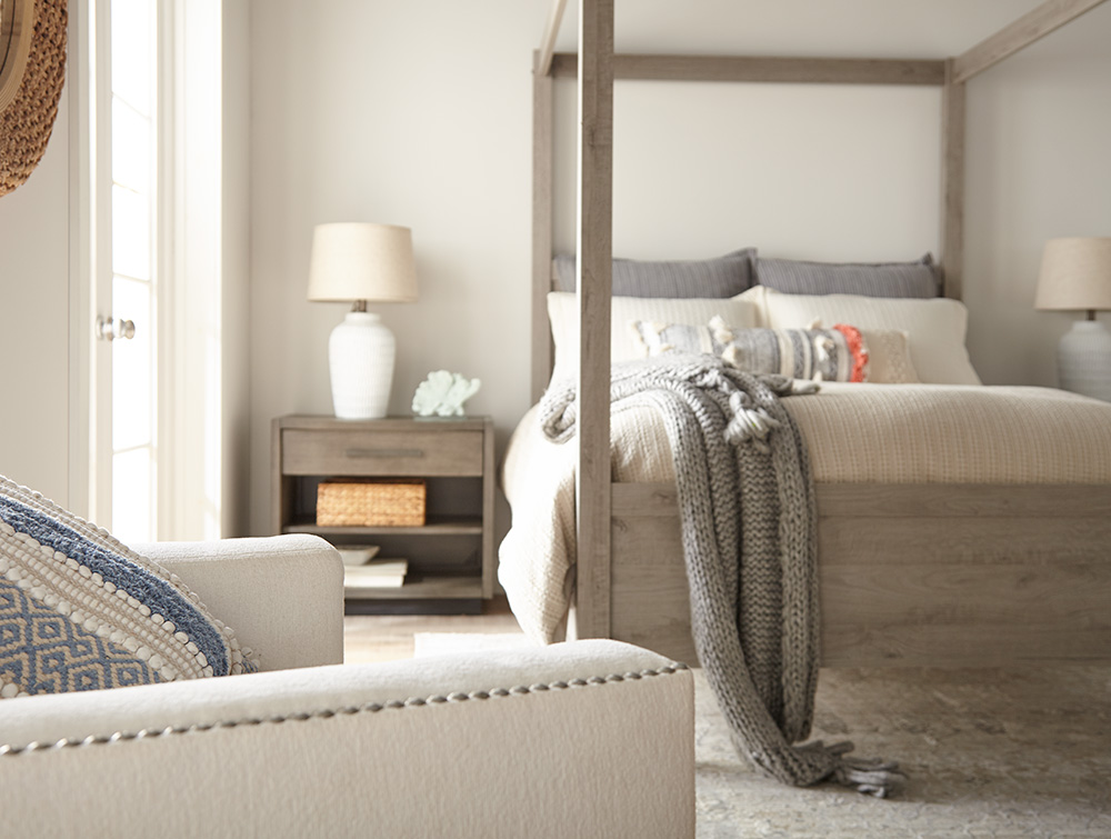
Our keynotes for this makeover were airy, simple, calm and relaxing, and we accomplished these with a streamlined Contemporary Swedish-Meets-Coastal California theme. For the focal point, we chose a modern four-poster bed in gray-toned brown natural wood. We added matching lacquered wood bedtables in a similar brown/gray shade, styled in keeping with our Scandinavian/Danish Modern theme.
We kept the attractive, natural hardwood floor, but added a cozy off-white rug. Other furnishings and accessories — including an armchair, lamps and bedding — were chosen to reflect the creamy white of the walls.
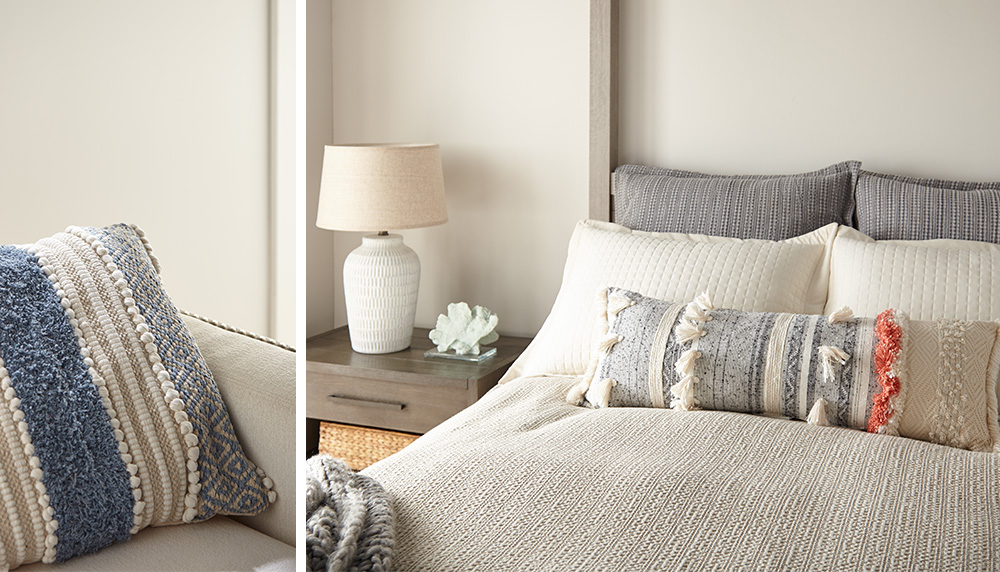
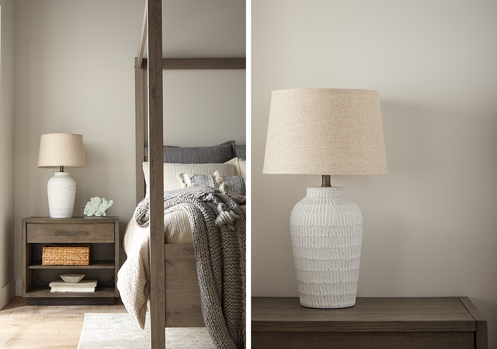
One interior designer’s tip: Pillows and other textiles are a great, affordable way to underscore your design scheme. We choose plump, oversized woven natural-fiber pillows in shades to tone in with the rest of the room, with handcrafted touches such as pom-poms and fringe. We finished the look with two attractive white ceramic lamps, styled in the Danish Modern tradition and topped with pale ecru linen shades.
The overall look is one of natural textures — crisp linens and woven cottons — giving this master bedroom a clean, fresh, inviting look of soothing freshness. When coupled with the bright sunlight filtering in from the glass doors, the impression is of a gleaming, glistening oasis for rest and relaxation — the kind of ambience you would look for in a luxury spa or hotel. And with quality primer and paint, the good news is that this pristine, fresh clean look can be easy to maintain as well.
Anyone can achieve a room transformation like this at an affordable price. The key is to choose colors that reflect the mood and ambience you want to create — whether it’s light and airy or warm and nostalgic. That’s why paint and primer are your greatest tools in any DIY makeover. They’re not only affordable, but they’re also so easy to apply that even a newbie can do it without any help, and with spectacular results.
With primer and a coat of paint, you can transform a dull, outdated room into a showplace. The primer will enhance all your painted surfaces, while protecting them from household dust, dirt and mildew. Likewise, a fresh coat of paint will lift a room into a new dimension of beauty and vibrancy. Just add a few pieces of furniture and accessories within your budget — and voila! You’ve created an affordable, elegant room makeover that will stimulate your sense of color and beauty, while relaxing your mind and spirits.
Always remember to refer to our website kilz.com or product back labels for additional information on which primer is right for your project and detailed instructions on how to apply our products.
RELATED ARTICLES
get inspired:
FOLLOw us:
@kilzbrand

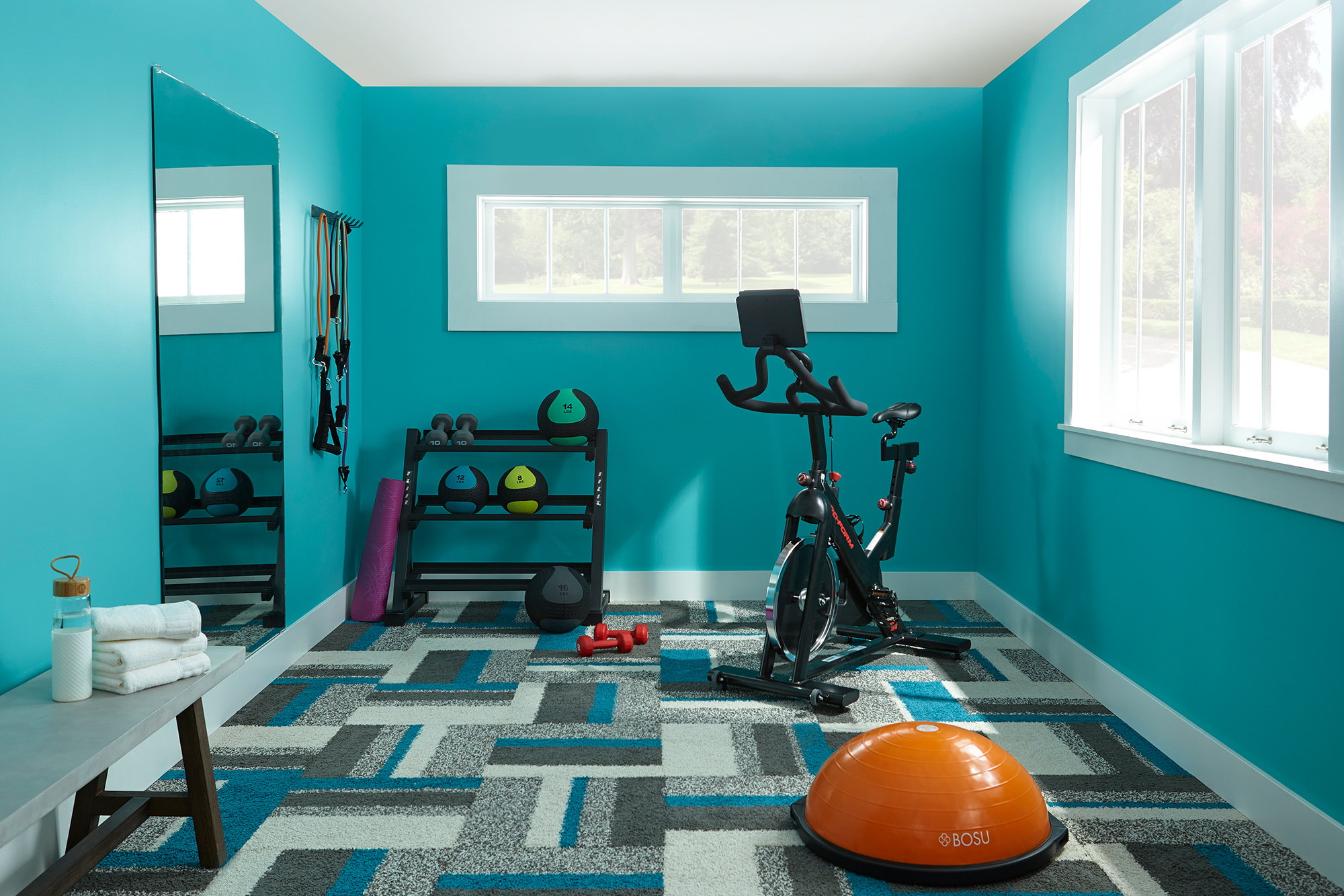
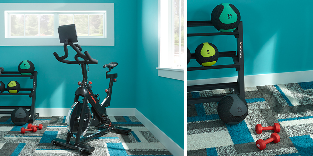
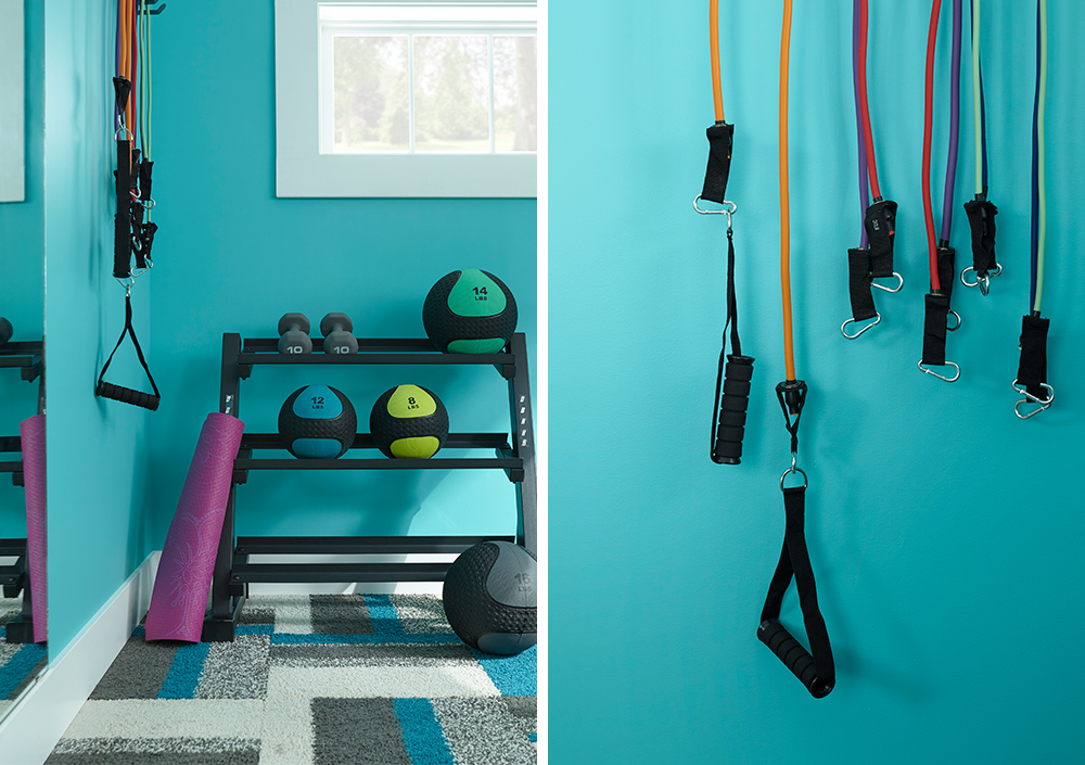
Fun & Functional Home Gym Makeover
March 23, 2021The way we live has changed in the last year and we are doing more at home than ever before. Instead of time spent at yoga studios and gyms, many are streaming workout classes online and rolling out their yoga mats on the living room floor. Not everyone has an extra room waiting to be transformed into a boutique fitness studio, but if you do have an unused guest room, why not convert it into a custom home gym? That’s what we decided to do with this unused bedroom, and the results are stunning. The secret to our success was our quick and easy wall transformation — executed with a layer of primer followed by a vibrant coat of paint in an energizing color. It’s yet another example of how primer and interior paint can make a big impact and transform just about any space.
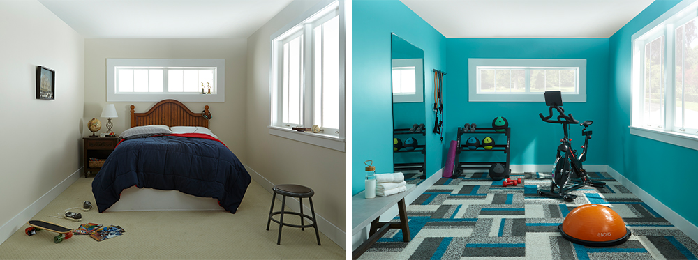
Here’s a look at exactly how we revamped this dull-looking bedroom into a sparkling home gym, using only primer, a coat of paint, a fun square of carpet and a few essential pieces of equipment. First, we tackled the walls, starting off with a coat of KILZ 2® All-Purpose Primer, which was especially ideal for our project because it created a perfect base layer to ensure the new topcoat color would be vibrant and vivid. This all-purpose primer is known for its durability, so you can trust that your paint job will last longer.
Next came the fun part — choosing a color. We opted for something invigorating, encouraging you to go for that extra 20 minutes on the bike or treadmill. A bold and bright aqua, KILZ® Tribute® Paint in Tropical Escape (TB-56) is so vivid, it almost has a neon vibe. It was the perfect shade to wake up our gym space. As we layered it over our KILZ® Primer, we noticed immediately that the color seemed to pop from the walls, giving an amazing vibe of energy and vitality.
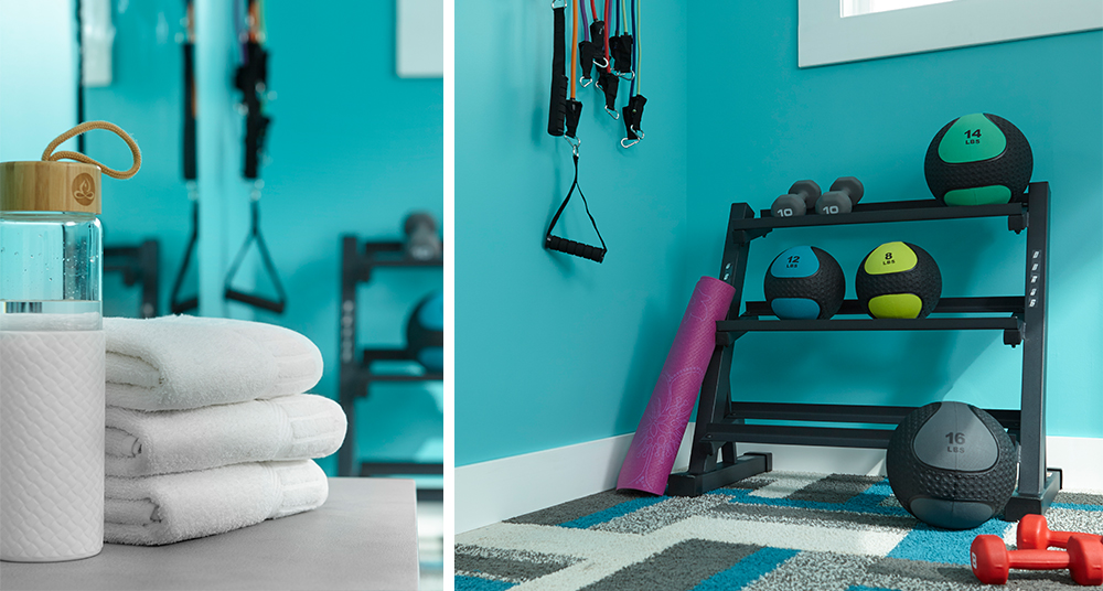
With a color like this, we knew that the flooring had to be something special. This bold geometric pattern caught our eye, and best of all, the colors matched our beautiful paint to perfection, proving that no matter how exotic your paint choices, there’s always going to be a bit of gorgeous flooring out there to match. We think that the combination of patterns and colors really adds a lot of character to the room — something you don’t always think of when creating a gym, but why not make your exercise space as attractive and appealing as the rest of your home? (Hint: The nicer it is, the more time you’ll want to spend there, which might even mean that you’ll exercise more). Another advantage to this carpet is its durability. For a home gym — or any type of space that gets a lot of physical impacts or foot traffic — it’s best to choose a durable, short-pile carpet that’s specially treated to resist stains, odors and moisture.
When renovating a room, you’ll want to first look for its advantages and figure out how to make the most of them. We recognized immediately that this room’s biggest assets were its two rectangular windows, so we made them into focal points by refreshing them with a coat of durable primer, followed by a coat of white paint. A good primer will give you that extra added adhesion you need for superior coverage when you’re painting — always a plus when you’re working with light colors because superior coverage will prevent the old colors from seeping through.
Nothing opens up a narrow space better than a full-length mirror (always a great accessory for any home gym), and we found one that added the perfect amount of depth to the room.
As for equipment, we kept it simple with just an exercise bike, along with a balance trainer ball and a few hand weights. The beauty of a bedroom-sized gym is there’s enough space for several pieces of equipment, so you’ll have enough space to add more items later on. We streamlined things even more by adding space-saving floor and wall racks (for equipment, helmets, and shoes) and a versatile gym bench for extra seating as well as storage.
Once we were finished, we decided hands-down that the paint color made all the difference and was the real winner here, proving once again a layer of primer and coat of paint can transform a room from a dull dud into a sizzling firecracker.
Always remember to refer to our website kilz.com or product back labels for additional information on which primer is right for your project and detailed instructions on how to apply our products.
RELATED ARTICLES
get inspired:
FOLLOw us:
@kilzbrand
SHOP
PRODUCTS
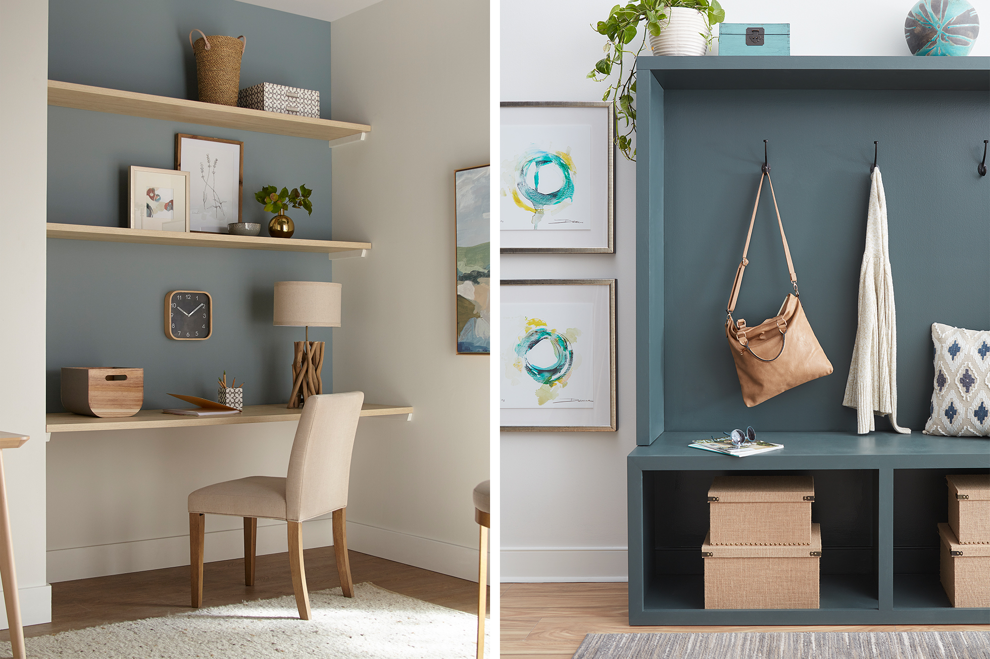
Creative Ways to Carve Out Functional Spaces
March 23, 2021The home office is becoming as standard as the laundry room. With more people working from home than ever before, often alongside children who are distance learning, people have been forced to get creative with their living/working/study spaces. Rather than trading in your dining table for a desk, try one of these ideas that empower multifunctional spaces and add some design flair to your home at the same time.
Here’s how you can fit everything in your life comfortably into your home.
Carving Out Office Nooks
The “corner office” has taken on new meaning. If you feel like your office is quite literally crammed into the first corner made available in your home, it’s time to take a look around and see if you can give yourself an upgrade.
For some households, having a workspace in the main living area isn’t a big deal — especially if you have a laptop that you can easily fold away to make room for other things when work is over. However, if you need more room to spread, out or you just work better at an actual desk, there are creative ways to fit it in and make it look great. Take this small-space office nook for example – with KILZ 2® All-Purpose Primer, a fresh coat of paint and built-in shelves, we converted a neglected nook into a pretty WFH space. See the full transformation here.
Building in Organization
Building organization into your house is essential for reducing all clutter that inevitably comes with spending more time at home. When things have a place at the end of each day, they’ll be out of your way. You might decide to relocate things around the house as you find new storage spaces, whether it’s under-the-bed, behind the couch, on top of the kitchen cabinets, or in the hall closet. The key to avoiding the look and feel of clutter is to have some rhyme and reason behind what you put where.
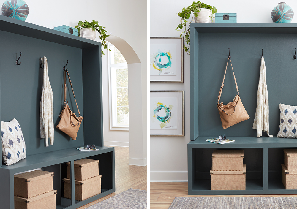
Adding some storage to your entryway or mudroom is a practical (and pretty!) way to keep the mess at bay. For this entryway storage center, KILZ Primer was the essential first step in transforming a boring wood bench into a statement piece. After priming the bare wood with KILZ 2® All-Purpose Primer, a fresh coat of pretty gray-green paint (KILZ Tribute® in Typewriter TB-70), completed the look.
Pretty baskets and bins, like the boxes in our entryway project, keep things aesthetically pleasing. Consider going the extra mile with labels to help everything find its way back to its rightful place.
Visually Divide Multipurpose Spaces
If you’ve found yourself using words like “multifunctional” more than you ever thought you would, you’re not alone. Putting up walls and partitions may be infeasible and is less than preferable. So, when it comes to squeezing more living (and working) out of the living space you already have, there’s a trick: divide them visually instead of physically.
One of the best tricks to keep things pleasing to the eye and mentally in their place is to visually divide your spaces with the use of intentionally placed paint colors. These can be in the form of a full accent wall or a smaller arch or geometric design. The visual definition from a pop of color helps you define a space a within a space.
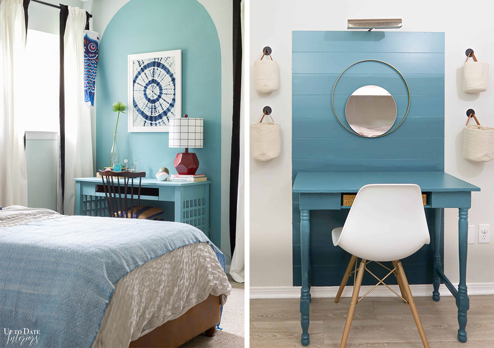
We’ve partnered with a few design savvy influencers in recent months who used primer and a coat of paint used to define their workspaces, and they are sure to inspire. Kathryn, from the blog Up to Date Interiors, used KILZ 2® All-Purpose Primer and KILZ® Paint to create a soothing blue arch behind her desk. Another fun and functional workspace came from Lindsey at Repurpose and UpCycle. Her ombre accent wall/desk combo came to life with the help of KILZ 3® Premium Primer and KILZ® Paint.
These visual dividers are pleasing to the eye and can even make your home feel larger when done right. Plus, it’s something you can do yourself. With primer and a coat of paint, KILZ can help you get more out of your home and make use of the space you already have.
Always remember to refer to our website kilz.com or product back labels for additional information on which primer is right for your project and detailed instructions on how to apply our products.
RELATED ARTICLES
get inspired:
FOLLOw us:
@kilzbrand
SHOP
PRODUCTS
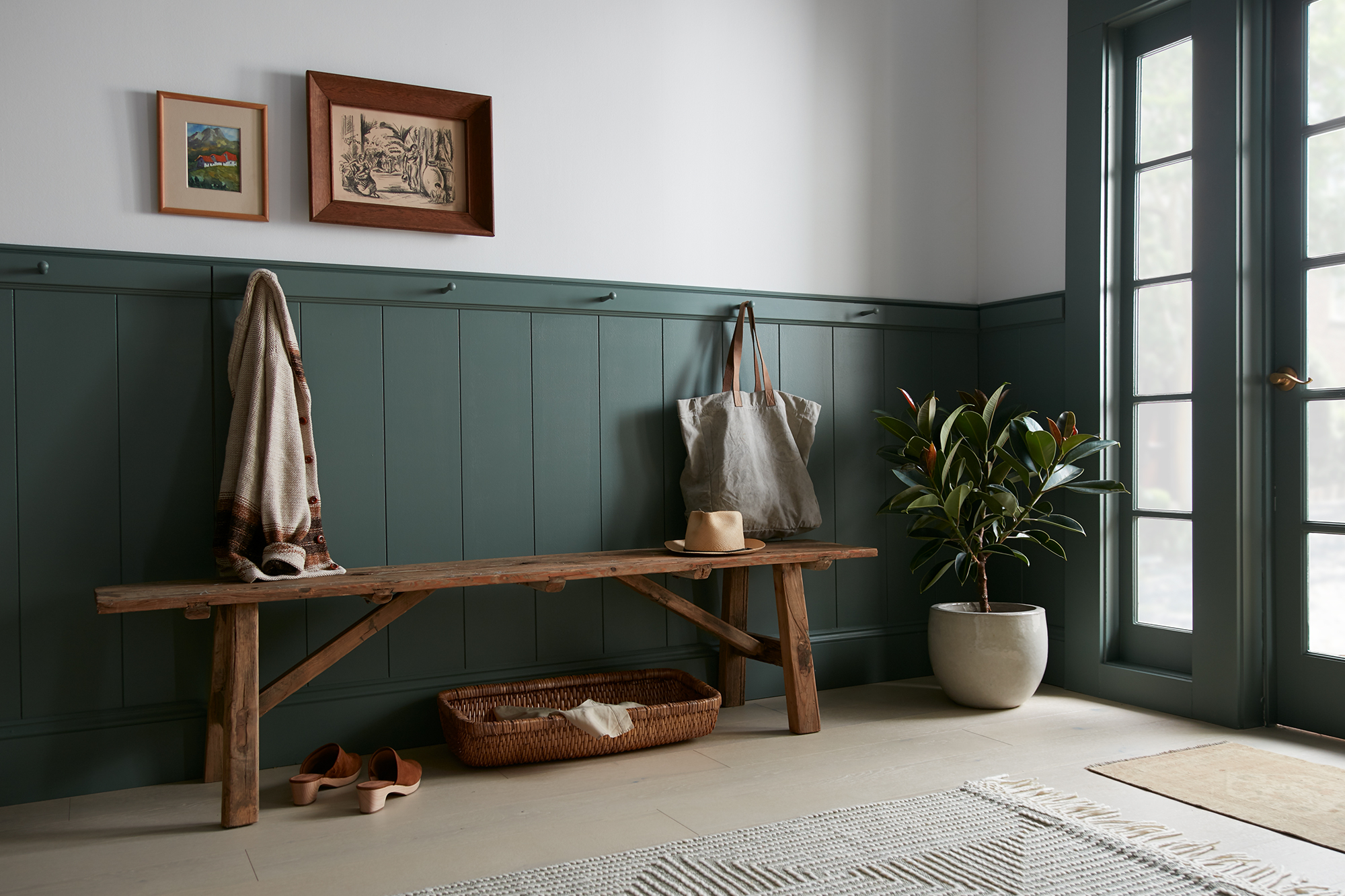
Magnolia Home: Inviting Entryway
March 15, 2021The entryway is often your home’s first impression to guests and visitors, and it is a great area to make a statement with a striking paint color combination. This entryway has an elevated feel that brings the outdoors in with a deep evergreen gray from Magnolia Home by Joanna Gaines® paint. Aptly named Luxe, the nature-inspired green hue brings a depth and richness to the space.
“This entryway has a warm and inviting feel to it, and I love how the stark white contrasted with the deep green gives it a bold, yet timeless look.” – Joanna Gaines
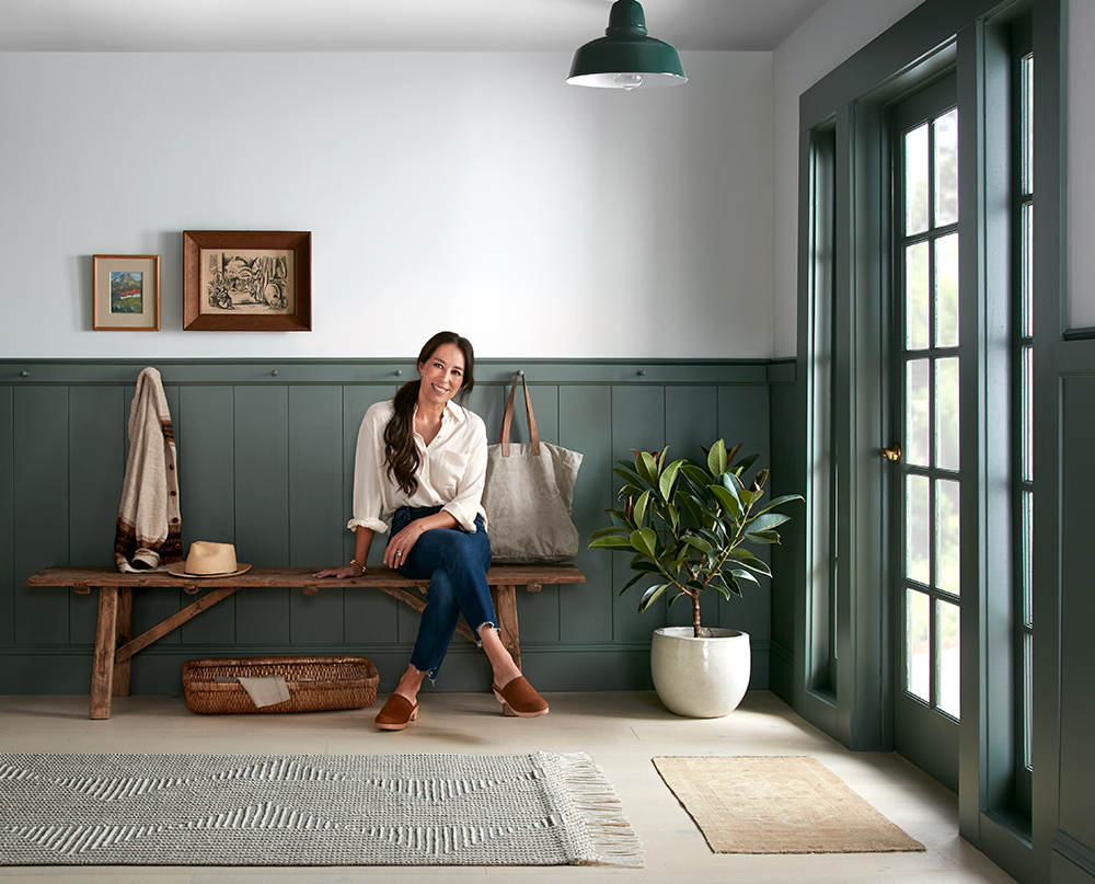
The placement of a paint color is just as important as the shade when you’re going for a statement-making transformation. The French doors in this entryway had a bold trim that was begging to be painted – and when coated in the same green as the wainscotting it created a seamless look and just the right amount of drama. The flow of green also served to draw the outdoors in, playing off the landscaping in the exterior.
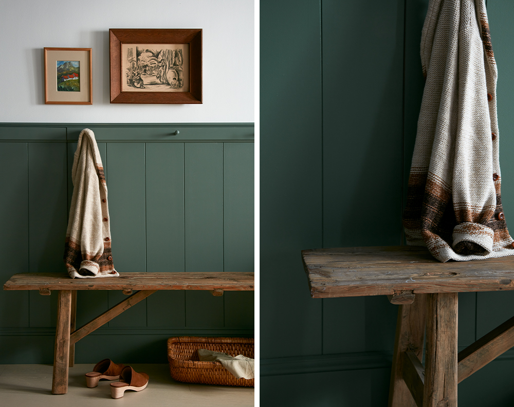
The timeless design of this entryway is accomplished with the perfect pairing of Luxe with the starkness of True White – a bright white that balances the rich green and emphasizes the space’s architectural elements. The bold green and white backdrop called for simple furniture and styling, with a perfectly placed wooden bench, simple artwork and pretty woven rugs completing the look.
Luxe and True White can both be found in the Market Collection, a palette of 25 colors personally crafted by Joanna Gaines. The entire Magnolia Home by Joanna Gaines paint line includes 150 timeless colors, making it easy to find a shade that’s perfect for your home.


Magnolia Home by Joanna Gaines paint is available at select Ace Hardware store locations, and online at AceHardware.com and Magnolia.com.
RELATED ARTICLES
get inspired:
FOLLOw us:
@kilzbrand
SHOP
PRODUCTS
Smart Spaces with Emily Henderson
February 19, 2021One of the biggest design “trends” we’re seeing as we move into this new year is multi-functional spaces. We put “” around the word trends, simply because while we are seeing plenty of beautiful multi-purpose spaces pop-up, the trigger for these transformations is often an essential need. The need for a place to log on to your zoom calls that isn’t your couch or kitchen island, the need for kiddos to have a place to do their schoolwork that doesn’t devour the dining room table, and even the need to have a place for some peace and quiet (meditation corner anyone?) since the local yoga studio is still closed.
Functional spaces are key to thriving in 2021, so why not make them beautiful too! One of our favorite interior designers and great friend of the KILZ® Brand, Emily Henderson, is a true pro when it comes to designing spaces that not only look amazing but work hard to meet her client’s needs. And like any seasoned designer, Emily knows that proper prep work is essential to professional quality results for every project both large and small. We sat down with Emily to get her tips and tricks for creating multi-functional spaces, learn how she properly preps her projects and get a sneak peek at a home office reveal she’s currently overseeing.
Hi Emily! We’re so excited to have you on the blog today. You’ve been a KILZ fan for some time, can you share what you love most about KILZ and why you trust KILZ products for your own projects and for your clients?
Hiya, thank you! A couple things: first – and I think this is the biggest one – it’s just a huge time saver. And it emboldens us to take more risks. And lastly, I guess it’s just a good, functional product. I can elaborate!
I think it’s a pretty commonly shared opinion that painting is the most affordable, most impactful thing you can do to change the look of the space. I agree with that! But if you want to make sure that your paint job actually looks good, you’re going to want a great blank canvas behind it. KILZ is the brand that all of our painting contractors use to prime our spaces, so there was a default level of trust there already – if you’re ever on a construction site before paint goes up, I’m sure you’ll see tubs of KILZ everywhere – but they use it because it makes their lives easier. Walls are smoother, paint sticks better, some of the primers even have mold- or mildew-fighting properties. (We used one of those primers in our windowless basement bathroom.) Instead of schlopping on coat after coat of paint and hoping for even coverage, it’s nice when you can just prime and then roll out two coats.
But also, it’s fun to have KILZ in your back pocket. My team in particular has been able to go crazy with paint in their apartments – you know, like green trim in the bedroom or purple stripes in the bathroom, but done tastefully! – with the knowledge that they’ll be able to change it back easily when they move out without losing their security deposit. We are genuinely big fans.
What’s one project in particular that you couldn’t have completed without KILZ? And which primer did you use?
Oh boy, where do I begin? Top of mind would be this living room that my team, lead by Julie Rose, just finished. It was in a historical LA building, right off the first-floor courtyard, and it was dripping with charm…but that black accent wall wasn’t doing any favors. It was just bumming us out. There was only one window in the space, which faced into the heart of the building, and it just made the room feel dark and depressed.
There were a couple problems in the space that we all deal with – not a ton of storage, a pass through layout, you know, the classics – but the main one was really that this wall was overshadowing everything in the space…literally. So we settled on painting the whole space, including the trim, in ‘Chalk Gray,’ brought out our painting contractor and he primed the whole wall in under half an hour – our photographer, Sara Tramp, had popped in to grab progress shots and he had already almost finished by the time she was set up and ready to go.
Those photos were taken after one coat. One coat! Do you know how long that would have taken to cover up with just white paint? We ended up priming every wall in the apartment so we’d have a nice, even base and a clean backdrop for our new gray walls and by the time we finished, it was such a beautiful space. The before and afters were staggering. It was like we had breathed new life into the architectural details – once everything had been cleaned up, you could finally see the beautiful moulding and the warm wooden details actually stood out. I’m so proud of how this one turned out.
Now let’s talk about prep. What is your advice for a novice DIYer looking to take on a painting project? How much time should they allocate to prep and what steps should they absolutely not skip?
If you’re painting the whole room, take the time to do it right. Sure, you can change paint, but not in the same way that you can swap out a throw pillow or blanket. Before doing anything else, I’d recommend taking 10 minutes to look around and to find and fill all your tiny nail holes or hairline cracks. If you ignore these things and paint straight over them, your eye is going to be drawn straight to them every time you walk in.
My team is split on the value of painter’s tape – actually, my photographer recently painted all of her closet trim freehand after installing a gorgeous wallpaper, out of fear that any tape would pull it off – so I think that if you have a pretty steady hand and a couple of baby wipes, you should feel free to go proceed without taping. You can also throw down drop cloths and make sure to move all your furniture out or to push it to the middle of the room and cover it!
From there, I’d recommend jumping straight into priming. For an average sized room – let’s say 11’ x 12’ – it should take about an hour or two, plus it’ll save you a ton of time on the back end, since you won’t need to paint as many coats to achieve vibrant coverage. The whole process, from filling holes to moving pieces to priming, shouldn’t take more than half a day and it’s definitely worth it.
Like we mentioned in the intro, you’re a true pro when it comes to designing multi-functional spaces. What are the key things you consider when presented with a project to create a room that will meet various needs?
Wow, thank you! There are three big questions to ask: who is using the space? What are the functional requirements? And how do you want it to feel?
For example, a multi-functional space shared exclusively by children, like a playroom or a homework room, and a multi-functional space that needs to work for the whole family, like a rec room, need to be designed differently. A room for kids will have softer pieces to abate the potential for injuries, more open floor space to encourage play, more nooks for alone time, etc. whereas you may float more pieces in a whole family space to encourage smaller zones for each task at hand.
Once you’ve nailed down who is using the space and what it’s for, the most important thing to figure out is how you want it to feel. Try to pick a few words that describe the vibe you’re going for. On my team, some favorites recently have been “warm grandpa library,” “bright art deco discotec,” and “moody old world restaurant.” Picking how you want it to feel when you walk in will really help dictate pieces, layout, and will remove a layer of design analysis paralysis that I think we all struggle with occasionally.
Home offices are by far one of the most popular spaces we’re seeing people DIY. What is your favorite office project you’ve completed recently? (And did you use primer?!)
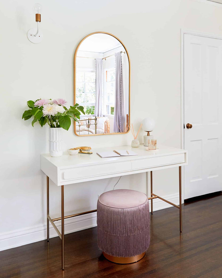
Did we use primer? You jest. Of course we did! My team, again led by Julie Rose, recently finished this teenager’s bedroom makeover, which obviously had to include a multifunctional office space for some homeschooling. I actually designed this space about a decade ago, so it was thrilling to be able to work on its update.
We ended up choosing this vanity in particular because of its size and storage – it wasn’t too heavy for the space and it can pull double duty as the perfect sized desk for a high school student who’s currently just learning from her laptop.
I guess that rolls into my main tips for folks looking to build an office or WFH space. Look for pieces that can serve a few purposes that you’ll still want to look at after you’ve returned to work or school. If you’re able to, try to grab a desk that’s the appropriate scale for your room. This one is a great size for a teen, though I know that some adults will need more space and closed storage. Finally – and the tip I love the most, as a stylist – see how you can accessorize your WFH or homeschooling space to make it feel a little less sterile. The mirror above this desk in question is across from the windows, so in addition to being a great place to get ready in the morning – there’s a cabinet with closed storage in the room, too, in case you’re wondering where the non-school products are kept – it also does a great job of bouncing light around the room.
You know I couldn’t leave without a paint transformation photo. Just such a bright, happy, serene bedroom and homeschool space!
One of the biggest woes of a home-office-lacking DIYer is that they just don’t have space for an office. What creative hacks or solutions have you seen to create an office in a small or unique space?
OH BOY. Let me tell you about the project we’re working on right now with one of my favorite new designers, Keyanna Bowen! She’s figured out an incredible way to separate her space and I can’t wait to see it all finished.
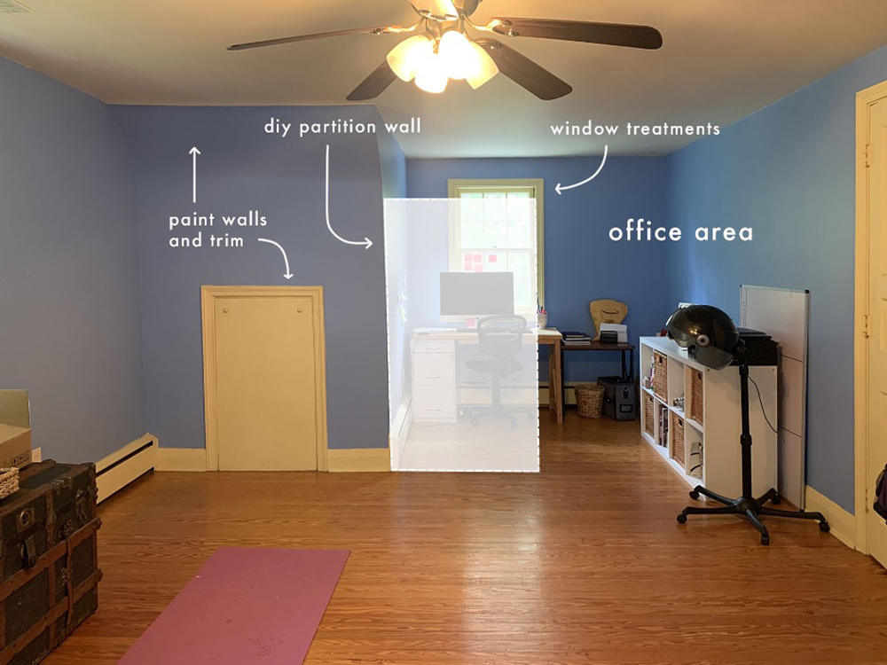
Here’s where we’re starting from. Beautiful! Just kidding – there’s obviously a ton of charm in this room, but it just needs a little bit of a boost. Keyanna wants this space to still serve as a guest room and as a yoga space, so we can’t go all-in on just decking it out as an office. I’m sure that’s a problem most folks at home are familiar with, too! Key’s plan, though, is awesome: she’s planning on building a rope wall partition. A rope wall partition! It’ll hang from the ceiling and it will still let in light while defining the office as its own separate space.
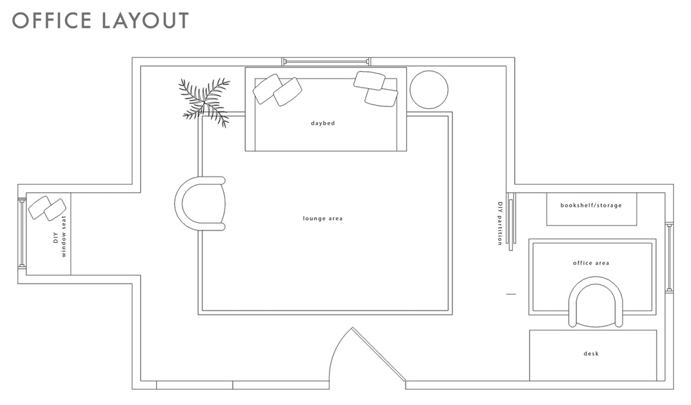
Over the past year, I think my favorite WFH spaces or DIY offices have been the ones where folks have turned their closet into a whole desk setup (long live the cloffice!) or folks who, like Key, have figured out a functional way to use a previously-awkward nook. I’m so inspired! If you aren’t blessed by architecture, though, the idea still stands: is there a way to carve out a corner of your home with privacy screens? Can you hang a similar partition in your living room to give the illusion of a separate workspace? The possibilities are endless.
A word we hear a lot when talking about multi-functional room design is zoning. Can you share what exactly that is and some tips to do it right?
I love a zone! I talked about it a little earlier, but it’s really about figuring out how to clearly define the different functions that take place in each part of a room. The best part: it’s very easy to do! You can set up separate zones in minutes by anchoring areas with different rugs. Key does it beautifully above, with the office and lounge areas both being really clearly defined by their rugs. It makes total sense, because when our brains see different flooring, they think, “oh, different room.”
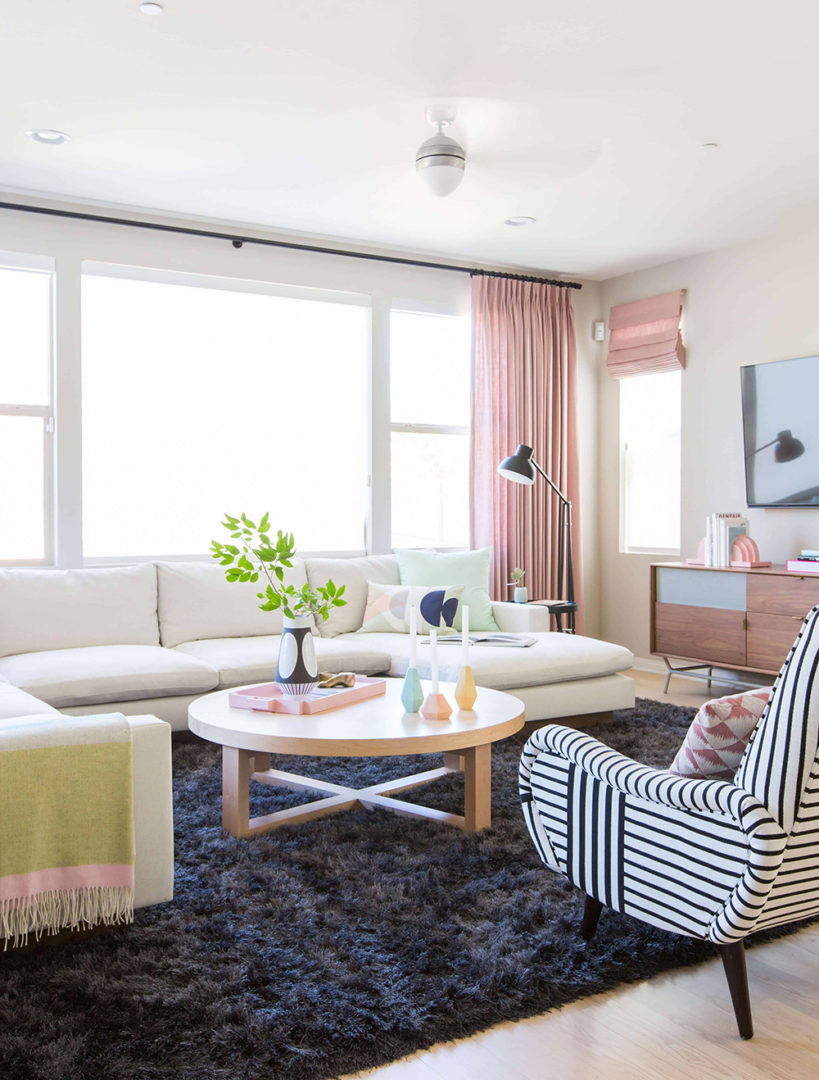
Zoning is really essential for folks with open concept layouts – especially now! So in this project – from 2016, oh my gosh, though it’s still one of my all-time favorites – we created a huge and comfortable family room by flanking this super-soft rug with a huge, u-shaped sectional and two graphic chairs. It’s bright and open, but still definitively its own space.
A few feet away, and anchored by a flat, easily-cleanable dhurrie rug, is the dining area. You’ll probably notice a lot of repeating elements: graphic hits of black and white, light woods, and pastels. Keeping a cohesive color palette isn’t always necessary – I am all for exploring, playing, and getting weird – but it does make the design process easier and it’ll make your rooms feel more relaxed and comfortable.
Switching gears to home-school rooms and kid’s study spaces. What was the biggest hurdle in creating a functional space for little ones?
Making spaces so that kids will actually use them! I think that a lot of the time, design-minded people like myself can get really hung-up on the vision. We want to make something beautiful and impressive and worth sharing, but kids don’t necessarily share those same motivations. They just want a fun place to play, learn, and explore.
The playroom is actually the space I struggle with most. My kids are still very young – 5 and 7 – so we’re early in the homeschool process, but they love art and playing with legos, so once I chose to design for those two hobbies in particular, it immediately became more functional and the kids used the space way more.
To that end, I’d ask: what do your kids like doing? How does your child actually study or do homework? If they love drawing, give them a space for that and relinquish your dreams of them ever actually wanting to play with the enormous dollhouse you bought in the hopes that you could play with it together. (Speaking to myself, here.) If you build it, with your kids and their specific tastes and interests in mind, they will come.
Can you share a recent personal or client projects you’ve done that included a room for kids? And of course, we want to know how primer came into play!
I’m in love with this room that my team, again led by Julie Rose (are you sensing a theme here?), recently completed for a little girl. We wanted to make a magical bedroom with a specialty art area and I think we really made it sing.
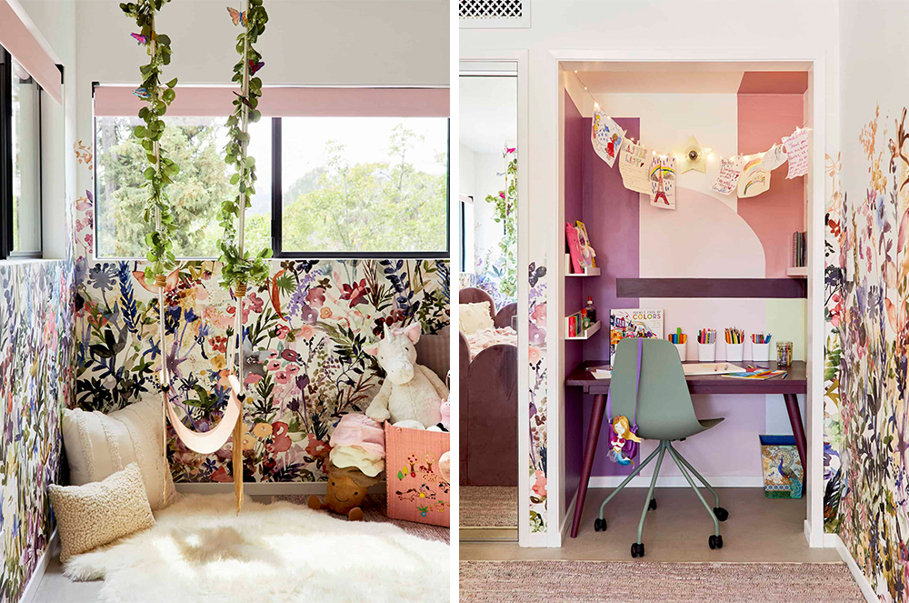
As for how we used primer – it went everywhere! We actually primed underneath the wallpaper, per our installer’s recommendation. It covered up the previous paint and served as a plain backdrop so that the white pieces of wallpaper would appear clean and fresh, but it also worked as a bit of a barrier so that the wallpaper paste didn’t bond with the walls too much. While wallpaper is pretty permanent, priming first can make the removal process a bit less painful in that you won’t need to worry about ripping off chunks of drywall by accident.
We also obviously had to prime that art nook so that all of our magical, fairy-inspired colors would show up. We love the way it turned out and so did the family.
Before we wrap up, let’s talk about the project that we’ve partnered with you on… that also includes your design mentee Key! Can you tell us about her, the project and give us any sneak peeks?
Woops, I guess I already spilled the beans a little bit on this one, but I’d love to talk more about Key! Earlier this year, my team and I decided to take on a mentee – I’ve been so incredibly fortunate to find success in this field and I’m now surrounded by people who are experts in editorial and social and more, so I wanted to share the wealth and hopefully, help more folks find long-term career stability in this weird world of internet design and influencing.
Key was an instant, unanimous pick from the team. She’s an incredible interior photographer in her own right, but we knew once we read her writing and peeked at her own DIY rental renovations – that’s her kitchen above – that she would be the next big thing. She’s warm and creative but she’s also detail-oriented with a perfectionist mindset, which is what it takes to make and shoot and share beautiful spaces for the internet!
We’ll be making her office over – the periwinkle one I shared above – and we’re so excited to work with KILZ because it’s actually covered in oil-based paint, which you can’t cover without using a specialty primer. We’ll have an official update in a few weeks, but I can share the general design direction which is going to knock your socks off…
My team and I have been working with Key to secure all the main furniture pieces and BOY, they’re great. (Also, do you see that rope wall partition on the bottom right? It’s so good, isn’t it?) I know it’s only February, but I have a feeling that this is going to be one of our top makeovers of the year. We’re so thrilled to reveal it to you all and so grateful that KILZ has given us the opportunity to work on such a fun project, together. Cheers to beautiful and multifunctional rooms in 2021!
Author is paid sponsor of KILZ Primer. Always remember to refer to our website kilz.com or product back labels for additional information on which primer is right for your project and detailed instructions on how to apply our products.
RELATED ARTICLES
get inspired:
FOLLOw us:
@kilzbrand
SHOP
PRODUCTS
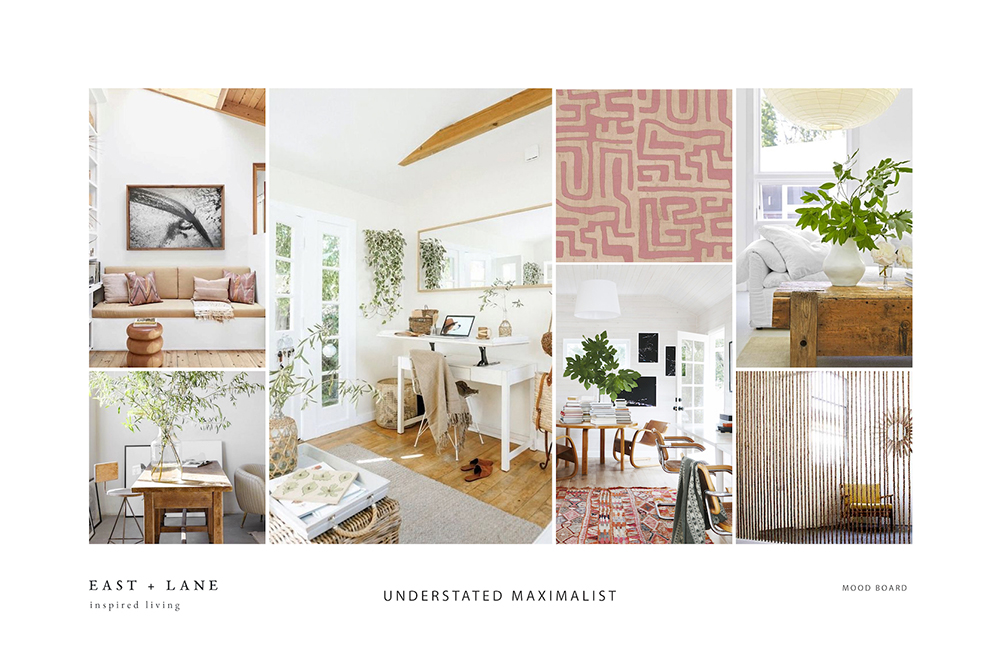
WFH Spaces that Inspire Great Work
February 12, 2021In the last year our homes have become more multi-functional than ever, becoming the spaces many people work and even go to school. Creating a space that can serve as an office or study area can be a challenge – especially if you don’t have an extra room just sitting empty and waiting for a makeover. But with a little creativity and the power of primer, you can create a gorgeous WFH (or study at home) area in just about any size space. Read on to see how we took two drab, uninspiring spaces and transformed them into attractive, design-forward offices and study areas that would motivate anyone to do their best work.
The key to our success? A layer of KILZ® Primer and a coat of fresh paint — once again proving that hard-working primer and quality paint are cost-effective tools in any type of interior makeover. Along the way, we added on-trend and functional furniture and a few eye-catching accessories. Here’s exactly what we did, and how we achieved these much-needed transformations.
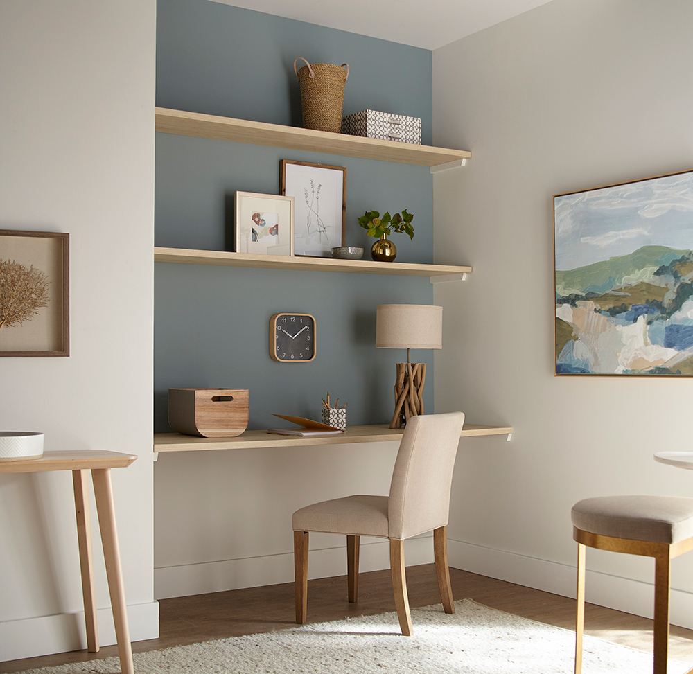
From a Neglected Nook to a Happy Home Office
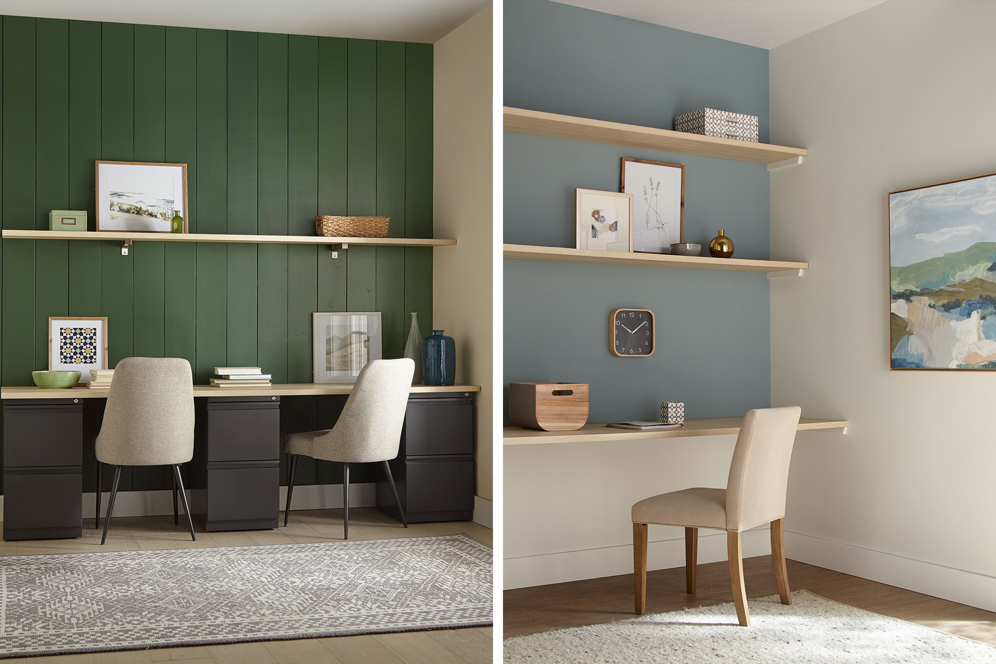
For our first transformation, a peaceful office was converted from an unused corner in a larger room. Given the limited dimensions, the space called for colors that would visually enlarge the area. Our first job was to open it up so you could feel like you’re working in a pleasant room, not a closet. Toward that end, we opted for light, airy shades that would add a subtle touch of color, while opening up the room to make it feel less confining. We also resorted to a tried-and-true designer’s trick—installing wall-to-wall shelving to create a space-saving recessed work area.
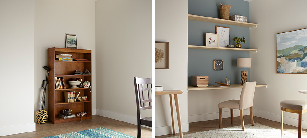
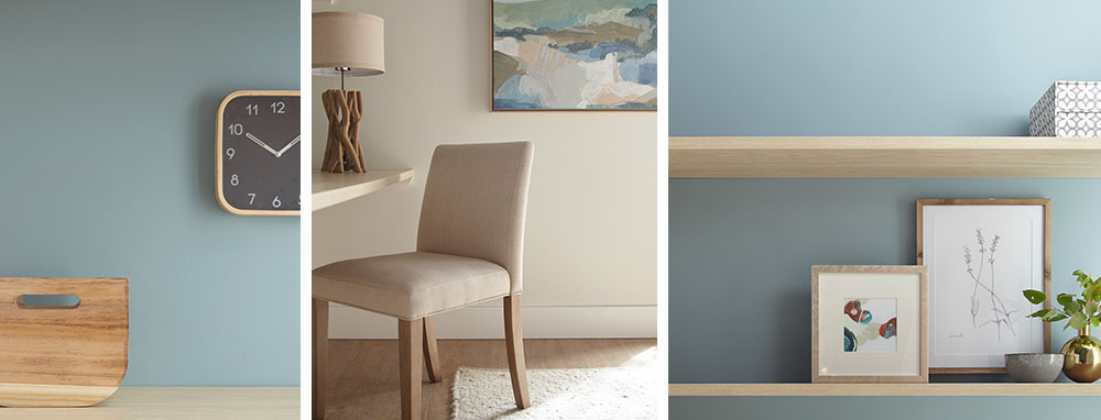
We started with KILZ 2® All-Purpose Primer, which covered up the unsightly scuffs left behind from the old bookshelf and offered added adhesion to ensure the new coat of paint would roll on evenly and easily. For our paint color choices, we opted for a fresh, contemporary office look—casual, light and attractive, with pastel shades that are easy on the eyes. For the back accent wall, we chose Magnolia Home by Joanna Gaines® paint, in Sir Drake, a gentle gray balanced with aqua blue hues. We decided on a more intriguing and deeper shade (rather than a classic sky blue) because it made the wall pop with color, while still generating a calm, soothing vibe. Following a slightly coastal theme, for the sidewalls and bottom accent wall we chose Shiplap – a rich, creamy weathered white also from the Magnolia Home paint line.
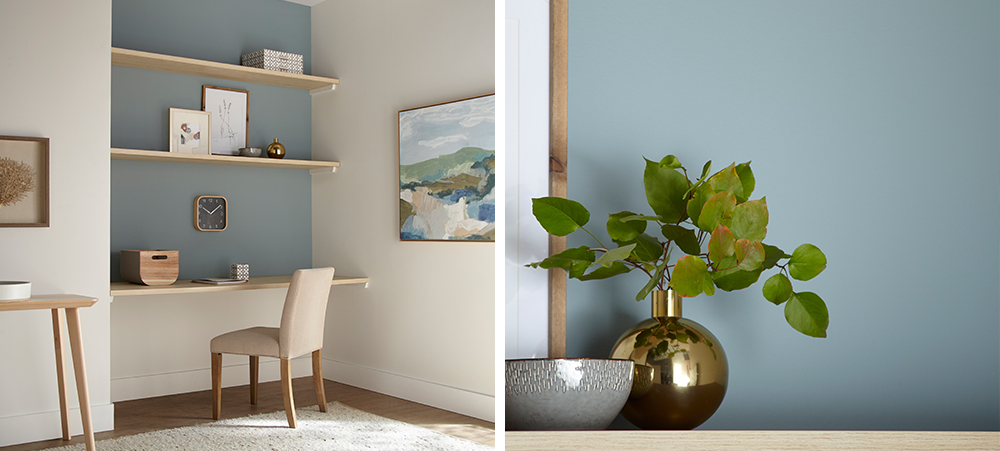
The mix of blue and white, combined with the natural wood shelving, achieved a slightly Scandinavian ambiance that felt just right. We accented the office nook with furnishings and accessories with a minimalistic, Danish-modern feel – a comfortable contemporary office chair in cream, a table in light varnished wood, nature studies in pale wooden frames, and accessories in wood, ceramic and brass, with touches of grey and blue throughout.
From Boring Back Room to A+ Study Area
The next transformation took a neglected room off a main living space and turned it into an appealing study space for two older kids. The heavy wood desk wasn’t making the grade and the clutter in the corner had to go. We decided to bring the room back to life with a bit of color to stimulate energy, imagination and creativity.
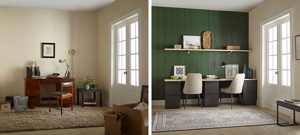
We started our project in a big way, by installing vertical shiplap boards over the back accent wall for instant visual appeal. A timeless and textural addition to any space, shiplap walls give you a designer look while being surprisingly easy and affordable to install – even if you’re a newbie DIYer.
Next, we covered our new shiplap wall with a coat of KILZ 2® All-Purpose Primer — a crucial first step when working with uncoated wallboards, because this multi-surface primer provides excellent adhesion and ensures the new paint glides on effortlessly.
Once the primer dried, it was time to choose the color. We opted for a warm, inviting green – KILZ® Tribute® Paint in American Pine (TB-69). This rich, eye-catching hunter green was perfect for the look we were going for, a modern take on the comfy/cozy traditional farmhouse style.
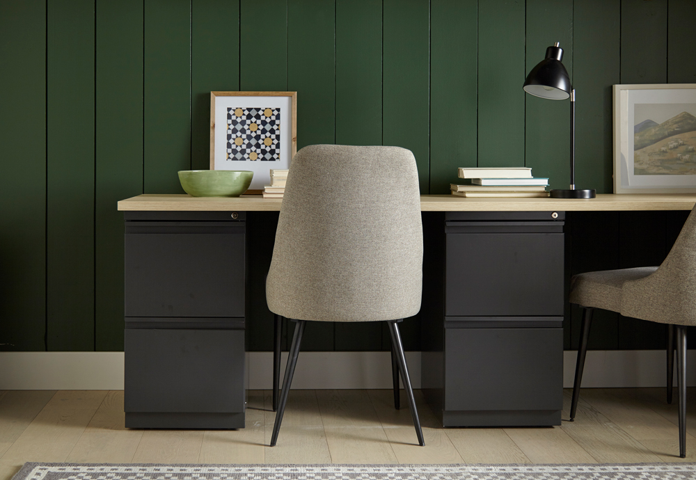
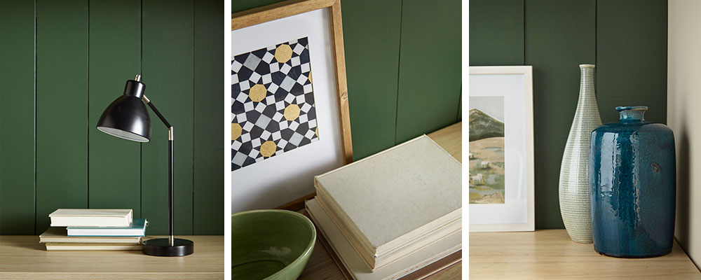
We added a convenient floating shelf for accessories; and, since space wasn’t a huge issue here, we were able to fit in a fantastic double desk, consisting of a simple deep-drawer base topped with pale wood to match the shelving. For added comfort, we replaced the dated desk chair with fully upholstered chairs in neutral shades to tone in with the rest of the room. To go with the woodsy green theme, we added accessories in wicker, nature-themed photos with pine frames and other knick-knacks in sage and blue tints—a bowl here, a vase there—to complete the look.
Always remember to refer to our website kilz.com or product back labels for additional information on which primer is right for your project and detailed instructions on how to apply our products.
RELATED ARTICLES
get inspired:
FOLLOw us:
@kilzbrand
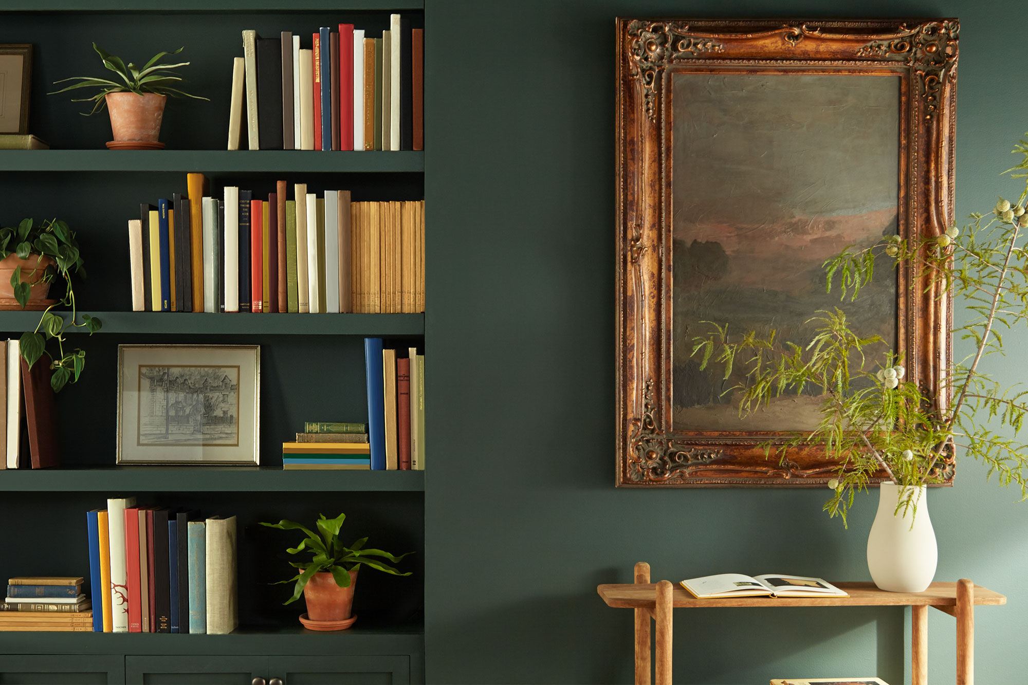
Magnolia Home: Cozy Green Library
February 12, 2021If you’re looking for color inspiration for a reading room or home office, this library is proof that a deep, rich color can set the scene. While it might seem like a bold choice to cover all four walls, the right shade can add a sense of comfort and refinement to your space. This paint color, 1905 Green from Magnolia Home by Joanna Gaines®, is a forest green hue that brings this library to life.
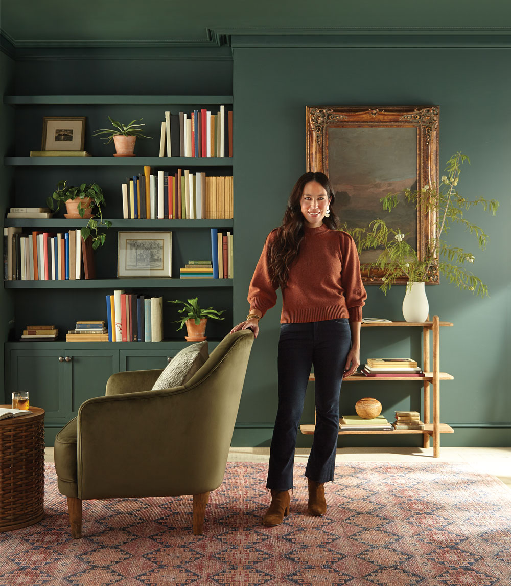 “I love the way this moody, dark green comes to life on the walls – balancing depth and sophistication with familiarity and comfort.”
– Joanna Gaines
Introduced last year to the Magnolia Home by Joanna Gaines® paint palette, 1905 Green was originally created for Magnolia Press Coffee Co. in Waco, Texas, covering both its interior and exterior. The mix of deep blue and jewel-tone green nicely complements warm accents and rich textures, like the bronze-framed artwork and cozy velvet reading chair featured in this sophisticated and inviting library.


Magnolia Home by Joanna Gaines paint is available at select Ace Hardware store locations, and online at AceHardware.com and Magnolia.com.
RELATED ARTICLES
get inspired:
FOLLOw us:
@kilzbrand
join the conversation:
SHARE this post: