Author: Katelyn Grover
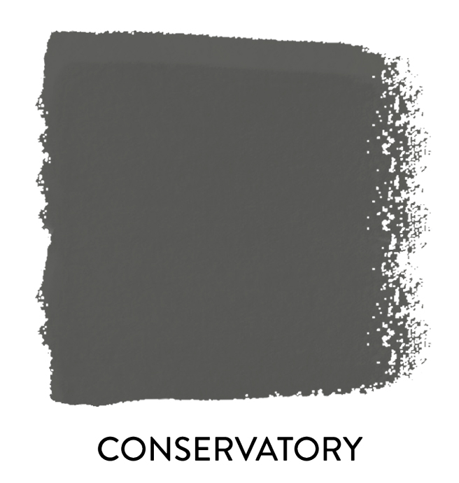
THE CASTLE COLLECTION: CONSERVATORY
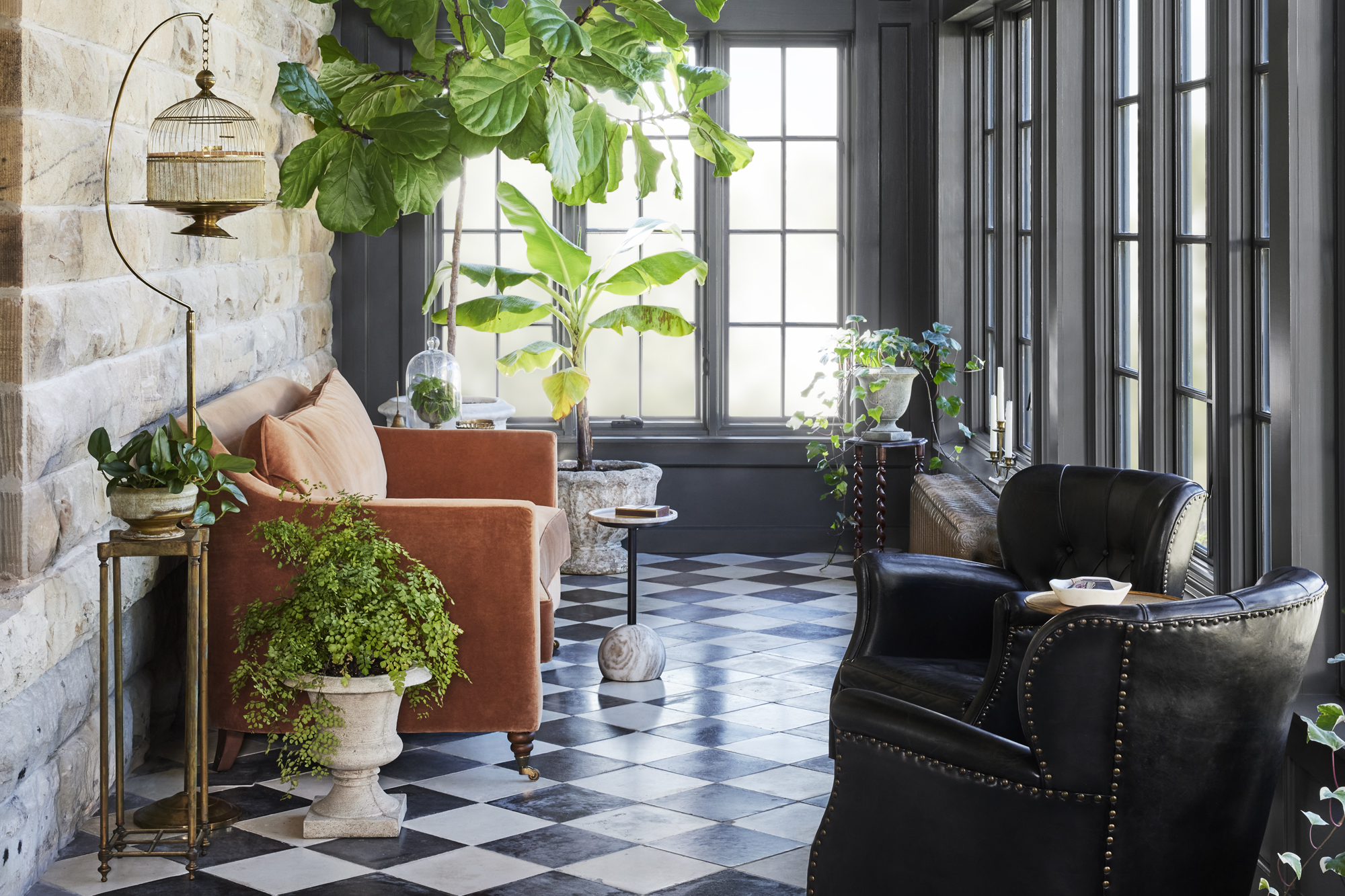
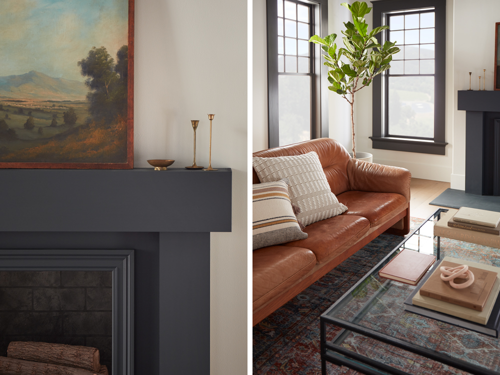
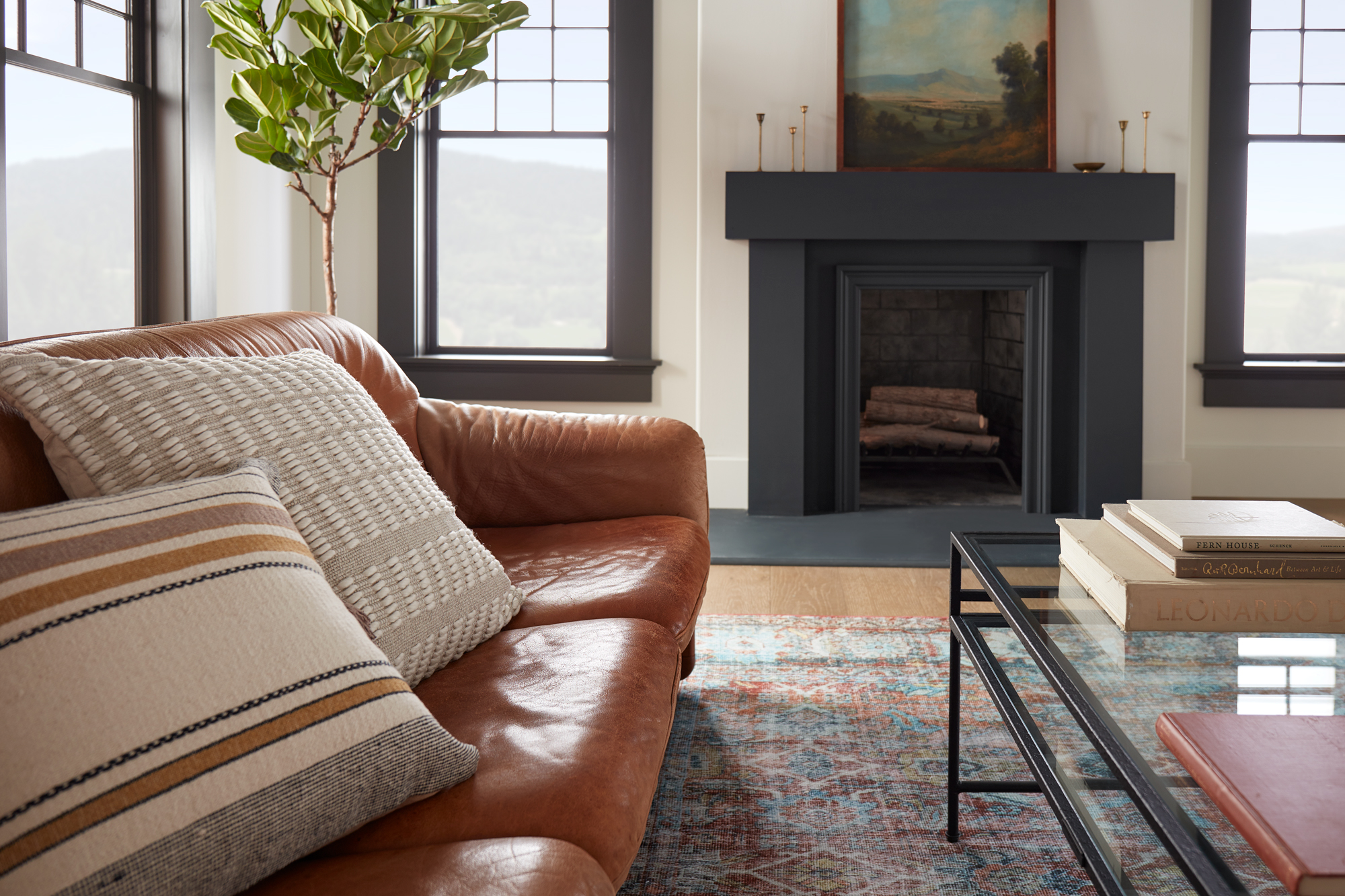
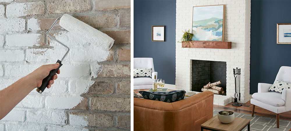
October 25, 2023Rich, warm and dark are some of the words used to describe this moody gray. A quick fan favorite, Conservatory, was inspired by the Castle renovation and transformed the once dull room into a vibrant space full of life.
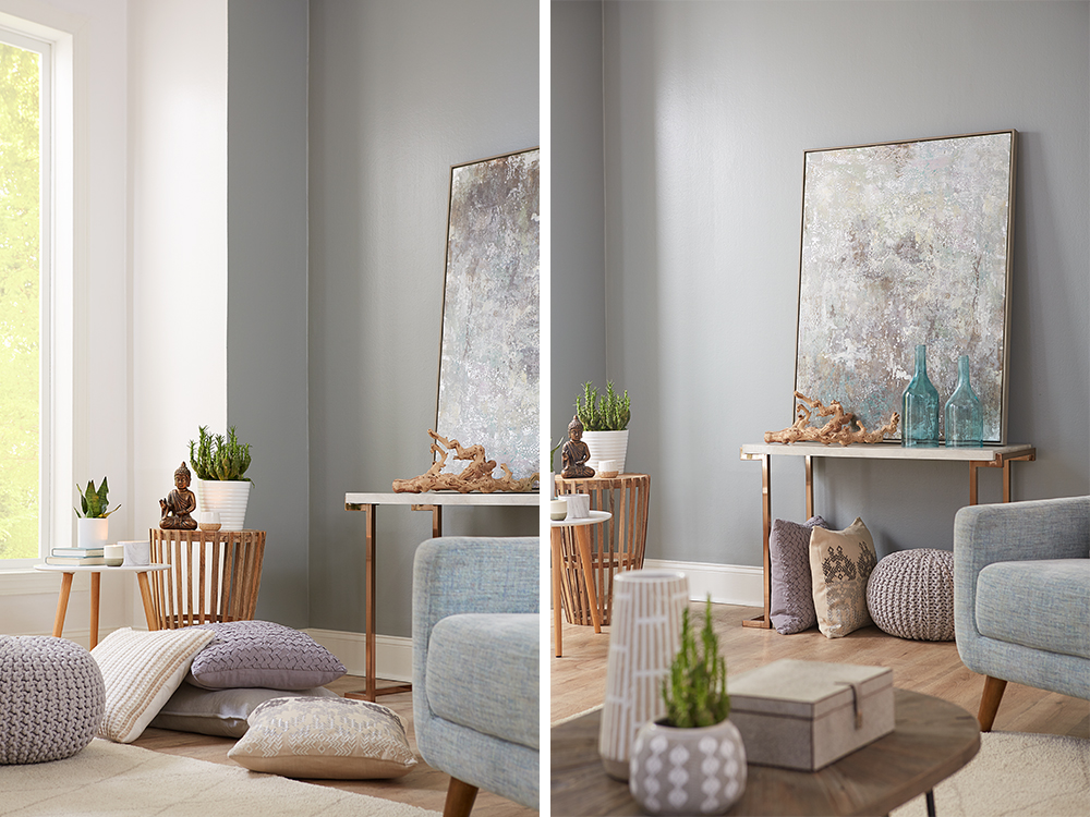
Conservatories, also known as sunrooms, are a nice choice for those looking to add some extra living space to their homes. What started out as a greenhouse in the original castle floorplan was eventually demolished, leaving this room to be built from scratch and converted into a conservatory and entertainment space. While this is the smallest room in the castle, it’s packed with charm and history.
The color Conservatory, which was named after the room itself, is a rich and warm dark charcoal gray that elevates any room and can bring in a unique contrast between your walls and décor.
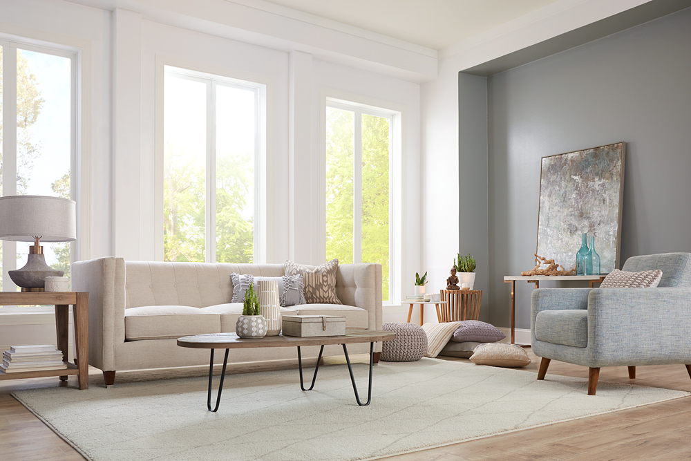
While the paint itself is on the darker side, the large windows illuminate this room giving it a cozy feel, and fun balance between enjoying the inside while feeling like you are outside. This color will make even the smallest rooms feel spacious and elegant.
 |
“The understated beauty of a deep charcoal gray adds just the right amount of sophistication and versatility.”- Joanna Gaines |
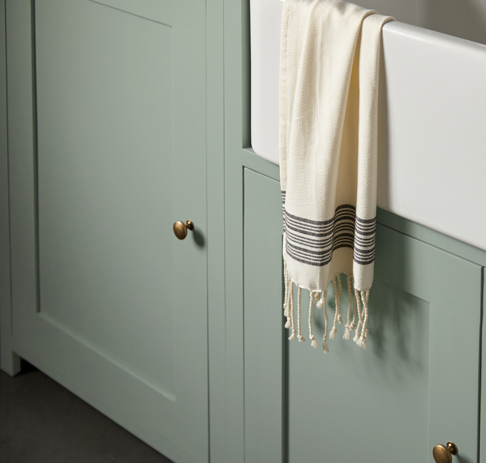
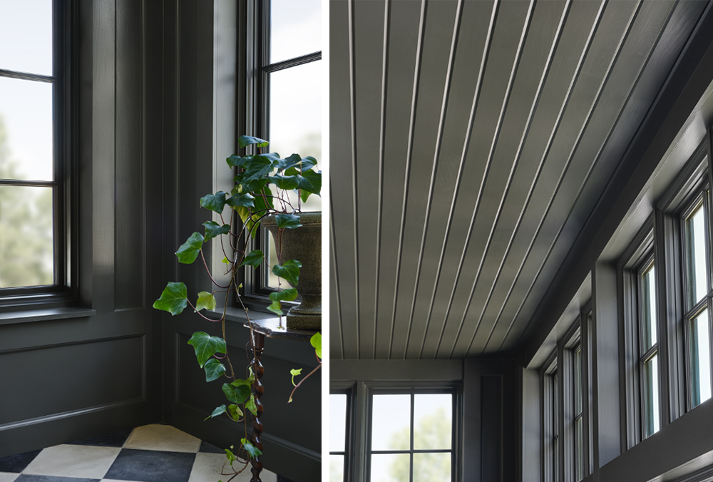 Refurbished concrete tiles, from a historic chateau in France from the same time period as the castle pair perfectly with the deep walls, bringing its history back to life. Full of natural light, plants, and a complimentary terracotta couch, the Conservatory is the perfect place to relax and enjoy a cup of coffee at dawn.
Encouraged to tackle a project using Magnolia Paint, color Conservatory? Check out the pallet below that compliments and coordinates with its rich and warm tones.

Silos White

Blanched

Sage Stem

Secondhand Find

Gold Moss
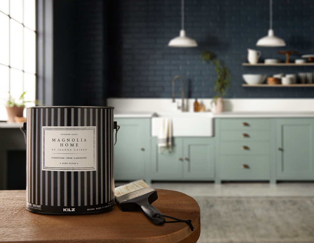
“Where can I buy Magnolia Home by Joanna Gaines Paint?”
These paint colors are now available at Ace Hardware, Lowe’s, and Magnolia.com/shop.
Always remember to refer to our website kilz.com or product back labels for additional information on which primer is right for your project and detailed instructions on how to apply our products. Check out our Coverage Calculator to understand your estimated paint needs for your upcoming project.
RELATED ARTICLES
get inspired:
FOLLOw us:
@kilzbrand
SHOP
PRODUCTS
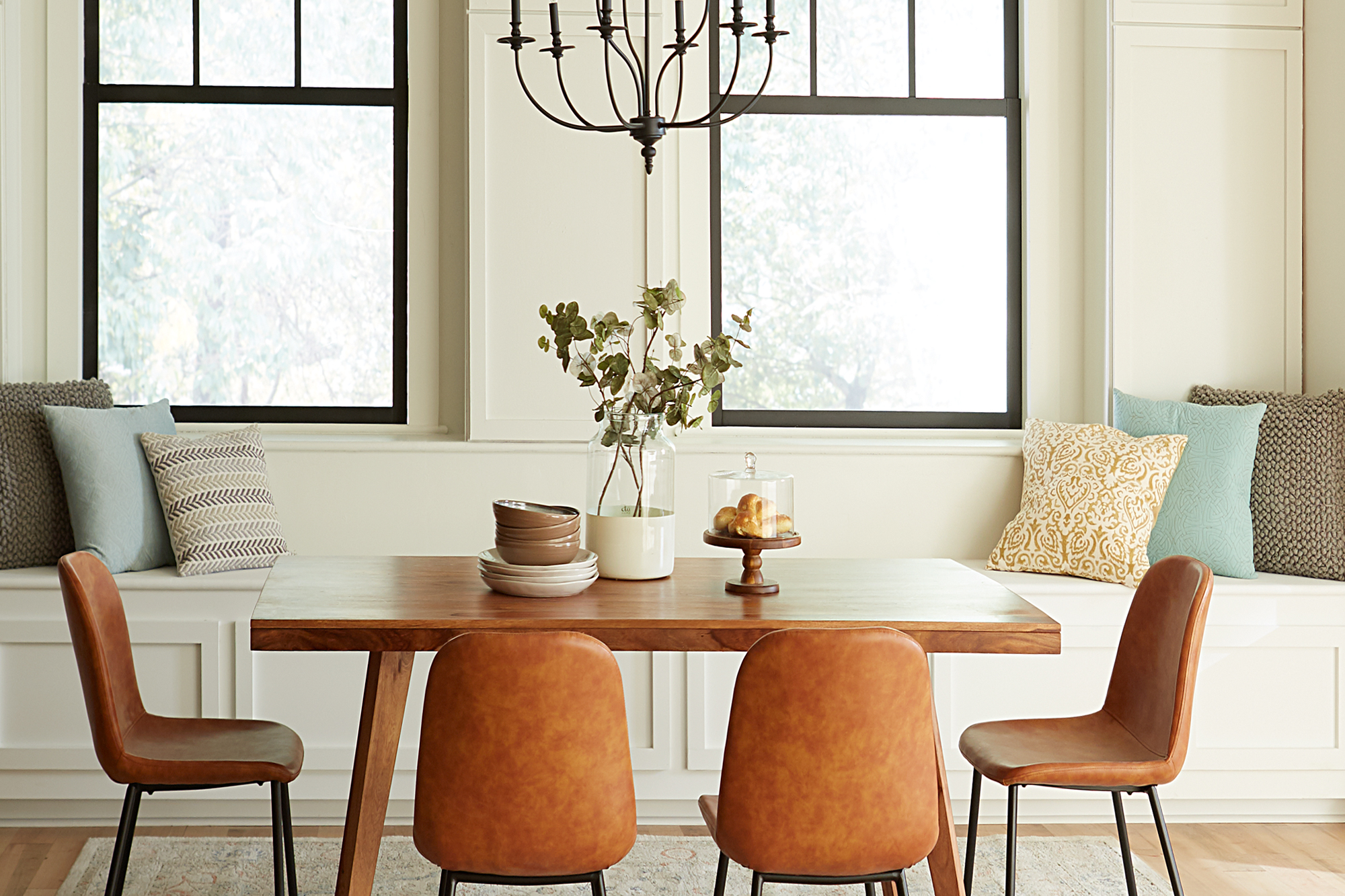
Dining Room Designed for Mindful Living
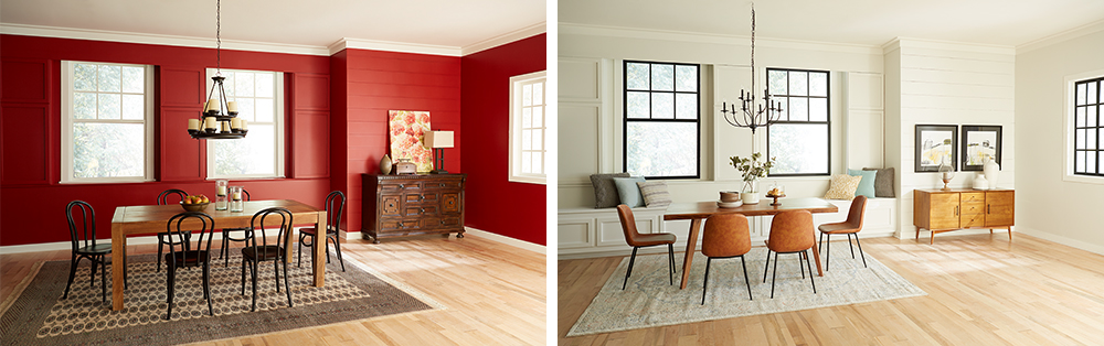
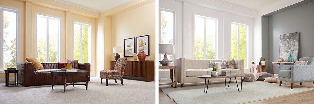
August 11, 2021A component of a balanced lifestyle is being able to slow down and relish each moment, including meals with family and friend. A light and inviting dining room can encourage you to savor the experience of every bite, while conversely a drab or too-intensely colored space can have the opposite effect. This brooding red dining room was decorated in a Mediterranean style, but its heavy atmosphere and dark furniture were uninviting and uninspiring.
Mediterranean design style, however, doesn’t have to mean dark paint colors and heavy furniture. For this dining room makeover, we kept to the existing Mediterranean theme but took in a light and bright direction – drawing inspiration from sunlight sparkling on light blue seawater and the quintessential, white-walled homes blanketing the hills of Greek islands.
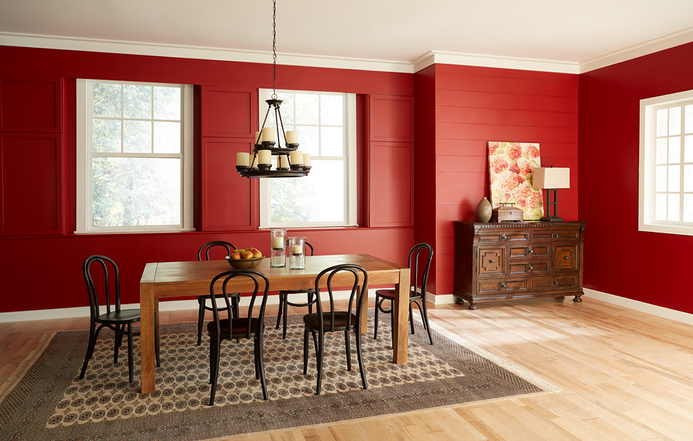
Our first step in creating a sense of tranquil enjoyment was to take the walls from saturated deep red to an airy light neutral that invites you in. In order to do justice to our new paint color, and allow its subtle tone to shine, we had to make sure there would be no shadow from the previous dark red. We used KILZ 3® Premium Primer, because its thick and creamy formula is ideal for hiding dark colors and creating the perfect foundation for new paint. Furthermore, old dining room walls can often have stains, and KILZ 3 covers heavy stains and hides surface imperfections.
Once we had the dark red completely covered with a coat of primer, we were able to bring in the light with fresh white paint. We chose One Horn White, from Magnolia Home by Joanna Gaines® Paint. This airy, cream color has a beautifully neutral quality, with a slight beige tint added to the warm white base. Pale colors like this one can instantly make your space feel larger.

To enhance the sense of invitation, we added a built-in window seat. By painting the bench in the same color as the walls, we kept the room feeling open and emphasized the connection of the room with the outdoors.
New décor elements were selected to bring a sense of lightness and ease into the space. While darker or more saturated colors tend to downplay textures, the new light walls will bring texture to the forefront. In the new dining room design, we introduced textural elements including pillows and a cream-colored woven rug. Similarly, the darker paint around the windows suddenly draws our attention to them, while in the original room they were almost lost in the dark red.
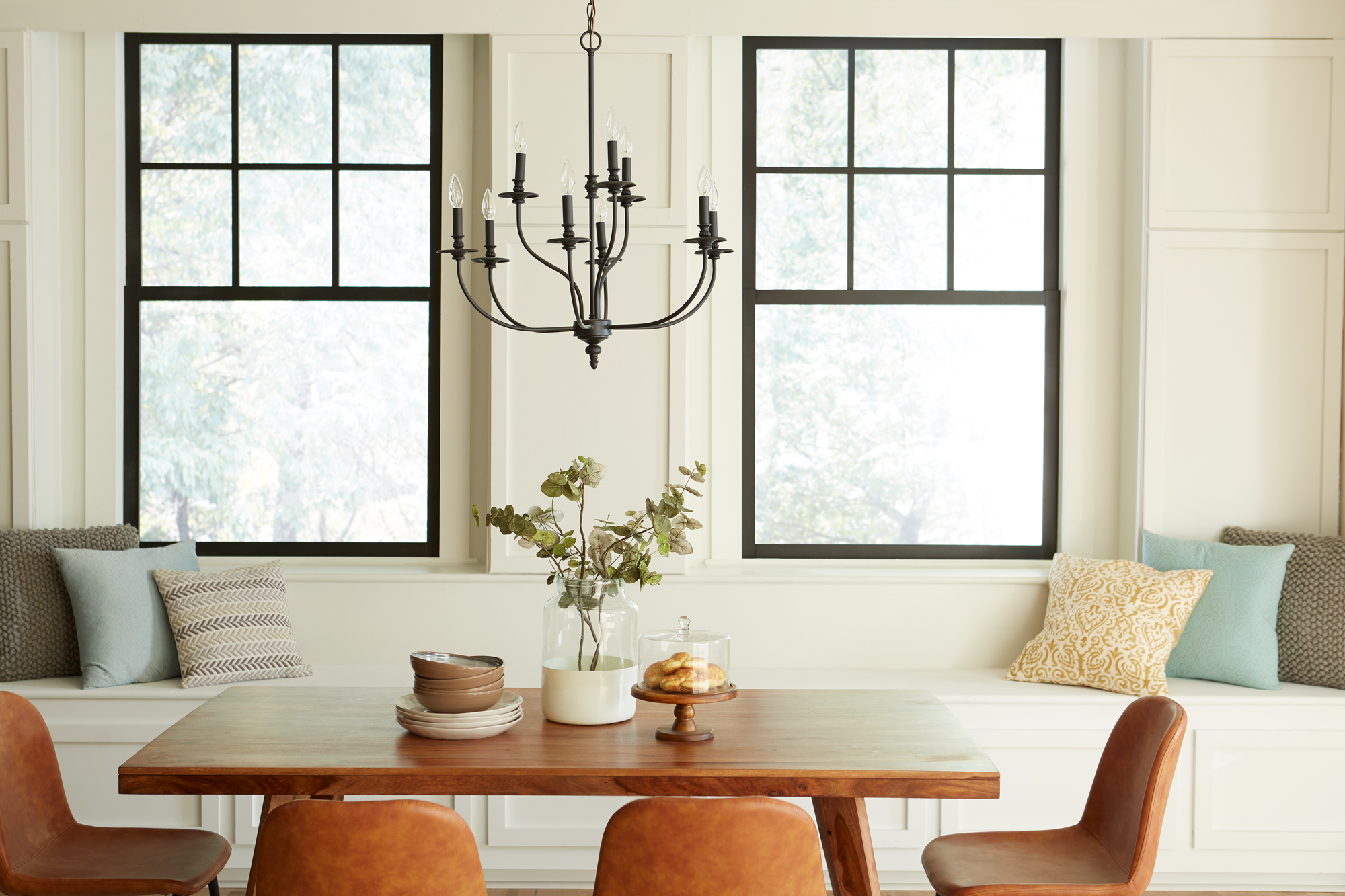
We also made the room brighter by swapping in a graceful new light fixture and by bringing a sleek, natural-wood buffet to replace the previous heavy, dark cabinet. The fact that our gaze naturally travels underneath the new cabinet, perched on its slender legs, is another small decorating detail that makes the room feel more spacious.
The end result of our makeover is a dining room that draws you in and invites you to linger. In a room that feels welcoming, conversation and eating will mingle, and the experience will naturally be more relaxed.
Always remember to refer to our website kilz.com or product back labels for additional information on which primer is right for your project and detailed instructions on how to apply our products.
RELATED ARTICLES
get inspired:
FOLLOw us:
@kilzbrand
Magnolia Home: Classic and Cozy Living Room
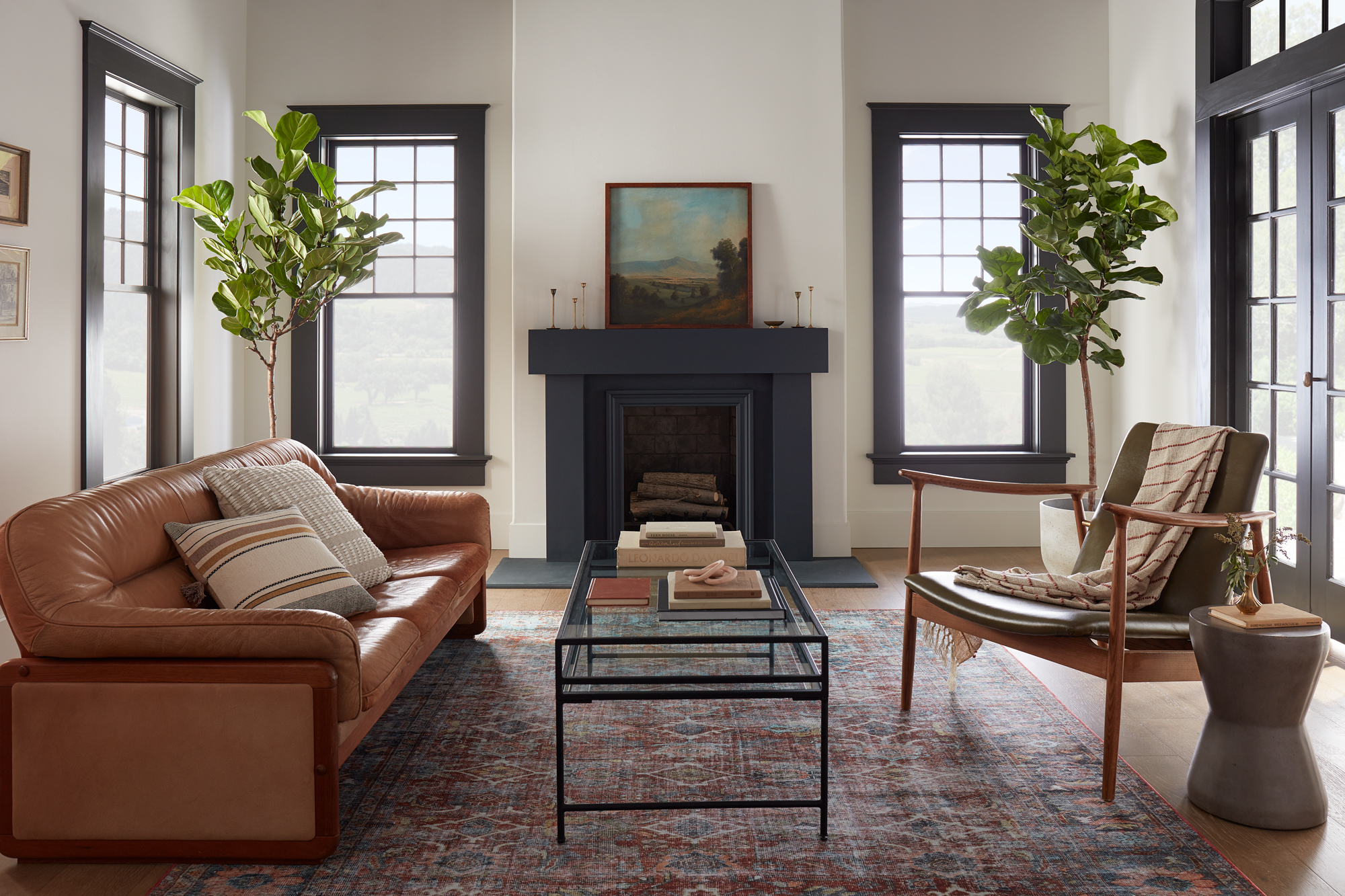
August 2, 2021Contrasting dark and light colors in a room’s design can make a classic statement. In this modern living room featuring Magnolia Home by Joanna Gaines® paint, a softer take on the traditional black and white paint pairing offers a modern yet welcoming feel.
“The contrast of the dark trim and light walls brings this room to life, giving it both a traditional and a modern feel.” – Joanna Gaines
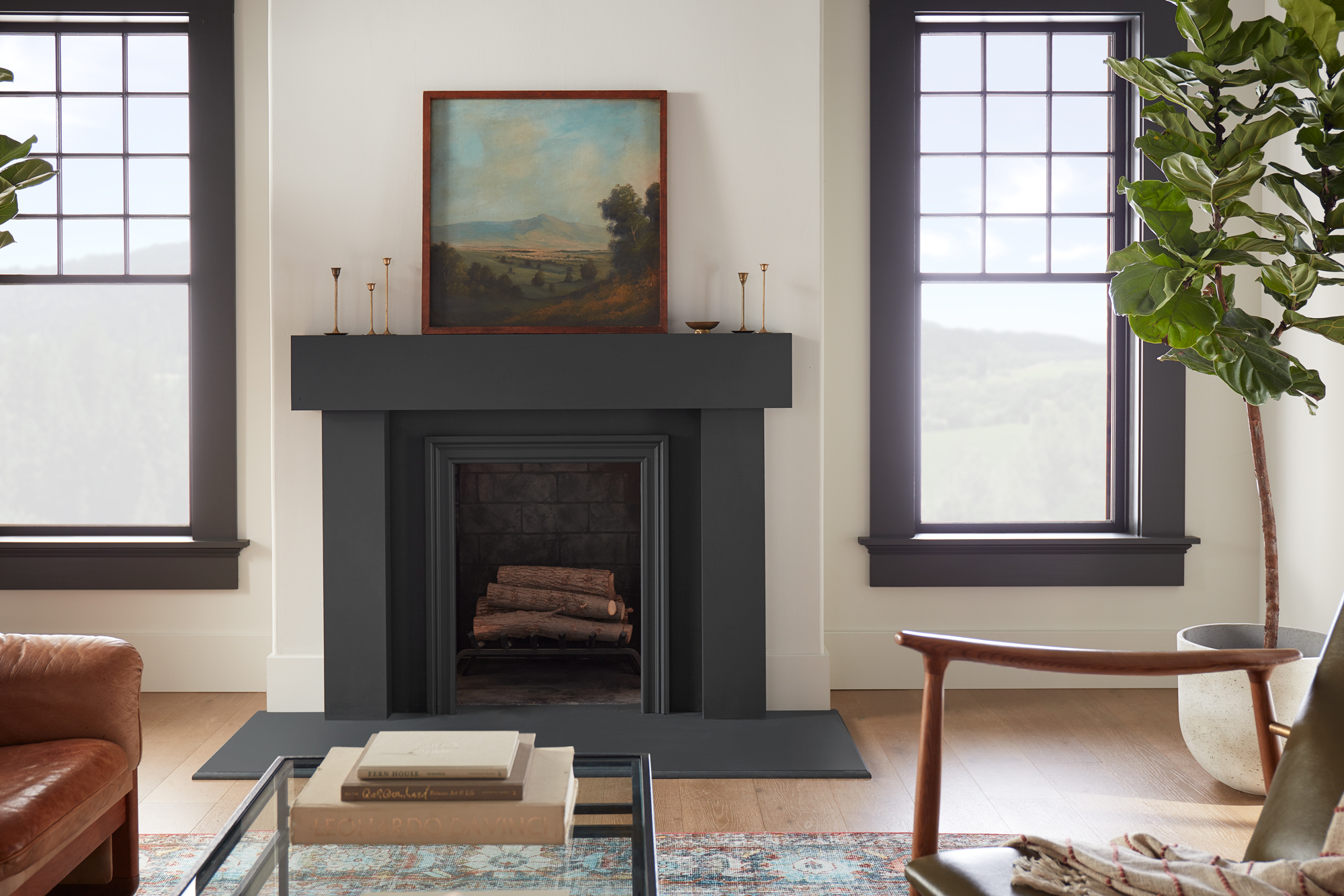
The fireplace was a natural focal point for this living room design and painting it a darker hue was an easy way to make it stand out in the large and open space. The chosen color from the Magnolia Home by Joanna Gaines paint line, Prairie Smoke, is a softer almost black with green undertones. It pairs perfectly with the wall’s creamy weathered white paint color, Shiplap – a can’t-go-wrong neutral from the Market Collection palette. A curated collection of 25 colors personally crafted by Joanna Gaines, the Market Collection takes the guesswork out of choosing coordinating colors.
Painting the windows and large French doors in the same dark color complements the fireplace, while still letting it draw the eye. The black and white backdrop created by the chosen paint colors offered many design possibilities for the living room’s furniture and décor items. A warm-toned leather sofa and plush neutral throw pillows bring a sense of relaxation and coziness into the open and airy living room.
A jewel toned area rug, sleek metal and glass coffee table and a modern wood and leather armchair create a welcoming space for conversation. And to bring the outdoors in, two large Fiddle Leaf Fig trees flank either side of the fireplace, topped with a beautiful landscape painting.
Inspired by this modern living room and looking for colors that complement a black and white color scheme for your own space? The curated palette below offers shades that complement Prairie Smoke and Shiplap.


Magnolia Home by Joanna Gaines paint is available at select Ace Hardware store locations, and online at AceHardware.com and Magnolia.com.
RELATED ARTICLES
get inspired:
FOLLOw us:
@kilzbrand
SHOP
PRODUCTS


Living Room Makeover with Meditation in Mind
June 21, 2021In this living room makeover, we set out to create a comfortable and functional meditation area that could be stored away when not in use. The living room’s large windows made it a perfect light and airy space to relax in, but the feeling of the room was weighed down by the old paint color and dark, heavy furniture. It was time to say goodbye to dull yellow walls and breathe new life into this living room with primer and a fresh coat of paint in calming colors.
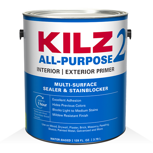
For the primary walls and mullions, we began with a coat of KILZ 2® All-Purpose Primer, a dependable choice for covering up previous paint colors. The pros know that a quality primer acts as the perfect foundation for any paint job; and in this case, KILZ 2® All-Purpose Primer provided coverage to hide the old yellow paint, while its adhesion properties made it a breeze for our new paint colors to glide over the walls effortlessly. KILZ 2 primer also adds amazing longevity and durability to painted walls by working as a sealer and stain blocker.
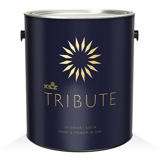
Once our primer dried, it was time to start painting. Sometimes a too-bright white can seem harsh in a sunny room, so we chose KILZ® Tribute® Paint in Contemporary White (TB-02) for the walls and ceiling. This particular shade of white has a subtle blue undertone that cooled down the brightness just a notch, while providing a gentle, reflective backdrop for the sunlight streaming in.
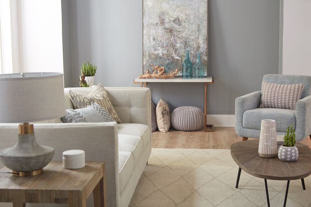
We followed the same steps — primer followed by a coat of paint — for our accent wall, choosing this time a contrasting color: KILZ® Tribute® Paint in Stone Cold (TB-66), a medium-dark gray with subtle pale green undertones. This neutral gray created a calming effect, while toning down the brightness of the white walls and ceiling.
As you can see in the “before” photo, nothing looks duller than a bland expanse of carpet, so it was an easy choice to replace it with luxurious gray hardwood flooring, topped with a plush cream-colored rug quilted in an attractive diamond pattern.

Because we wanted to maintain a light, airy feel, we chose contemporary style furnishings in complementary colors, including an understated, quilted-back sofa with soft plump cushions and a cozy armchair in a fabric that matches our accent wall to perfection. We added a bit of diversity with a natural wood finish coffee table that stylistically hints at Danish Modern, and a simple butcher block end table.
We accessorized with a couple of wood accent tables, including an attractive console table that we used to support a stunning modern painting that reflects both of the room’s primary colors. We upped the comfort level several notches by adding overstuffed pillows in complementary shades.
Given the stresses of this past year, our goal for this room was to create a calm, soothing oasis for rest and relaxation. To accomplish this goal, we used an empty corner space to create a meditation station, complete with comfortable, oversized pillows and a few decorative items. Pillows are ideal for creating an on-the-spot meditation corner in any room, because once you’re done, you can easily remove them and store them away — in this case, under the console table.
Primer and a coat of paint are the two valuable tools you can have for a DIY makeover project. Primer protects and enhances your paint job, while a coat of gleaming paint can transform any space. Once you choose the right colors for your design scheme, you can add to the ambience with a few carefully chosen pieces of furniture and accessories.
Always remember to refer to our website kilz.com or product back labels for additional information on which primer is right for your project and detailed instructions on how to apply our products.
RELATED ARTICLES
get inspired:
FOLLOw us:
@kilzbrand
Magnolia Home: Bold Kitchen Colors
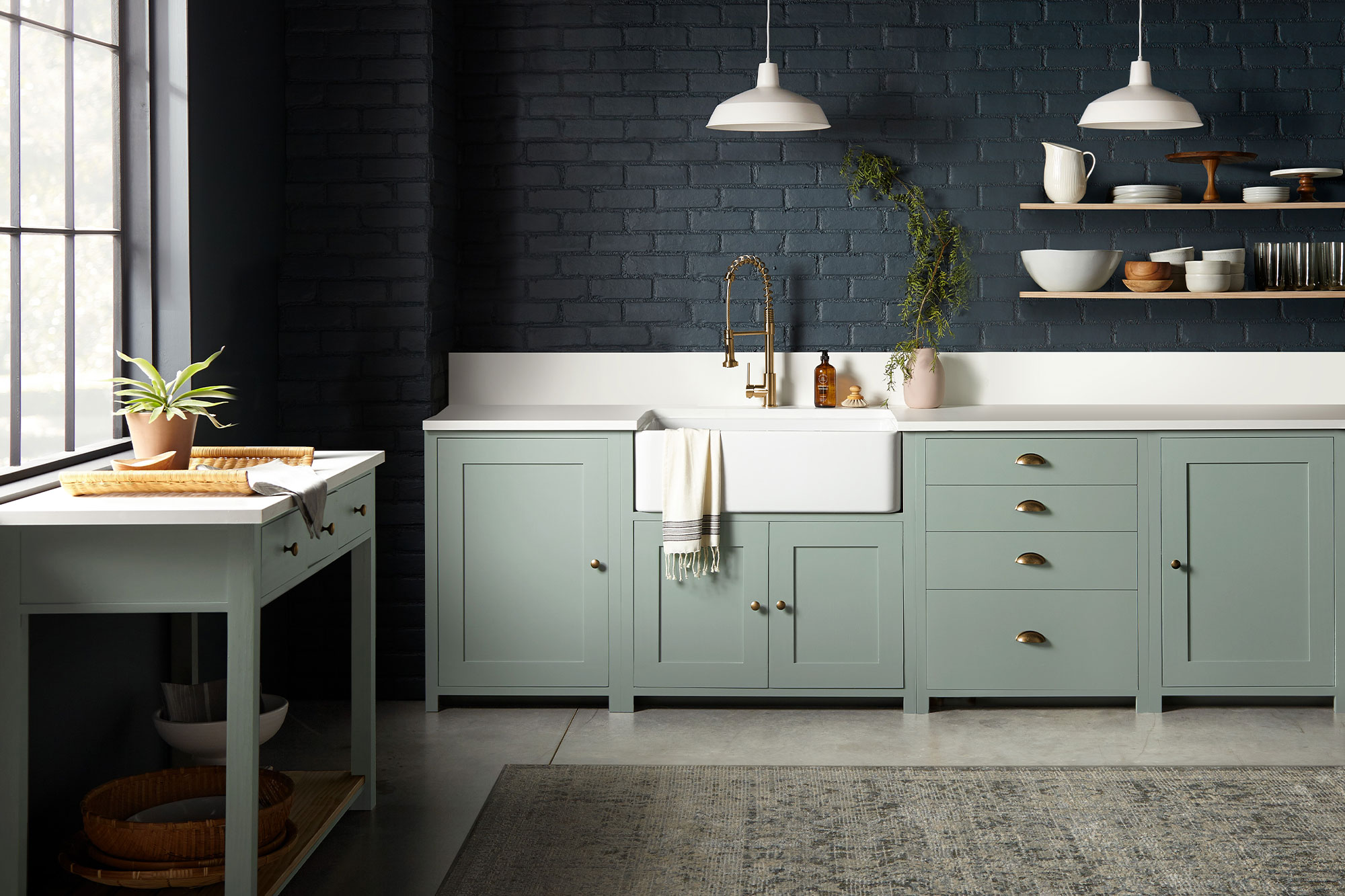
May 11, 2021While a bright white kitchen is a timeless and classic look, sometimes adding a dash of dark color in your space can be the secret ingredient to achieving an elevated design style. In this kitchen, the open and light-filled layout was ideal for a bold color choice on the walls or cabinets.
“Going with a dark paint color for a space might feel intimidating to some, but when you find deep, rich tones like these that beautifully elevate the space, the risk is worth it.” – Joanna Gaines
The brick walls in this kitchen had a beautiful natural texture that combined with the light pouring in from the large open window, made for an ideal surface to hold a darker paint shade. The chosen color, Magnolia Home by Joanna Gaines® paint in Coffee Nook, offered the depth desired (a dark, smoky gray) with a softness that comes through in the blue undertones.
To complement the deep and dark walls, the cabinets were coated in a paint color with a similar gray hue but in a much lighter shade. The chosen color, Clean Slate, brought together a perfect pairing of cement gray and blue undertones. A white farmhouse sink and bright white countertops added airiness to the space, while minimalist open wood shelves added interest to the dark, brick wall.
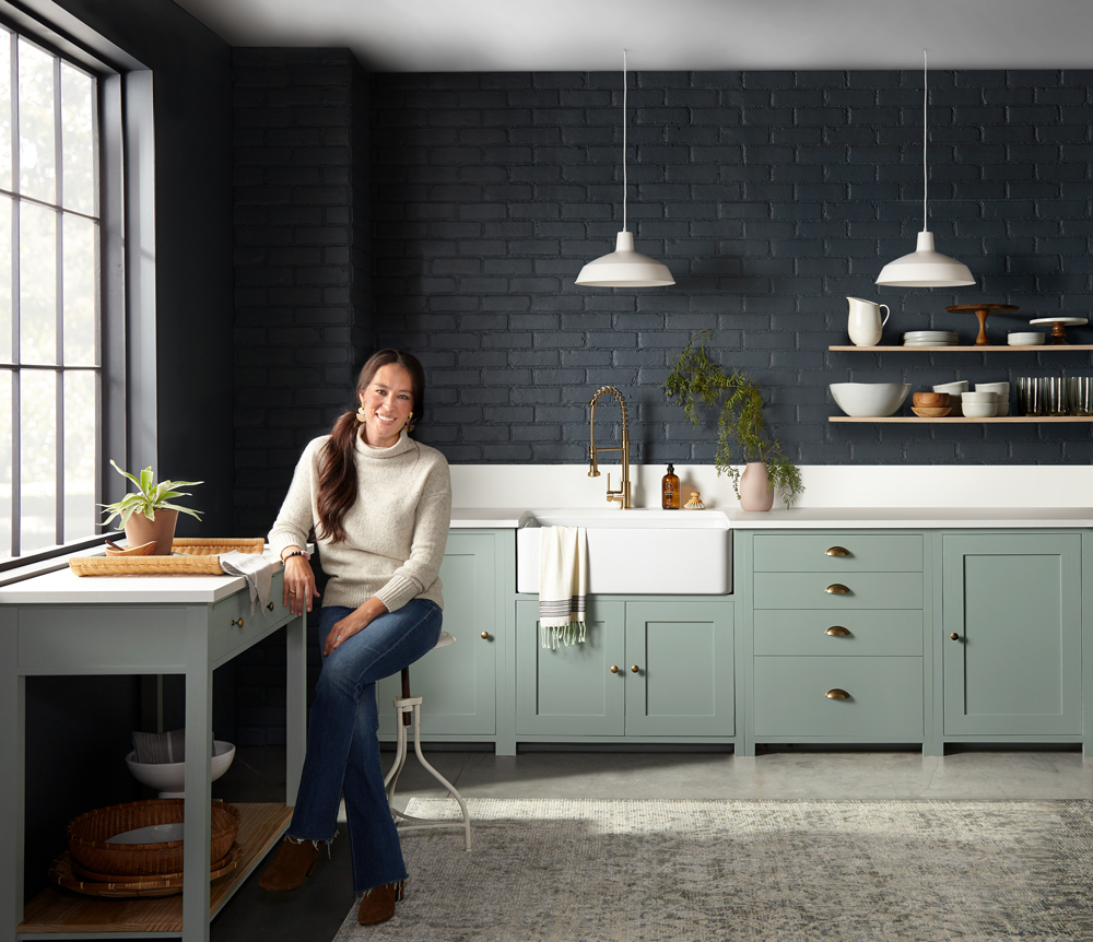
This resulting kitchen is a design and culinary masterpiece, and proof that bold and dark color choices can be just the thing to take a design from simple to decadent. If you’re looking to explore using bold colors in your space and aren’t sure what to pair them with, explore the palette below of shades that complement Coffee Nook and Clean Slate.


Magnolia Home by Joanna Gaines paint is available at select Ace Hardware store locations, and online at AceHardware.com and Magnolia.com.
RELATED ARTICLES
get inspired:
FOLLOw us:
@kilzbrand
SHOP
PRODUCTS
WFH Spaces that Inspire Great Work
February 12, 2021In the last year our homes have become more multi-functional than ever, becoming the spaces many people work and even go to school. Creating a space that can serve as an office or study area can be a challenge – especially if you don’t have an extra room just sitting empty and waiting for a makeover. But with a little creativity and the power of primer, you can create a gorgeous WFH (or study at home) area in just about any size space. Read on to see how we took two drab, uninspiring spaces and transformed them into attractive, design-forward offices and study areas that would motivate anyone to do their best work.
The key to our success? A layer of KILZ® Primer and a coat of fresh paint — once again proving that hard-working primer and quality paint are cost-effective tools in any type of interior makeover. Along the way, we added on-trend and functional furniture and a few eye-catching accessories. Here’s exactly what we did, and how we achieved these much-needed transformations.
From a Neglected Nook to a Happy Home Office
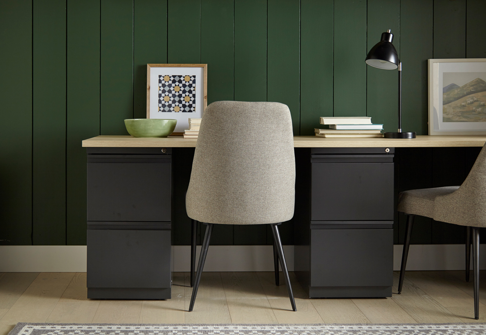
For our first transformation, a peaceful office was converted from an unused corner in a larger room. Given the limited dimensions, the space called for colors that would visually enlarge the area. Our first job was to open it up so you could feel like you’re working in a pleasant room, not a closet. Toward that end, we opted for light, airy shades that would add a subtle touch of color, while opening up the room to make it feel less confining. We also resorted to a tried-and-true designer’s trick—installing wall-to-wall shelving to create a space-saving recessed work area.
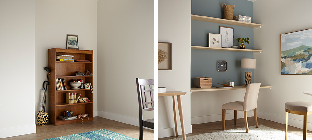
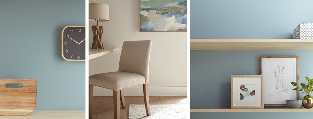
We started with KILZ 2® All-Purpose Primer, which covered up the unsightly scuffs left behind from the old bookshelf and offered added adhesion to ensure the new coat of paint would roll on evenly and easily. For our paint color choices, we opted for a fresh, contemporary office look—casual, light and attractive, with pastel shades that are easy on the eyes. For the back accent wall, we chose Magnolia Home by Joanna Gaines® paint, in Sir Drake, a gentle gray balanced with aqua blue hues. We decided on a more intriguing and deeper shade (rather than a classic sky blue) because it made the wall pop with color, while still generating a calm, soothing vibe. Following a slightly coastal theme, for the sidewalls and bottom accent wall we chose Shiplap – a rich, creamy weathered white also from the Magnolia Home paint line.
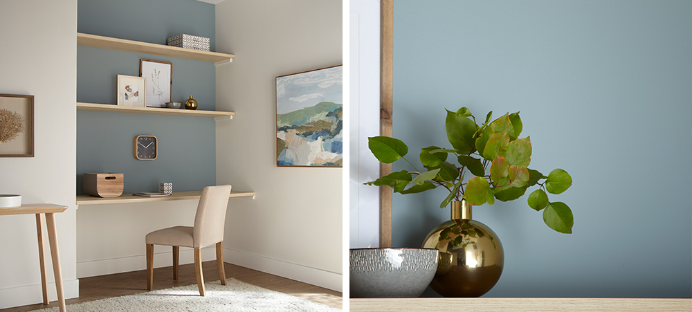
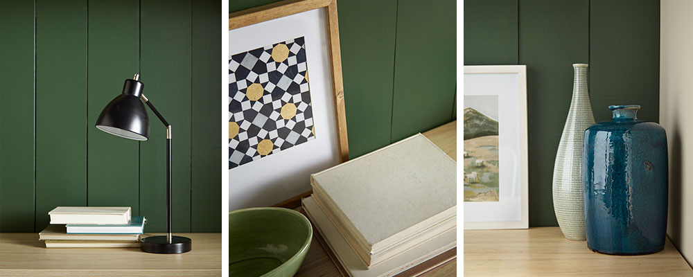
The mix of blue and white, combined with the natural wood shelving, achieved a slightly Scandinavian ambiance that felt just right. We accented the office nook with furnishings and accessories with a minimalistic, Danish-modern feel – a comfortable contemporary office chair in cream, a table in light varnished wood, nature studies in pale wooden frames, and accessories in wood, ceramic and brass, with touches of grey and blue throughout.
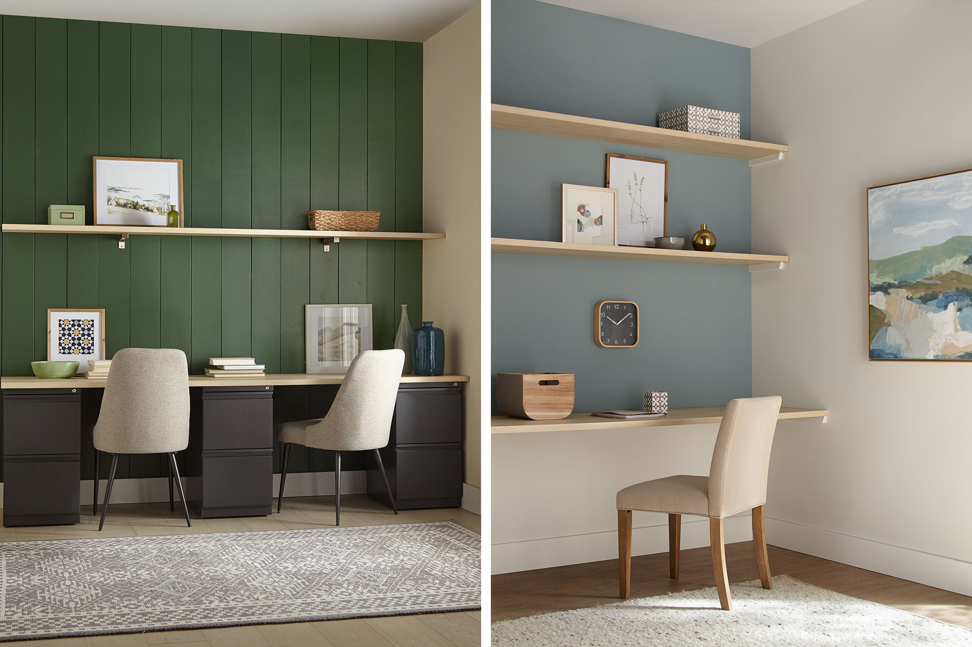
From Boring Back Room to A+ Study Area
The next transformation took a neglected room off a main living space and turned it into an appealing study space for two older kids. The heavy wood desk wasn’t making the grade and the clutter in the corner had to go. We decided to bring the room back to life with a bit of color to stimulate energy, imagination and creativity.
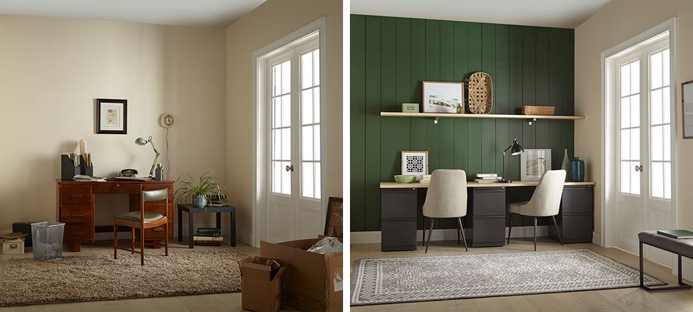
We started our project in a big way, by installing vertical shiplap boards over the back accent wall for instant visual appeal. A timeless and textural addition to any space, shiplap walls give you a designer look while being surprisingly easy and affordable to install – even if you’re a newbie DIYer.
Next, we covered our new shiplap wall with a coat of KILZ 2® All-Purpose Primer — a crucial first step when working with uncoated wallboards, because this multi-surface primer provides excellent adhesion and ensures the new paint glides on effortlessly.
Once the primer dried, it was time to choose the color. We opted for a warm, inviting green – KILZ® Tribute® Paint in American Pine (TB-69). This rich, eye-catching hunter green was perfect for the look we were going for, a modern take on the comfy/cozy traditional farmhouse style.
We added a convenient floating shelf for accessories; and, since space wasn’t a huge issue here, we were able to fit in a fantastic double desk, consisting of a simple deep-drawer base topped with pale wood to match the shelving. For added comfort, we replaced the dated desk chair with fully upholstered chairs in neutral shades to tone in with the rest of the room. To go with the woodsy green theme, we added accessories in wicker, nature-themed photos with pine frames and other knick-knacks in sage and blue tints—a bowl here, a vase there—to complete the look.
Always remember to refer to our website kilz.com or product back labels for additional information on which primer is right for your project and detailed instructions on how to apply our products.
RELATED ARTICLES
get inspired:
FOLLOw us:
@kilzbrand
Magnolia Home: Cozy Green Library
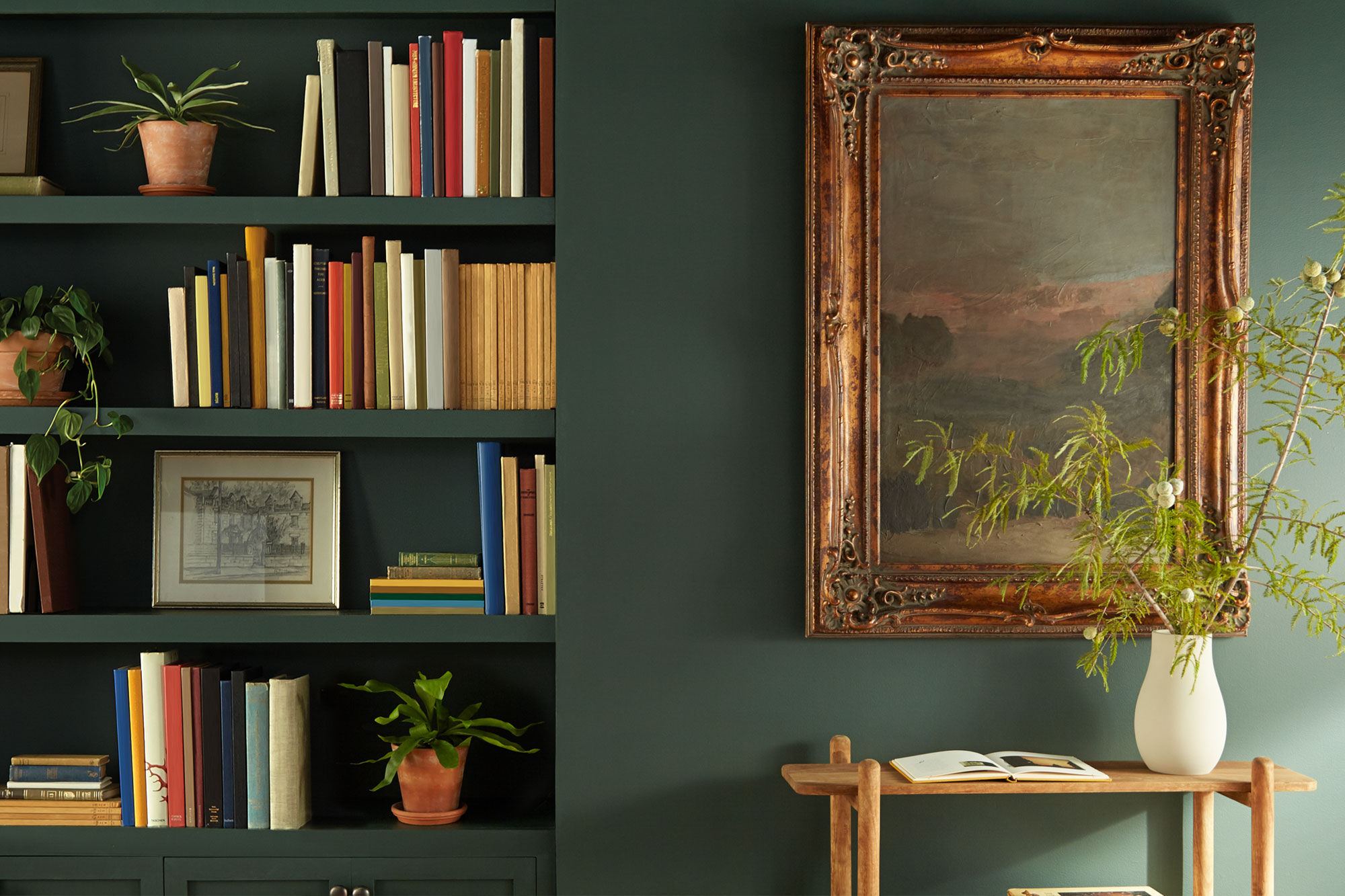
February 12, 2021If you’re looking for color inspiration for a reading room or home office, this library is proof that a deep, rich color can set the scene. While it might seem like a bold choice to cover all four walls, the right shade can add a sense of comfort and refinement to your space. This paint color, 1905 Green from Magnolia Home by Joanna Gaines®, is a forest green hue that brings this library to life.
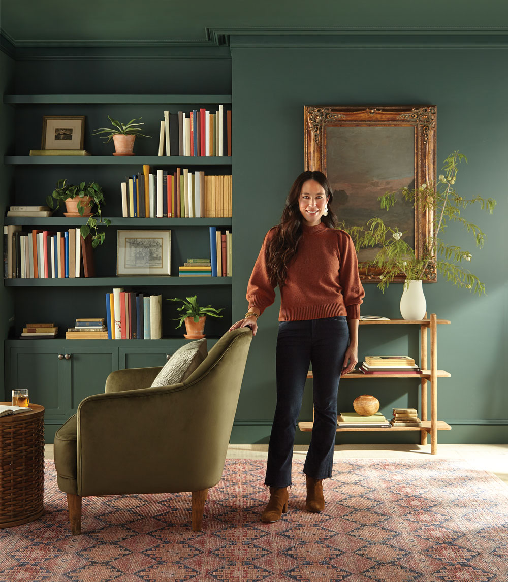 “I love the way this moody, dark green comes to life on the walls – balancing depth and sophistication with familiarity and comfort.”
– Joanna Gaines
Introduced last year to the Magnolia Home by Joanna Gaines® paint palette, 1905 Green was originally created for Magnolia Press Coffee Co. in Waco, Texas, covering both its interior and exterior. The mix of deep blue and jewel-tone green nicely complements warm accents and rich textures, like the bronze-framed artwork and cozy velvet reading chair featured in this sophisticated and inviting library.


Magnolia Home by Joanna Gaines paint is available at select Ace Hardware store locations, and online at AceHardware.com and Magnolia.com.
RELATED ARTICLES
get inspired:
FOLLOw us:
@kilzbrand
SHOP
PRODUCTS
Ask the Pro: Misconceptions About Primer and How Many Coats of Primer To Use
February 12, 2021
Here on The Perfect Finish, we’ve shared what primer can do for your paint job, tips on choosing the right primer for your project and step-by-step instructions on how to prime various surfaces. In this post, we’re excited to turn the tables and talk about what primer is not – debunking seven common misconceptions about primer.
To discuss these often-believed myths and misunderstandings about primer, we sat down with John Golamco – Product Manager, Primers at KILZ. A member of the KILZ team for over six years, John is a true expert on all things primer and has a wealth of knowledge to share. Ready to learn more? Let’s get rolling!
Misconception #1: Primer is just paint without color in it.
Although both primer and paint are classified as “architectural coatings” they are not the same. The formula of paint is different from the formula for primer. Paint is formulated to deliver color while primer is formulated to stick, better protect the surface, and in some cases block stains.
Misconception #2: Priming before painting takes too much time and won’t have a considerable effect my paint job.
Applying primer is indeed an additional step in the painting process but, depending on the surface condition and problem areas that might be present, investing in the primer step might actually save time and money. Applying primer to solve the problem (for example uneven, porous surfaces, strong colors or stains that might bleed through the paint, or adhesion issues that might cause peeling of the paint) before applying paint may prevent the need to re-paint or add several more coats of paint to get desired results.
Misconception #3: If I use primer over a stain and I can still see the stain through the coat of primer, the primer didn’t work.
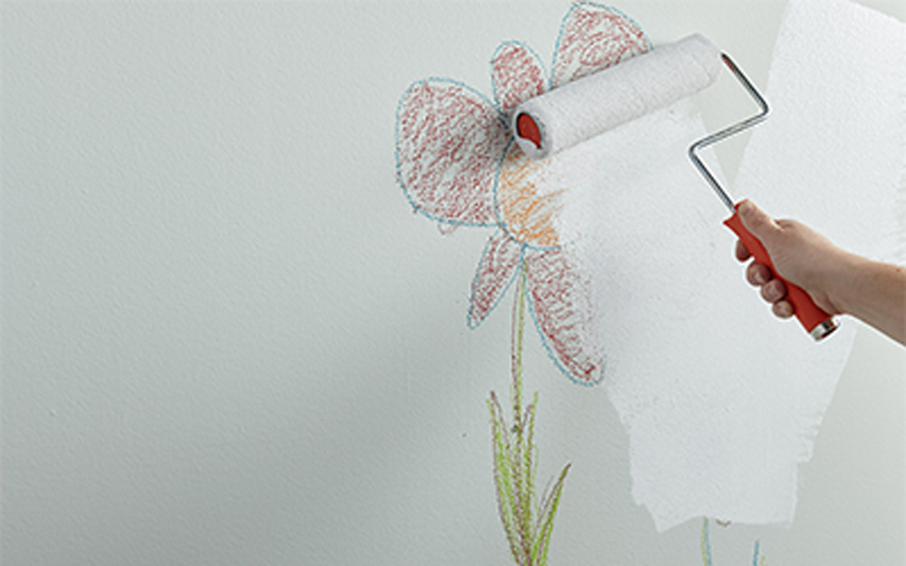
This is a quite common misconception about primer. A primer coat or coats is not meant to look like the finished topcoat paint. Primer is supposed to work underneath the paint to create a uniform surface, hiding strong or bright colors, block stains that might bleed through or show through the paint and enhance the paint’s ability to stick to the surface better and last longer. So even if the primer coat does not look like a fully painted wall, it will still perform the above functions. Then it is the paint’s job to completely cover the surface, deliver the color and look great.
Misconception #4: Primer is only for the walls.
Primer is mainly applied to walls, but it is not only used for that surface. It can also be used on other vertical surfaces like wood paneling, brick or stone fireplaces or other masonry. Some types of primers are also designed to apply to horizontal surfaces like furniture, windowsills, floors and countertops. It depends on the type of primer and where it is designed to be used for – always read the label and follow label instructions.
Misconception #5: I’m using primer, I don’t need to clean the surface first.
It is always important to properly prepare the surface before applying primer. At the very least, the surface has to be clean and free of dust, dirt and debris. Failing to clean the surface prior to applying primer may compromise the adhesion of the primer to the surface – which could lead to peeling and blistering.
Misconception #6: I need to add multiple coats of primer if I can still see my previous color.
Depending on how strong or bold the previous color is, it may be necessary to apply more than one coat of primer. However, it is not necessary to over apply the primer with so many coats. As long as the primer applies uniformly over the previous color, then one or two coats should be sufficient. Again, it is not necessary to apply several coats of primer to try to get a perfect white finish. That is the job of the topcoat (paint) which has to be applied on top of the primer.
Misconception #7: I don’t need to prime when painting outside.
Priming outside is just as important, if not more important, than priming inside. Exterior surfaces are typically exposed to the elements and are subject to expansion (from heat) and contraction (from cold). This and the exposure to wind, rain, snow and even dust, dirt, pollution, sunlight (UV) may cause the paint to fail due to lack of adhesion to the surface. Using an exterior primer first on a properly prepared surface can make a big difference to whether the paint lasts or potentially cracks, peels or blisters after a short period of time.
Always remember to refer to our website kilz.com or product back labels for additional information on which primer is right for your project and detailed instructions on how to apply our products.
RELATED ARTICLES
get inspired:
FOLLOw us:
@kilzbrand
SHOP
PRODUCTS
5 Things Primer Does for Your Paint Job
January 19, 2021Primer and paint belong together. A match made in design-heaven, primer helps paint to be the best it can be and is key to getting professional quality results. Read on below to learn five things primer does for your paint job and get inspiration for your next painting project.
Primer Makes Your Paint Job Durable
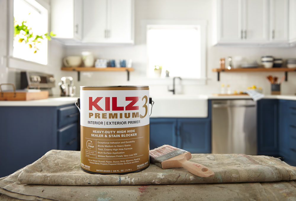
Over time, fluctuating temperatures and humidity levels can make paint peel. For spaces where this is normal like kitchens, using KILZ 3® Premium Primer (known for its exceptional adhesion and durability) before you paint can help ensure your paint job lasts longer. See the full kitchen transformation with step-by-step instructions here.
Primer Seals and Blocks Stains
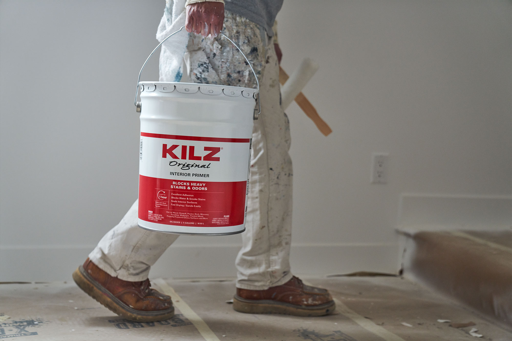
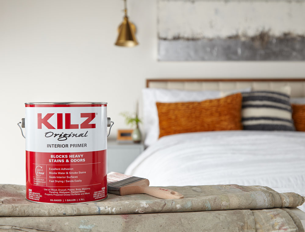
If you have a wall with unpleasant stains, for example smoke stains from a previous homeowner in a bedroom, KILZ® Original Primer with its powerful stain blocking formula is the one for the job. See how we freshened up a mid-century modern bedroom with primer here.
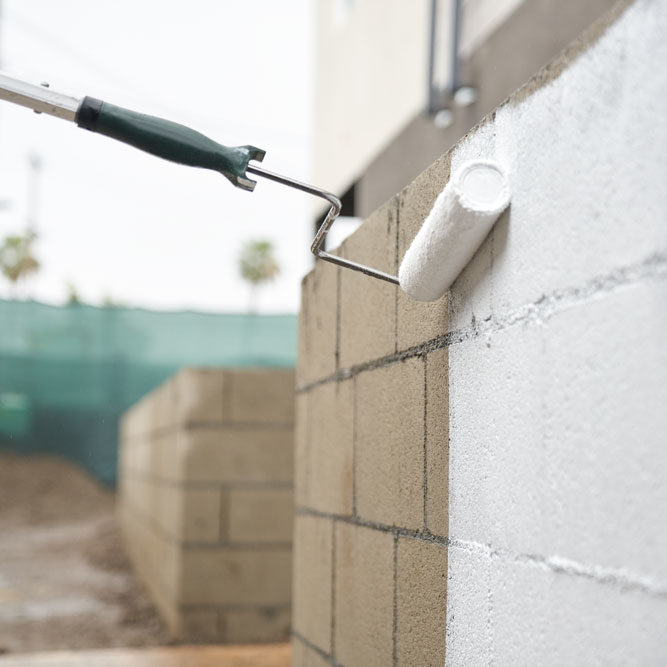
Versatile Multi-Surface Sealer
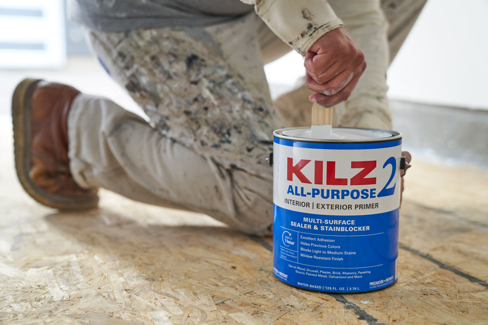
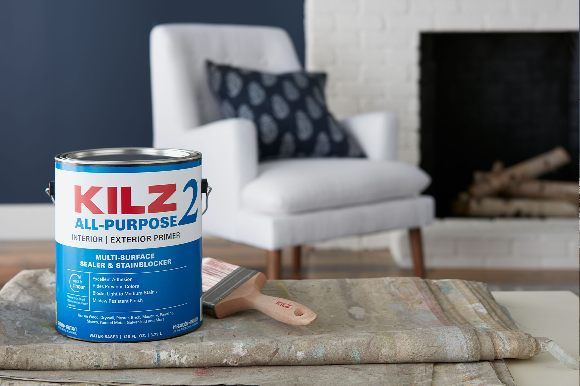
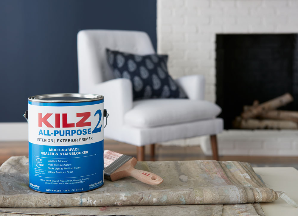
When you want to paint a porous surface like brick, you want a primer that seals the surface. KILZ 2® All-Purpose Primer is a versatile multi-surface sealer perfect for the task. See how a freshly primed and painted fireplace pops against on-trend navy walls in this post.
Primer Hides Dark Colors
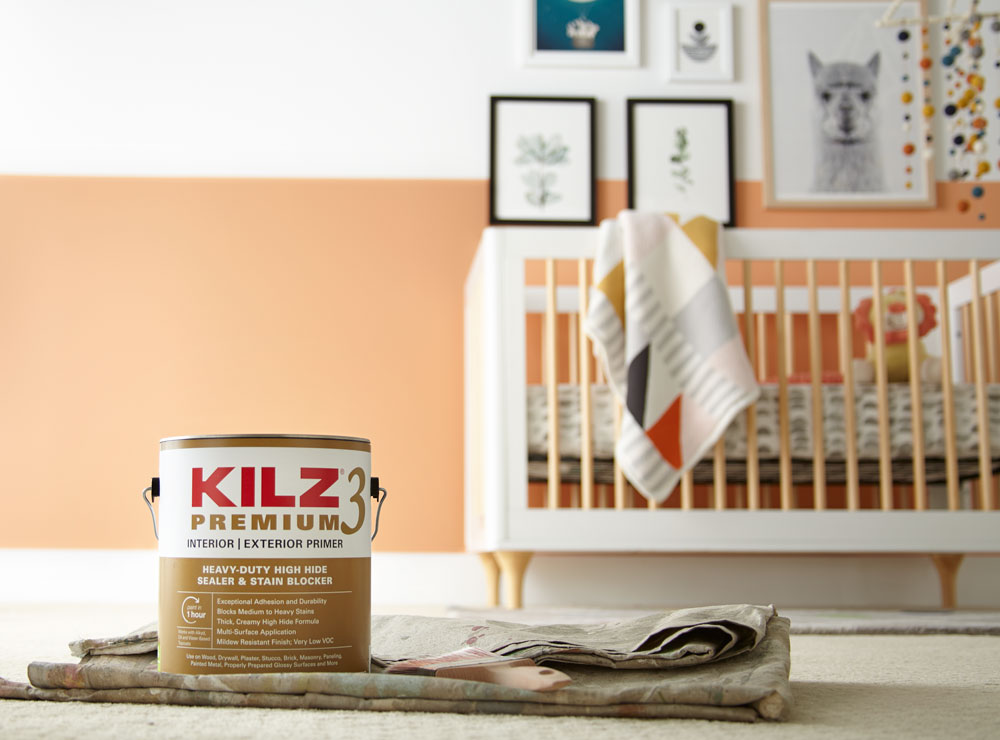
When you’re applying a new paint color, the last thing you need is your old color seeping through. That’s why KILZ 3® Premium Primer is a great primer choice when going from a darker color to a lighter color. It hides dark colors and creates the perfect base for your new topcoat paint. See how KILZ primer turned a dark spare room into a sunny and sweet nursery here.
Primer Has a Mildew Resistant Primer Finish
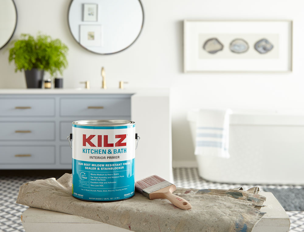
In high humidity areas, like bathrooms, KILZ® Kitchen & Bath Primer is up to the task. It dries with a mildew resistant primer finish that helps protect and support paint. See the full bathroom transformation here.
Always remember to refer to our website kilz.com or product back labels for additional information on which primer is right for your project and detailed instructions on how to apply our products.
RELATED ARTICLES
get inspired:
FOLLOw us:
@kilzbrand
join the conversation:
SHARE this post: